logozuu
Draftee
- Apr 23, 2022
- 1
- 23
- AFL Club
- Hawthorn
Listening to Cal Thomey on The Exchange the other day and he made a point about the current Gold Coast jumper that I wholeheartedly agree with - it looks like a training kit!
I've said this since Day 1 - It's going to be difficult for fans and players to truly embrace their jumper design. I get the gold stripes down the side of the red jumper as a nod to surf lifesaving. In fact, I love that the club opted for the warm red and bright yellow; it's a great colour scheme to own, just drop the sky blue as there is no need for it.
What I love about Aussie Rules footy jumpers is the simple yet striking colours and design elements; vertical or horizontal stripes, sashes and all sorts of yokes and v-shapes. It's unique to our sport and should be celebrated. But there tends to be this notion that younger generations expect new design approaches and that has led to some god-awful outcomes. At least we have the pleasure of seeing the indigenous designs each year, an opportunity to cater for more complex design outcomes which look fantastic.
This said, I feel that things have taken a turn for the good recently where clubs have embraced a simple yet memorable design scheme. Love the Port Adelaide and Fremantle jumper changes. Thank goodness the Eagles went back to their original jumper design and embraced the royal blue and gold instead of the dog's breakfast jumpers of the Noughties. I don't mind what the Giants are doing - this is one example of good modern design. Even the Tigers took the brave but smart decision to go for the yellow and black sash clash jumper. The Hawks opted for a heritage yet simple and striking V design for their clash. It's all looking good now.
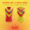
Except for the Suns. So I have put together a standard and clash design that I think can be embraced by the players and fans and the competition in general. This is a jumper that you want to go out and represent. And I think this is now the time to adopt it. 10 years now since they joined and this is time for a new era.
The elements represent a bright sunrise on the horizon. Always looking forward to the next success.
I've said this since Day 1 - It's going to be difficult for fans and players to truly embrace their jumper design. I get the gold stripes down the side of the red jumper as a nod to surf lifesaving. In fact, I love that the club opted for the warm red and bright yellow; it's a great colour scheme to own, just drop the sky blue as there is no need for it.
What I love about Aussie Rules footy jumpers is the simple yet striking colours and design elements; vertical or horizontal stripes, sashes and all sorts of yokes and v-shapes. It's unique to our sport and should be celebrated. But there tends to be this notion that younger generations expect new design approaches and that has led to some god-awful outcomes. At least we have the pleasure of seeing the indigenous designs each year, an opportunity to cater for more complex design outcomes which look fantastic.
This said, I feel that things have taken a turn for the good recently where clubs have embraced a simple yet memorable design scheme. Love the Port Adelaide and Fremantle jumper changes. Thank goodness the Eagles went back to their original jumper design and embraced the royal blue and gold instead of the dog's breakfast jumpers of the Noughties. I don't mind what the Giants are doing - this is one example of good modern design. Even the Tigers took the brave but smart decision to go for the yellow and black sash clash jumper. The Hawks opted for a heritage yet simple and striking V design for their clash. It's all looking good now.
Except for the Suns. So I have put together a standard and clash design that I think can be embraced by the players and fans and the competition in general. This is a jumper that you want to go out and represent. And I think this is now the time to adopt it. 10 years now since they joined and this is time for a new era.
The elements represent a bright sunrise on the horizon. Always looking forward to the next success.