


It is perfectly fine when you first read it, it's just when you analyse it, the use of the word 'tackle' probably isn't a great idea.Really? I didn't see it that way at all, I thought it was quite clear what the message was. I think that says more about those people to be honest.
Navigation
Install the app
How to install the app on iOS
Follow along with the video below to see how to install our site as a web app on your home screen.
Note: This feature may not be available in some browsers.
More options
You are using an out of date browser. It may not display this or other websites correctly.
You should upgrade or use an alternative browser.
You should upgrade or use an alternative browser.
Discussion Bad Graphic Design
- Thread starter Jones2ByrneJones
- Start date
- Tagged users None
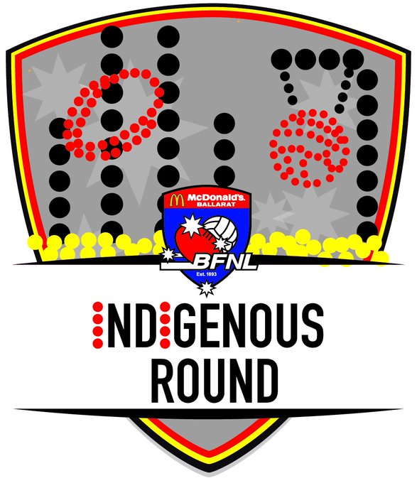
Ballarat Football League Indigenous Round logo. It is just horrendously offensive.

Last edited:
- Sep 19, 2007
- 19,078
- 17,644
- AFL Club
- St Kilda
- Other Teams
- Anaheim Ducks, PSV Eindhoven
It's not that bad except for the netball ring looking a bit like a noose.
- Moderator
- #504
It's not that bad except for the netball ring looking a bit like a noose.
It's awful! It's pretty easy to tell that it's been made in Paint or similar – this isn't a traditional dot painting converted to digital, this is little symmetrical circles all lined up in perfect rows to create silhouettes of footy goals and netball rings. I'm no authority on indigenous art as I'm just a young white male but I think the execution comes off as poor taste rather than being a true representation of indigenous culture.
Plus the type sucks.
That's exactly it, I mean I can understand if they are unable to, or cant afford to commission an Indigenous artist to design a logo but know where the line is if you want to represent Indigenous culture. It's bordering on offensive to be perfectly honest.It's awful! It's pretty easy to tell that it's been made in Paint or similar – this isn't a traditional dot painting converted to digital, this is little symmetrical circles all lined up in perfect rows to create silhouettes of footy goals and netball rings. I'm no authority on indigenous art as I'm just a young white male but I think the execution comes off as poor taste rather than being a true representation of indigenous culture.
Plus the type sucks.
After seeing this, I knocked up my idea for a logo. It is in a similar vein to the Crows' first Indigenous jumper, a simple recolour (I included the TSI colours in the lower shield) that clearly represents what the round is about without butchering an ancient art form.

Last edited:
cats2rise
#63 - Mount Buller Demons
- Apr 10, 2005
- 22,808
- 20,304
- AFL Club
- Geelong
- Other Teams
- THFC
May be wrong, but looks like a random has attempted to imitate indigenous art. Could come across as veeery cringe-worthy.It's awful! It's pretty easy to tell that it's been made in Paint or similar – this isn't a traditional dot painting converted to digital, this is little symmetrical circles all lined up in perfect rows to create silhouettes of footy goals and netball rings. I'm no authority on indigenous art as I'm just a young white male but I think the execution comes off as poor taste rather than being a true representation of indigenous culture.
Plus the type sucks.
- Moderator
- #507
May be wrong, but looks like a random has attempted to imitate indigenous art. Could come across as veeery cringe-worthy.
I'd love to know who designed it.
Some fourty-something bloke on the leagues board who thought he was doing the right thing, but got it horrendously wrong.I'd love to know who designed it.
probably the same bloke that made their normal logo.Some fourty-something bloke on the leagues board who thought he was doing the right thing, but got it horrendously wrong.
fancyscum
Radical Crommunist
I love how they can't even get the yellow dots don't even stay in the shield. Not only do they need to hand this job off to an actual indigenous artist, but they also need to teach the guy who did this one to colour within the lines!
fancyscum
Radical Crommunist
Perhaps I'm a bit ignorant here, but I don't quite see why using the TSI colours is important for a local footy league ~3000kms away from the Torres Strait islands. For a national competition like the AFL it is, but I would assume that local leagues would be better off placing a focus on the traditional indigenous tribes of that local area.That's exactly it, I mean I can understand if they are unable to, or cant afford to commission an Indigenous artist to design a logo but know where the line is if you want to represent Indigenous culture. It's bordering on offensive to be perfectly honest.
After seeing this, I knocked up my idea for a logo. It is in a similar vein to the Crows' first Indigenous jumper, a simple recolour (I included the TSI colours in the lower shield) that clearly represents what the round is about without butchering an ancient art form.
- Oct 27, 2016
- 5,949
- 10,676
- AFL Club
- Collingwood

- Other Teams
- Packers, Raptors, Renegades
I had to explain to my class why this would be a horrible Australian flag. They didn't really seem to care how it looked. Not a problem with the aboriginal flag, just combining the two makes me cringe.


MKMatty
Busy Vibin’
Proof that we really haven't come that far in 50 odd years with cultural understanding. Incredibly offensive.Ballarat Football League Indigenous Round logo. It is just horrendously offensive.
Not just that though, the designer of the aboriginal flag doesn't want itI had to explain to my class why this would be a horrible Australian flag. They didn't really seem to care how it looked. Not a problem with the aboriginal flag, just combining the two makes me cringe.
View attachment 374025
This is the first image put on on Eureka Stadium's new scoreboard...it's horrendous.


This is the first image put on on Eureka Stadium's new scoreboard...it's horrendous.
View attachment 378151
I don't think I've seen that version of the Port logo before... with Port Adelaide scrunched at the top?
Yeah looks like it was just added for the sake of it. Not only that though but the time is wrong! The game starts at 1:45 pm local time, not 1:15!I don't think I've seen that version of the Port logo before... with Port Adelaide scrunched at the top?
And sentence capitalisation. Yeesh.
Scrunched up or not, this is so much better than just "Power"I don't think I've seen that version of the Port logo before... with Port Adelaide scrunched at the top?
- Oct 27, 2016
- 5,949
- 10,676
- AFL Club
- Collingwood
- Other Teams
- Packers, Raptors, Renegades
Not sure why the Port logo has 'Port Adelaide' on the top. I've never seen that before but I guess it doesn't change much reallyThis is the first image put on on Eureka Stadium's new scoreboard...it's horrendous.
View attachment 378151
fancyscum
Radical Crommunist
That scoreboard hardly deserves an unveiling, does it?This is the first image put on on Eureka Stadium's new scoreboard...it's horrendous.
View attachment 378151
We still run things by steam engine here, this is a big deal!That scoreboard hardly deserves an unveiling, does it?
Similar threads
- Replies
- 8
- Views
- 568
