Discussion Essendon's 2011 jumper

Remove this Banner Ad

Jun 23, 2004
13,506
38
AFL Club
Adelaide
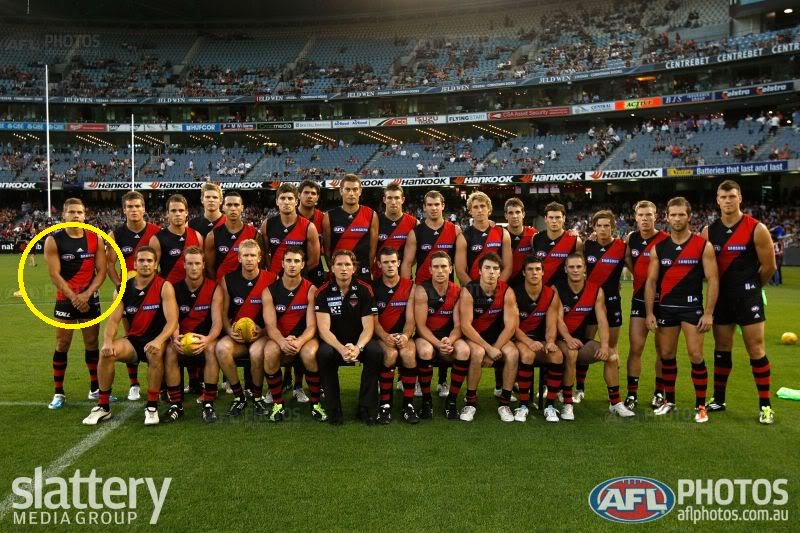
Home/stock jumper, as opposed to any potential clash jumper.

Would like some clarification from Mero/others in the know here: Has Essendon actually ever worn a 'straight' sash? Is there any major difference from today's jumper compared with the 1990 GF jumper, or the 2000 GF jumper?

Will also throw in something I've always wondered - one Mero may know - has Essendon ever had different shades of red? It would have something to do with the material and the manufacturer, but I've always thought that its 1999 jumper was brighter than it's 2000 one, for eg. And the black was a little lighter, a faded black, if that makes sense. The red, too, was faded a little. In the same year, Melbourne's red yoke was a different red, IMO, particularly at the start of the season - bordering on pink, as Jim Main pointed out in Inside Footy, as I recall.

What do you think?

As an aside, a general point about jumpers, I reckon Richmond, although it isn't traditional, needs to go back to the black back and yellow n.o. Looked far classier.

Cheers.
 
Officially, since printed jumpers began, which for Essendon was from about 1998 on, they have used one shade of Red, which is PMS 186, which is the same as the Red in the club logo.
This will appear different on the new style jumpers depending on sunlight/cloud cover and the lighting at night games.
As for the 2000 jumper, I would tend to agree.
However I would suggest the material Fila was making the jumper from was causing the colour to looked washed out. The Fila jumpers were shinier than the Reebok ones they used in 1999.
(Fila also made Melbourne's jumpers in 2000, moving from Canterbury in 1999)

Technically, a sash is not a diagonal stripe, and my memories of Essendon jumpers have always been with them having a slight bend in them.

I believe people have written to the club in the off-season and linked the following pics from the club website to their email

prem1946.jpg

prem1949.jpg


These seem to show straighter sashes were used, but then that also might be the material. The other thing with that is that most jumpers are not seen at the hip, only across the chest, and this has the effect of pulling the jumper straighter, and covering up the most prominent besnd in the sash.

prem1984.jpg

For mine, this clearly shows that the more recent teams wore sashes with a bend in them.
 
ALL of Essendon history before the year 2000,the Sash was always basically,a tight diagonal over the heart STRAIGHT sash,(or at least straightish looking Sash from front on).
From 2000 onwards, it took on a slight curve (not bad,and nothing too noticable),but then Adidas came along in 2009 and disgracefully drooped and sagged our sash to the EXTREME! (Adidas are notorious for putting their own funky trendy stamp on things,regardless of tradition and logic).
I was so outraged,i proceeded to do something about it as you will read below.
A sagging droopy sash is aesthetically and psychologically plain WRONG!!!. This Adidas sagging droopy sash was a complete balls up, and it somehow got passed!!!
It naturally makes a players shoulders look rounded,and chests flat and deflated. It looks plain sloppy, and the opposite of what a powerful, battle ready team should look like.
The severity of the sagging droop of a sash, can also be clearly determined by how close the front and back parts of the sash get to underneath the left armpit.
See this picture of the 2009/2010 Adidas Sagging Drooping sash which shows it almost meets under the armpit...
mawhg7.jpg

And again from the front,the 2009/2010 ADIDAS Sagging Sash....
stanton_ad_a.jpg


The corrected Adidas 2011 Tight Straight Sash....(MUCH MUCH BETTER!!!)
110218_nab_stk_09-l.jpg


A straight and tight sash, will always naturally make the players look, and feel MUCH more formidable,uncompromising,and powerful.
I just had to do something to get this back...I can personally confirm, that in the off-season summer of 2009/10, i wrote to expose and express to the highest of EFC club officials (with absolute detail), a fully discriptive articulated letter, with side by side REAL photographs (including the ones Mero mentioned, yes) for comparisons.
After the truth was told, i knew it would be hard to ignore and there was nothing more needed to be said,because i was then informed that my letter was discussed at board meeting and it was emphatically conclusive....Tighten and restore the sash!!!
A meeting was then held with Adidas,were they were instructed to straighten our Sash to it's former glory,and the rest is history, (The club personally acknowledged this to me in many exciting and impressive ways).
At that particular time of the off season, it was deemed too late to have the Sash corrected for the 2010 season,so they set about making it happen for 2011.

NOW WE LOOK LIKE ESSENDON AGAIN...TIGHT, FULL CHESTED, UNCOMPROMISING AND POWERFUL SASH SUPREMACY!!! ENJOY!
*The design proof was set and frozen on the 21/05/2010.
*The Design and Developers were both female.
*The Red colour code is...Poppy 013A

Long live the TIGHTENED Straightened Sash!!!!
224130.jpg


It crosses the heart, tight and powerful.
This is Essendon!!!....
548306.jpg


And a further snapshot of our proud history,(All tight straight Sash)....
1946
prem1946.jpg


1984
prem1984.jpg


1985
prem1985.jpg


1993
prem1993.jpg
 
Last edited:

Log in to remove this ad.

I've always preferred the sash with a slight curve, we (Richmond) had a staright sash a couple of seasons back looked crap IMO.
 
I initially LOVED our 2011 jumper. But after looking at it more I'm not likeing it as much.

The collar gives the illusion that the sash is actually curving the other way. Also I hate how the sash connects at the bottom, looks messy IMO.

But it's 10x better then last years, that curve was rediculous.
 
This years jumper is an overcorrection based on last years guernsey. A very slight curve looks best.
 
I initially LOVED our 2011 jumper. But after looking at it more I'm not likeing it as much.

The collar gives the illusion that the sash is actually curving the other way. Also I hate how the sash connects at the bottom, looks messy IMO.

But it's 10x better then last years, that curve was rediculous.

Just something about Adidas, they can never do something subtle. The sash either has to be dead straight, or curved so much it looks like the players have giant man boobs covering the sash.
 
Yes unfortunally Adidas designers seems to like to put their own stamp on things,which is why we got that shocking sagging droopy sash in the first place.
The new one is very good now that they have straightened the sash,but they still could'nt help themselves with wanting to put their stamp on things with making the collar slightly interfere with the sash.
Anyhow, at least they were made to correct the big one, and their Adidas ego would have taken a hit at the same time,so i'm very happy now.:)

The new 2011 Jumper
1851-1.jpg
 
Pretty sure Leroy Jetta was wearing a 2010 jumper tonight with the iron on over the top because the Adidas logo was much lower, below the "bib" on the old ones and the sash was curved as well. At least they had the correct sponsors. Still, I cannot believe that an AFL club as big as Essendon cannot get that right, and not even wear the correct jumper design, as a member of the club it annoys me. Jobe Watson also had the sponsors the wrong way round, Samsung on the back instead of the front with the others. We need to lift our game in this respect.

224702jpg.jpg

(open in new tab for full sized image)

That photo clearly shows Watson wearing the proper jumper, he likely had to change jumpers for whatever reason when he did his speech after the game.
 
Straight sash looks better, but I don't like the way the sash joins at the bottom. There needs to be more of an angle to the sash, while keeping it straight, so that the sash joins slightly above the hip, just like the '84, '85 and '93 jumpers shown above in this thread. Can another alteration be done so that the sash is at slightly more of an angle?
 
That photo clearly shows Watson wearing the proper jumper, he likely had to change jumpers for whatever reason when he did his speech after the game.
I noticed a player during the 2nd half wearing the wrong sponsors whilst on the field. This shouldn't happen even if they have to change as each listed player is required to have 2 jumpers with their own number on it, and if they need to swap again (damage, blood etc) they need to inform the Umpires and Interchange Steward of the number swap. Agreed that it's pretty slack on the property manager's part to get this wrong, especially for a pretty big game like a grand final.
 

(Log in to remove this ad.)

Yeah leyroy war wearing a 2010 jumper, wtf is he allowed to do that?

He is allowed to because it meets all the AFL requirements, adidas logo in the correct size at the front, AFL logo in the right place, Samsung logo in the right place, and the 13solar logo in the right place (as an iron on)
Numbers have the AFL logo so there is nothing the AFL would disallow. However, adidas wouldn't be thrilled, as they want to sell new jumpers, not promote the old ones.
 
Pretty sure Leroy Jetta was wearing a 2010 jumper tonight with the iron on over the top because the Adidas logo was much lower, below the "bib" on the old ones and the sash was curved as well. At least they had the correct sponsors. Still, I cannot believe that an AFL club as big as Essendon cannot get that right, and not even wear the correct jumper design, as a member of the club it annoys me. Jobe Watson also had the sponsors the wrong way round, Samsung on the back instead of the front with the others. We need to lift our game in this respect.

224702jpg.jpg

(open in new tab for full sized image)

Yeah i noticed this too. Jetta had his 2011 jumper ripped last week,but surely a big club like Essendon would be able to supply a repacement for the week after,instead of digging out the leftover droopy disgrace from last year. This is not country football,and simply should not happen.
And onfield,jobe Watson was wearing the opposite sponser arrangment jumper to the rest of the team (13SOLAR Front / Samsung Back) instead of (Samsung Front / 13SOLAR Back).
The extra sponser dollars are good for the club,but the shared logo position situation on the jumper is very annoying and getting messy.
I can't understand that Samsung would be to happy about this situation,when their contract was already in place,and have had front and back rightly to themselves.
The Bombers need to lift in their game in uniformity,because this is just not befitting of such a great club.
If i had my way,tidyness and uniformity would even go to the point of having our entire team wearing black boots.
Come on Bombers! no more untidy stuff.
 
The new jumper is better than last years one but it's still one extreme to another. This years one looks too pointy and doesn't really look like a sash which may also be because the positioning of it is so vertical. Adidas have also seemed to print the sponsors in different places, some are right at the edge of the sash while some are further away. Obviously not a huge issue when watching but for a huge company like Adidas you'd think they'd have more consistency.
I think Puma had it spot on, it was just a plain old sash which is how it should be.
r247272_1011740.jpg
 
As mentioned before, lets not forget it's Adidas were dealing with here, and they are the perhaps the worst for allowing them to design a traditional football jumper, because they tend to want to put their own funky stamp on things, regardless of tradition and logic.
Our 2011 jumper is fine now, in that the big part of the problem (the sagging droopy sash) was fixed, and it's really just 3 tweaks that would bring it close to perfect, such as....
(1) Lose the black collar intrusion on the top part of the Sash.
(2) Take 10mm off the width of the Sash.
(3) Make the front Sponsers logo smaller, so as to fit inside the sash.

That dual sponsership does'nt help uniformity for the jumper either.
Ah well,at least now,the basic tightened,and straight over the heart Sash, makes the players look like a formidable force again.
 
(3) Make the front Sponsers logo smaller, so as to fit inside the sash.

That might happen with True Value Solar's badge but I can't see Samsung allowing their logo to be that small.
3 was a good fit as their logo sat perfectly on the sash.
 
Yeah probably not now that Samsung has to share with ''True Value Solar''.
I've seen True Value Solars front logo on the jumper,and it makes Samsung's look GREAT by comparison. It's taller,and it looks fussy and complicated by craming in ''True Value Solar'' in a smallish square,with the light blue somehow looking worse on the front (13SOLAR is O.K. and passable on the back),and makes it look cheap,which is not helped by the words ''True Value''.
The Samsung Logo is a classy one,and being a HUGE sponser for the club,it should have stayed front and back regardless,with ''True Value Solar'' stuck on the shorts instead.
The shared major sponsership with ''True Value Solar'' has come suddenly out of the blue, and i just can't see how Samsung would have been happy to share 50% of their payed jumper logo space.

P.S. Agreed...the 3 Logo sat nicely inside the Sash, which is what we want.
 
Is it just me or do this years player's on-field jumpers rip and tear in fights far easier than they have in the past?
 
Yeah, i don't know if it's just a big coincidence,but we had one ripped last week ,and also one ripped last night. Maybe they've gone overboard with trying to lighten things to much,and have compromised the strength.
 
I think you'll find they will get a new set of jumpers before the season starts.
And these jumpers will be made of a slightly thicker material.
(Which is a probable reason why the 13solar logo is ironed on, and why Jetta was using the 2010 jumper)
Quite a few clubs have worn preseason jumpers that are different from what they've worn in the regular season. Mostly I've noticed this on sponsor logos.
I would think it's because the preseason is usually played in the hotter months, where as the regular season jumpers used in the colder months.
But I have nothing to confirm this as the official reason.

Sounds logical...lets hope we get the tougher material for the main season.
Any views on the late and sudden shared sponsership situation, where Samsung (already a long term paid up contractual sponser from 2 years ago) has forfeited 50% jumper exposure to ''True Value Solar"?
I would have thought they owned both front and back for the full term, after their major initial contract signing.
 

Remove this Banner Ad

Back
Top