Gold Coast SUNS guernsey discussion

Remove this Banner Ad

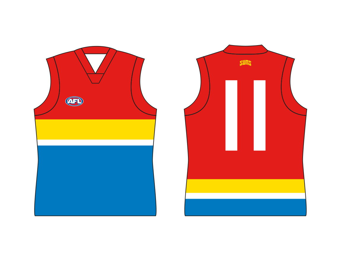
Played around with another idea, still using a similar logo to the start of the thread.
I wanted this one to look more traditional that the others. A basic design that would be recognisable as the Gold Coast jumper, even if they change logos in the future.

GoldCoastDoubleSash.png
The double sash was original supposed to look more like sun rays with some smaller rays coming from the sides but it looked too messy.
Still, it fits with the spacing of the G and C and creates a point of difference from Essendon and Richmond. Having the sash come from the left shoulder also does this but the main reason I did it was to avoid the sponsor sitting on top of it and breaking it up.
 
Played around with another idea, still using a similar logo to the start of the thread.
I wanted this one to look more traditional that the others. A basic design that would be recognisable as the Gold Coast jumper, even if they change logos in the future.

View attachment 339686
The double sash was original supposed to look more like sun rays with some smaller rays coming from the sides but it looked too messy.
Still, it fits with the spacing of the G and C and creates a point of difference from Essendon and Richmond. Having the sash come from the left shoulder also does this but the main reason I did it was to avoid the sponsor sitting on top of it and breaking it up.
id rather not have the logo in it at all
 

Log in to remove this ad.

id rather not have the logo in it at all
Yeah, well that's the other option.
GoldCoastDoubleSashPlain.png
The good thing about something like this is it's not like Fitzroy, Adelaide or the Brisbane Bears and also not just a recolour of an existing clubs design.
Back in the early days recolours didn't matter so much but these days I think it's important for new clubs to establish their own identity.
 
Yeah, well that's the other option.
View attachment 339697
The good thing about something like this is it's not like Fitzroy, Adelaide or the Brisbane Bears and also not just a recolour of an existing clubs design.
Back in the early days recolours didn't matter so much but these days I think it's important for new clubs to establish their own identity.

What do they look like with yellow side panels?


Sent from my iPhone using Tapatalk
 
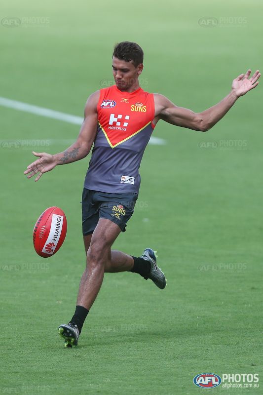
Sorry about the blurry photo but looks like we have new redesigned training top. Trying to find the footage from 9 news so you guys can get a better look View attachment 339866
always been a huge fan of the 'V' on jumpers, although working with a Sun as a logo is fairly hard to incorporate into a jumper I would have thought..

Looks great can't wait to see something other than what we got at the moment... it really is a disgrace.
 
I had a crack at redesigning the SUNS logo and guernsey

6a0Wu6y.png


fVVAcWS.png
 
I had a crack at redesigning the SUNS logo and guernsey

6a0Wu6y.png


fVVAcWS.png
looks cool man, it's a good start.

i liked the logo, so i tried seeing how it'd look on the guernsey, in a similar way to the guernsey you've done above. (not trying to steal your thunder or anything!)

6qaQv6j.png


p.s., welcome to bigfooty! we've got a footy jumpers and graphic design forum as well, if you want to have a look over there.
https://www.bigfooty.com/forum/forums/footy-jumpers-and-graphic-design.122/

this thread would probably be the thread to post any similar guernsey ideas like above into:
https://www.bigfooty.com/forum/threads/jumper-ideas-for-2017.1127344/page-64
:)
 

(Log in to remove this ad.)

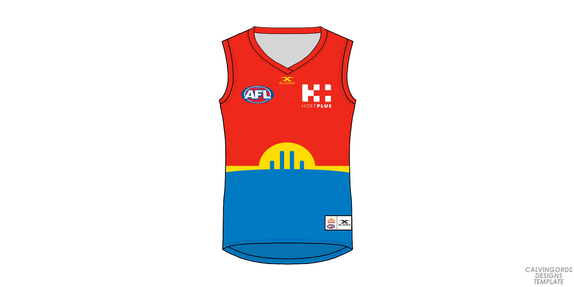
I really like that home Guernsey! Works in the skyline and the colour blue well, and the blue underneath makes it look like your looking at the skyline from off the coast, with the blue being ocean. Also doesn't make the logo stick out as obnoxiously. It also isn't too modern/hip/juvenile (lions paddelpop), but also isn't exactly the same as any other team, a la chevrons. Probably the best home mock-up I have seen.

cheers


On iPhone using BigFooty.com mobile app
 
Played around with another idea, still using a similar logo to the start of the thread.
I wanted this one to look more traditional that the others. A basic design that would be recognisable as the Gold Coast jumper, even if they change logos in the future.

View attachment 339686
The double sash was original supposed to look more like sun rays with some smaller rays coming from the sides but it looked too messy.
Still, it fits with the spacing of the G and C and creates a point of difference from Essendon and Richmond. Having the sash come from the left shoulder also does this but the main reason I did it was to avoid the sponsor sitting on top of it and breaking it up.
Vertical stripes?
 
Where the hell is our New MAJOR Sponsor??! Not happy we haven't secured one by now. Might be just as easy if HUWAEI increased sponsorship to be a Major one.
 
th
Where the hell is our New MAJOR Sponsor??! Not happy we haven't secured one by now. Might be just as easy if HUWAEI increased sponsorship to be a Major one.
thats what im hearing that huwaei will be upgrading- but u would have tought it would have been announced by now- if not by this weeks game
 
Where the hell is our New MAJOR Sponsor??! Not happy we haven't secured one by now. Might be just as easy if HUWAEI increased sponsorship to be a Major one.

We have a major sponsor but on paper it does not take over from a certain date. So Can't advertise it until closer to the date apparently
 

Remove this Banner Ad

Back
Top