Played around with another idea, still using a similar logo to the start of the thread.
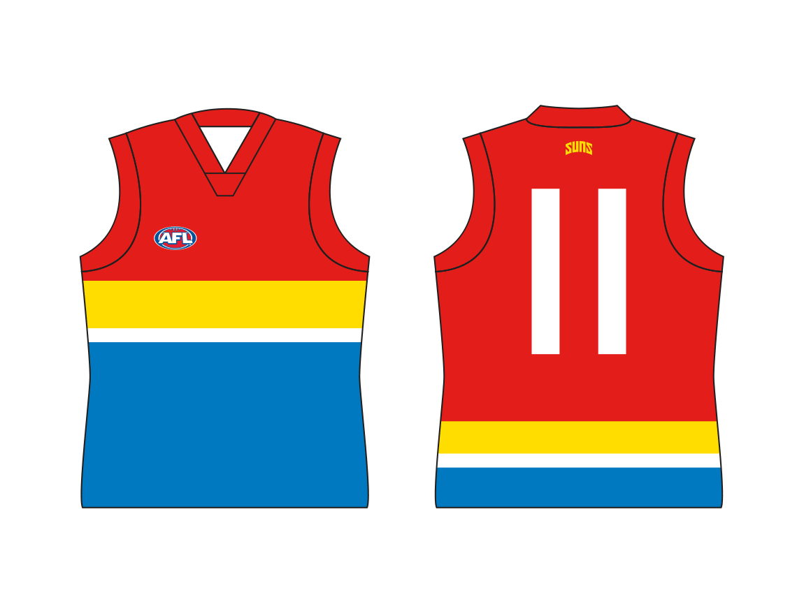
I wanted this one to look more traditional that the others. A basic design that would be recognisable as the Gold Coast jumper, even if they change logos in the future.

The double sash was original supposed to look more like sun rays with some smaller rays coming from the sides but it looked too messy.
Still, it fits with the spacing of the G and C and creates a point of difference from Essendon and Richmond. Having the sash come from the left shoulder also does this but the main reason I did it was to avoid the sponsor sitting on top of it and breaking it up.
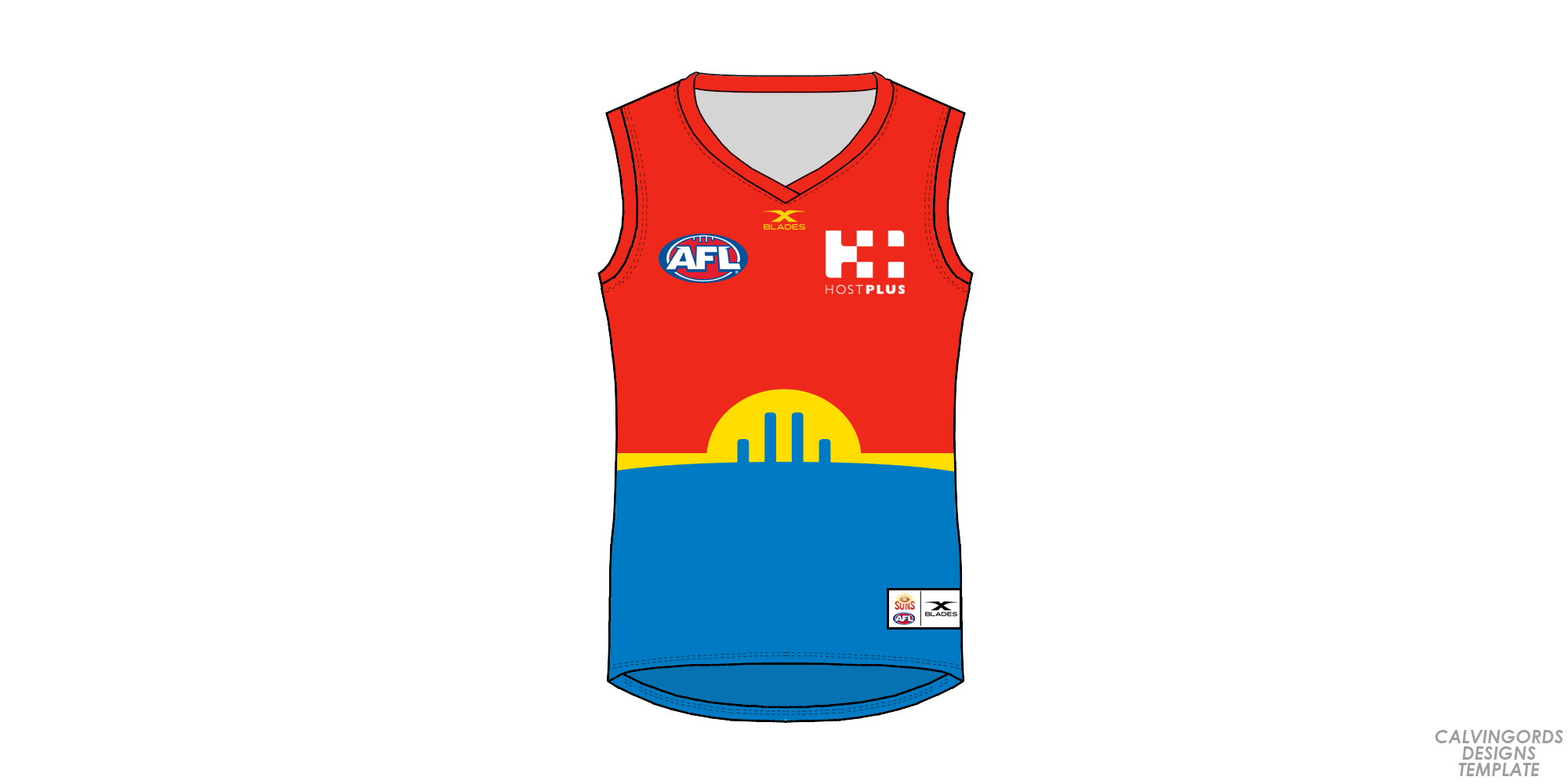


")