RedmanWasHere
Rarely in kitchens at parties.
- Joined
- Aug 23, 2010
- Posts
- 31,127
- Reaction score
- 38,534
- Location
- Information Superhighway
- AFL Club
- Essendon
- Other Teams
- Exers, Gryffindor, Rich+Ess AFLW, Tassie
Follow along with the video below to see how to install our site as a web app on your home screen.
Note: This feature may not be available in some browsers.

LIVE: Hawthorn v Western Bulldogs - Rd 13 - 7:40PM Fri
Squiggle tips Hawks at 68% chance -- What's your tip? -- Injury Lists » -- All Rd 13 Games
 BigFooty Tipping Notice Img
Weekly Prize - Join Any Time - Tip Round 13
The Golden Ticket - Corporate tickets, functions, Open Air Boxes at the Adelaide Oval, ENGIE, Gabba, MCG, Marvel, Optus & People First Stadiums. Corporate Suites at the Gabba, MCG and Marvel.
Nope.
If anything it reminds me of Parmalat.


Walmart's logo uses a modified Myriad Pro Bold (the W and T are modified), whilst Morrisons uses Museo Sans 900 with modified M.View attachment 230210 View attachment 230211
Maybe I'm looking at it different, but I reckon the typefaces are almost the same (look at the r) and the symbols bear a strong resemblance.
I have heard that Glenelg was first to adopt the logo and Melbourne could be the old that copied.Probably already been mentioned, but Glenelg FC SANFL seem to have adopted Melbourne's new logo as a weird second logo on the chest of the media polo only.
View attachment 228870
Log in to remove this Banner Ad
I have heard that Glenelg was first to adopt the logo and Melbourne could be the old that copied.
Just saw the December edition of a Glenelg Newsletter which had the 2016 membership information in it. The logo was part of the advertisement. If they copied Melbourne they must have done it quickly to have Melbourne release it in November and then be copied and appear in membership advertising so soon after.If thats true then this whole article is bullshit:
http://m.melbournefc.com.au/news/2015-11-12/the-man-behind-melbournes-new-logo
I'm pretty sure its not though, and Glenelg copied Melbourne.
Love this given the issues the logo hasIf thats true then this whole article is bullshit:
http://m.melbournefc.com.au/news/2015-11-12/the-man-behind-melbournes-new-logo
I'm pretty sure its not though, and Glenelg copied Melbourne.
“Your logo has to work at 32 pixels, just as much as 32 centremetres and we were losing impact with the previous logo the smaller it got. It was illegible and the colours were dark against dark.


I like the older logo over the current one FWIW. It's such a small little change but it really affects the whole logo.Just saw this on Logopedia and thought of the second logo.
But more like the previous logo.
I like the older logo over the current one FWIW. It's such a small little change but it really affects the whole logo.
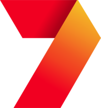
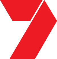
The launch idents with all the different coloured '7's is cool. I like to search up old adverts and the like on YT and I stumbled upon a bunch of old network idents for 10,7 & 9.At least the old 7 had something going for it and was versatile with its colours.
 & when home button highlighted:
Almost looks like they were worried people weren't pronouncing the HBit late with this one.
New Florida Panthers logo (it's obviously a sketch)
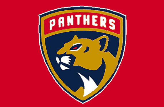
http://news.sportslogos.net/2016/04/26/florida-panthers-new-logo-leaked/

Looks good, but why would they call a cougar/puma/mountain lion a panther? God Bless AmericaHere is a better rendering
Looks good, but why would they call a cougar/puma/mountain lion a panther? God Bless America
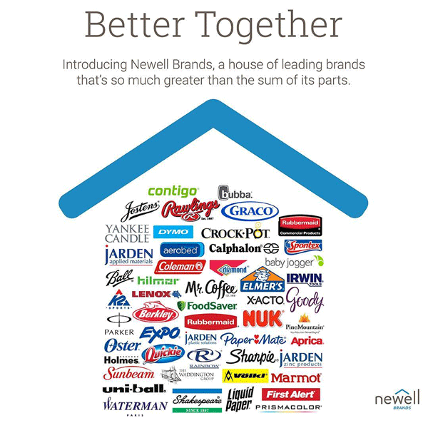
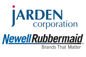
I thought First Alert was part of BRK?These 2 companies have merged to become one big corporation.
Before.
After.
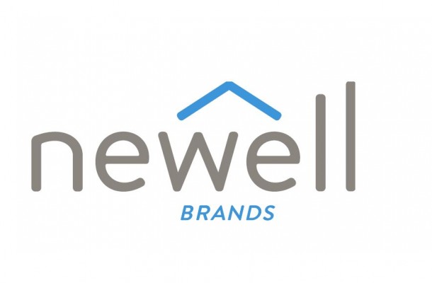
Here's a logo of the products they own.
Well it's a massive improvement on there former one, that's certain.You'd hope that isn't the final cut because it looks incomplete