


- Joined
- Oct 10, 2018
- Posts
- 2,114
- Reaction score
- 5,032
- AFL Club
- Geelong
Follow along with the video below to see how to install our site as a web app on your home screen.
Note: This feature may not be available in some browsers.

I've just realised this about the Dees old logo - the zigzag shape at the bottom is his cape thingy and the top diagonal shape is the Dees' vee yoke:
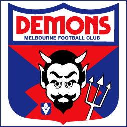
I doubt they want to, there has been no talk of it from them .Love that Demons logo.
Speaking of logos, when will Essendon refresh theirs? Been ages ....
Log in to remove this Banner Ad

The shield within a shield amuses me. Also, what's the point of a finals logo when there's only three games over four days?Big Bash Finals logo
View attachment 617386

So this is what people mean when they say taxation is theft...Australia's corporate regulator ASIC spends more than $100,000 on new font and branding
View attachment 618754
https://www.abc.net.au/news/2019-02...than-100000-on-new-font-and-branding/10802362
So this is what people mean when they say taxation is theft...
Seriously though, how do you spend that much on a rebrand and make it somehow look worse?
Haha exactlythey would have done the job for $200 and a sandwich. Mate, I'd do it for just the sandwich
- Re-design feeI'd say it looks better, but how changing the font cost $100,000 is ridiculous.
I understand the reason it costs so much, but to barely even change the logo it is just a waste of $$$Yeah lot of people don't really understand the re-brand process. Of course it's not $100k just for a new logo.
Our rebrand at work is expected to cost upwards of $2.5m
Bhp?I understand the reason it costs so much, but to barely even change the logo it is just a waste of $$$
How much did they spend on their rebrand?Bhp?
- Re-design fee
- New signs
- New business cards
- New stationery
- Replacement and disposal of old materials
- Changes to websites, documents and any paper forms
- Etc. etc.
Logo looks like something off Fiver, all the other stuff is the real cost
I withdraw haha what the actual shirt-front were they thinking?The article states that nearly 50% of that budget was "creative design"...
Why? If its not broken dont fix it!!Another one has traded in a well known look for another boring font.
View attachment 619827
View attachment 619828
Is this the new A-league team?Another one has traded in a well known look for another boring font.
View attachment 619827
View attachment 619828
Not sure if serious.Is this the new A-league team?
Why? If its not broken dont fix it!!
Sent from my SM-G930F using Tapatalk
