- Joined
- Mar 20, 2012
- Posts
- 48,187
- Reaction score
- 33,537
- AFL Club
- Carlton
- Thread starter
- #2,626
Follow along with the video below to see how to install our site as a web app on your home screen.
Note: This feature may not be available in some browsers.

 BigFooty Tipping Notice Img
Weekly Prize - Join Any Time - Tip Round 10
The Golden Ticket - Corporate tickets, functions, Open Air Boxes at the Adelaide Oval, ENGIE, Gabba, MCG, Marvel, Optus & People First Stadiums. Corporate Suites at the Gabba, MCG and Marvel.
 Fantasy Footy Notice Image Round 10
SuperCoach Rd 10 Trades - Rd 10 SuperTalk - VC/Captain ,//, AFL Fantasy Rd 10 Rd 10 Fantasy Talk - Trades! - AFLF VC / Captains
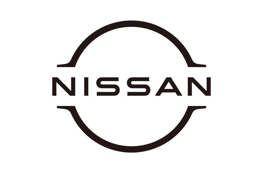
And they’ve removed the black outline.

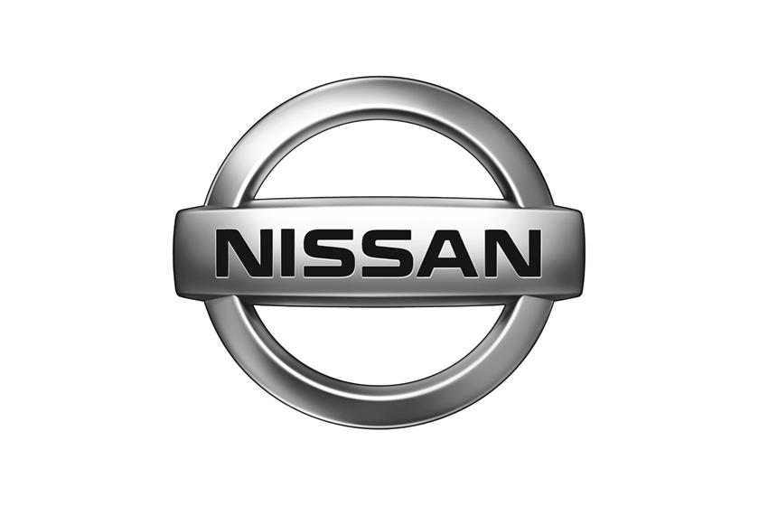
It looks like Nissan may be getting a new logo.
Old
New
Log in to remove this Banner Ad
Been working on a logo today in my spare time (which is ample now) for a new Sweet FA team. Heavily inspired from the NOLA Pelicans logo. I just can't put my finger on it but I know there's something I can add to polish it up. Thoughts?
View attachment 853017
Know any good fonts I could use for the Vampires text? That one I'm using is probably the one that fits the most but im sure there are better ones out there.a nice broth
Maybe shrink the Vampires text and space it out a bit like the Pelicans text of the original logo?
Keep the same distances between the wording and the black lines. The 'VAMPIRES' text looks like an afterthought because it doesn't follow the same 'rule' that the PENN wording does. Font-wise I'd try something a little more extended. Maybe something like industry inc. from foundry.Been working on a logo today in my spare time (which is ample now) for a new Sweet FA team. Heavily inspired from the NOLA Pelicans logo. I just can't put my finger on it but I know there's something I can add to polish it up. Thoughts?
View attachment 853017

Sorry I just had to.Been working on a logo today in my spare time (which is ample now) for a new Sweet FA team. Heavily inspired from the NOLA Pelicans logo. I just can't put my finger on it but I know there's something I can add to polish it up. Thoughts?
View attachment 853017


Atlantic cruise is pretty close to the font on the Batman:the animated series logo.Know any good fonts I could use for the Vampires text? That one I'm using is probably the one that fits the most but im sure there are better ones out there.
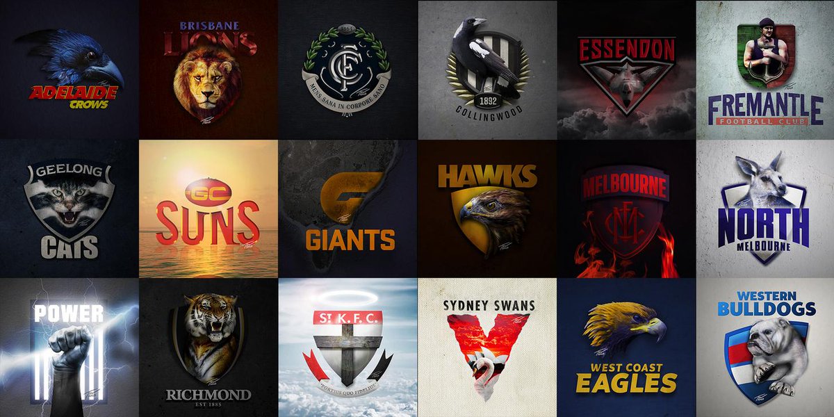
Crows, Dockers, North and Doggies are lot less intimidating...


Teeth, without vampire teeth they are just bats.Been working on a logo today in my spare time (which is ample now) for a new Sweet FA team. Heavily inspired from the NOLA Pelicans logo. I just can't put my finger on it but I know there's something I can add to polish it up. Thoughts?
View attachment 853017
Anyone know who the afl X new orleans (nfl) logo is meant to be?Nice niceView attachment 871166
Is there a link to all of the AFLxNFL logos.Anyone know who the afl X new orleans (nfl) logo is meant to be?
The Saints? I'd say the Saints.Anyone know who the afl X new orleans (nfl) logo is meant to be?