


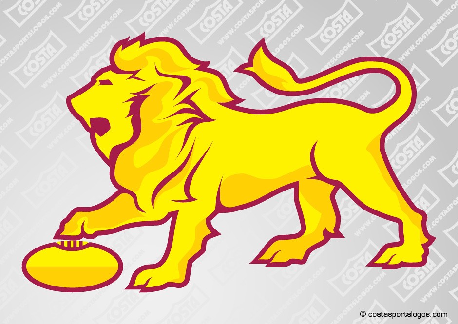
Costa lion is a little dated now imo. Might just be the shading though.Replace with the Costa lion and I'm a fan. (as an aside, this design has to be one of the oldest tropes on the FGD board)
Navigation
Install the app
How to install the app on iOS
Follow along with the video below to see how to install our site as a web app on your home screen.
Note: This feature may not be available in some browsers.
More options
Style variation
-


LIVE: Hawthorn v Western Bulldogs - Rd 13 - 7:40PM Fri
Squiggle tips Hawks at 68% chance -- What's your tip? -- Injury Lists » -- All Rd 13 Games
-
 BigFooty Tipping Notice Img
Weekly Prize - Join Any Time - Tip Round 13
The Golden Ticket - Corporate tickets, functions, Open Air Boxes at the Adelaide Oval, ENGIE, Gabba, MCG, Marvel, Optus & People First Stadiums. Corporate Suites at the Gabba, MCG and Marvel.
12 Winner: gab213
-
Witness 32 nations clash in your Graphic Design boards biggest competition yet: The 2026 FJGD World Cup!
You are using an out of date browser. It may not display this or other websites correctly.
You should upgrade or use an alternative browser.
You should upgrade or use an alternative browser.
Discussion Logo Discussion Thread
- Thread starter akkaps
- Start date
- Tagged users None
🥰 Love BigFooty? Join now for free.
- Joined
- Apr 19, 2008
- Posts
- 23,473
- Reaction score
- 40,153
- AFL Club
- Essendon
- Other Teams
- Stars, Mets, USC, Southport Sharks

Fiorentina updated (more like downgraded) their crest, old on the left new on the right.
Sent from my Louis Vuitton Jaffle Maker
- Joined
- Oct 23, 2018
- Posts
- 7,443
- Reaction score
- 6,912
- Location
- Victoria
- AFL Club
- Gold Coast
- Other Teams
- Storm, Western Utd
Old
New
New
RedmanWasHere
Rarely in kitchens at parties.
- Joined
- Aug 23, 2010
- Posts
- 31,127
- Reaction score
- 38,533
- Location
- Information Superhighway
- AFL Club
- Essendon
- Other Teams
- Exers, Gryffindor, Rich+Ess AFLW, Tassie
Log in to remove this Banner Ad
- Joined
- May 9, 2011
- Posts
- 967
- Reaction score
- 2,569
- Location
- VIC
- AFL Club
- St Kilda
- Other Teams
- San Francisco Giants
The Jazz moved to Salt Lake City where they don't allow music.Today's Logodump:
New logo for totally workwear who seem to be ripping off Vkusno i Tochka, The A-League and Warner Music.
View attachment 1429386
Utah Jazz make their logo less jazzy.
View attachment 1429387
And Hogs Breath Café.
View attachment 1429392
SomeNorthFan
Senior List
- Joined
- Jan 25, 2018
- Posts
- 182
- Reaction score
- 183
- AFL Club
- North Melbourne
- Other Teams
- Melbourne Renegades
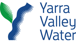
Finally, my water company doesn't look like it got cryogenically frozen in the 90's.Old
New
- Joined
- Jul 21, 2010
- Posts
- 7,784
- Reaction score
- 11,498
- Location
- Gold Coast
- AFL Club
- Gold Coast
- Other Teams
- Philadelphia 76ers

- Joined
- Oct 10, 2018
- Posts
- 2,112
- Reaction score
- 5,032
- AFL Club
- Geelong
the shield is pretty generic but the old logo was so shit so it's still an upgrade
royboy2
Average Old Bastard
- Joined
- Dec 7, 2007
- Posts
- 14,162
- Reaction score
- 17,323
- AFL Club
- Brisbane Lions

- Other Teams
- Rabbitohs, Villa, McLaren
Yeah I dont mind it eitherthe shield is pretty generic but the old logo was so s**t so it's still an upgrade
RedmanWasHere
Rarely in kitchens at parties.
- Joined
- Aug 23, 2010
- Posts
- 31,127
- Reaction score
- 38,533
- Location
- Information Superhighway
- AFL Club
- Essendon
- Other Teams
- Exers, Gryffindor, Rich+Ess AFLW, Tassie
Didn't even know The Muppets had a logo.
RedmanWasHere
Rarely in kitchens at parties.
- Joined
- Aug 23, 2010
- Posts
- 31,127
- Reaction score
- 38,533
- Location
- Information Superhighway
- AFL Club
- Essendon
- Other Teams
- Exers, Gryffindor, Rich+Ess AFLW, Tassie
The new logo being a modern retro rendering of the original logo.

- Joined
- Oct 23, 2018
- Posts
- 7,443
- Reaction score
- 6,912
- Location
- Victoria
- AFL Club
- Gold Coast
- Other Teams
- Storm, Western Utd
A new temporary logo for the 2026 Commonwealth Games
Old

New

Old
New
RedmanWasHere
Rarely in kitchens at parties.
- Joined
- Aug 23, 2010
- Posts
- 31,127
- Reaction score
- 38,533
- Location
- Information Superhighway
- AFL Club
- Essendon
- Other Teams
- Exers, Gryffindor, Rich+Ess AFLW, Tassie
Will the next ugly logo please depart the room?
 ----------->

Andonis1997
Sporting masochist
- Joined
- Jun 24, 2011
- Posts
- 26,689
- Reaction score
- 17,367
- Location
- Adelaide
- AFL Club
- Carlton
- Other Teams
- ΠΓΣΣ LFC Sturt Steelers Nix
This was so unnecessary, AND they got rid of the negative space bear?Will the next ugly logo please depart the room?
----------->

RedmanWasHere
Rarely in kitchens at parties.
- Joined
- Aug 23, 2010
- Posts
- 31,127
- Reaction score
- 38,533
- Location
- Information Superhighway
- AFL Club
- Essendon
- Other Teams
- Exers, Gryffindor, Rich+Ess AFLW, Tassie
This was so unnecessary, AND they got rid of the negative space bear?
Yep.
A big miss all round.
- Joined
- May 3, 2004
- Posts
- 856
- Reaction score
- 1,729
- AFL Club
- Geelong
Somebody in marketing has to justify their salary somehow
I think they'll go back to it in time. The brand was instantly recognisable. Isn't that the point?
I think they'll go back to it in time. The brand was instantly recognisable. Isn't that the point?
- Joined
- Mar 30, 2014
- Posts
- 3,101
- Reaction score
- 5,316
- AFL Club
- Brisbane Lions
- Other Teams
- Dolphins, Seattle Kraken
#daretobearThis was so unnecessary, AND they got rid of the negative space bear?
- Joined
- Mar 20, 2012
- Posts
- 48,187
- Reaction score
- 33,537
- AFL Club
- Carlton
- Thread starter
- #3,818
The neg space bear was the appeal of the logo
🥰 Love BigFooty? Join now for free.
RedmanWasHere
Rarely in kitchens at parties.
- Joined
- Aug 23, 2010
- Posts
- 31,127
- Reaction score
- 38,533
- Location
- Information Superhighway
- AFL Club
- Essendon
- Other Teams
- Exers, Gryffindor, Rich+Ess AFLW, Tassie
From

To

And, now, the newest of the batch.

Does anyone still use this?
Haven't thought about Hootsuite in ages but never used it.
To
And, now, the newest of the batch.
Does anyone still use this?
Haven't thought about Hootsuite in ages but never used it.
- Joined
- Jun 12, 2012
- Posts
- 21,638
- Reaction score
- 69,195
- AFL Club
- Port Adelaide
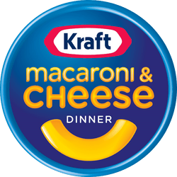
Read the case study and check out the applications – it’s way better than just taking it as one logo change to another. The wordmark is based on the original 1908 illustration. Seriously, how cool is the off-centre O? As designers you should be lauding this.
Even without knowing the history my initial impression was that it’s a modern take on an old logo. It has a lot of character, something that a lot of updates sorely lack.
bomberclifford
Importer/Exporter
- Joined
- Sep 2, 2005
- Posts
- 43,959
- Reaction score
- 140,938
- Location
- Cerebral Cortex
- AFL Club
- Port Adelaide
- Other Teams
- Port Adelaide Magpies
Read the case study and check out the applications – it’s way better than just taking it as one logo change to another. The wordmark is based on the original 1908 illustration. Seriously, how cool is the off-centre O? As designers you should be lauding this.
It’s an incredible brand refresh. The new packaging is so good.
cannavo
Kabigon Resonator
- Joined
- Aug 4, 2012
- Posts
- 4,784
- Reaction score
- 8,003
- Location
- South Nunya, Nunya Bizmate
- AFL Club
- Collingwood
- Other Teams
- Yes
- Staff
- #3,823
From
To
And, now, the newest of the batch.
Does anyone still use this?
Haven't thought about Hootsuite in ages but never used it.

Opted for Hoothoot-esque eyebrows
SomeNorthFan
Senior List
- Joined
- Jan 25, 2018
- Posts
- 182
- Reaction score
- 183
- AFL Club
- North Melbourne
- Other Teams
- Melbourne Renegades
The bear is still on the packaging. Just its on top of the wordmark now.

