Fizzler
BBTB
- Dec 26, 2013
- 12,772
- 16,362
- AFL Club
- Port Adelaide
- Other Teams
- OKC, Coburg, Werribee, Storm, QPR
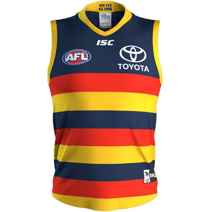
2018 had no orange.
Be interesting to see what Collingwood think of this, black and white V strip with no teal
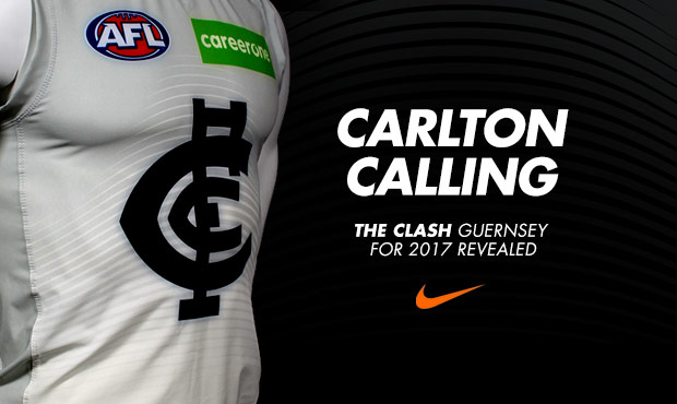
Not this years one, but the one that was leaked on here and eventually scrapped.Was there Orange in the Carlton clash this year? Didn’t notice it if there was.
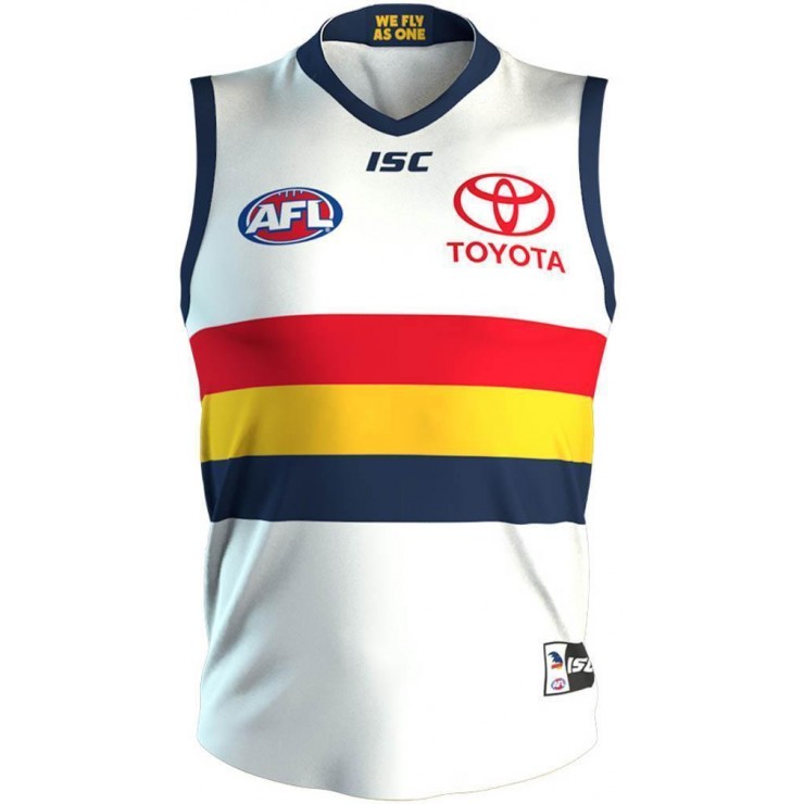
IMO I thought Port’s white clash was one of the best going around, not a fan of grey/silver guernsey’s in general.
Sent from my iPhone using Tapatalk Pro
I like the white one more personally, but I don’t hate the silver one. A couple tweaks (black collar/cuffs, white number panel) and it’s perfect.
As for Collingwood, they can GAGF and if they have any issues with it and if the league rules in their favour that’s clear cut proof that the league favours them. Not a good look indeed. Hopefully this is the first step to wearing the PB’s full time.