Navigation
Install the app
How to install the app on iOS
Follow along with the video below to see how to install our site as a web app on your home screen.
Note: This feature may not be available in some browsers.
More options
You are using an out of date browser. It may not display this or other websites correctly.
You should upgrade or use an alternative browser.
You should upgrade or use an alternative browser.
Portfolio Realistic AFL Team Logos - WonderT Portfolio
- Thread starter WonderT
- Start date
- Tagged users None
i like how you did North's logo generally but it's been pointed out on the north board that the kangaroo you've used looks like a grey kangaroo whereas our kangaroo is usually more like a red kangaroo (they're bigger and burlier, which is probably why.) there are albino red roos though, this one might make a good reference image:


Freight Train
Once hit the sign at the Mercantile Mutual Cup
- Moderator
- #128
i like how you did North's logo generally but it's been pointed out on the north board that the kangaroo you've used looks like a grey kangaroo whereas our kangaroo is usually more like a red kangaroo (they're bigger and burlier, which is probably why.) there are albino red roos though, this one might make a good reference image:
View attachment 859404
jeeeeeeez.
- Mar 30, 2014
- 2,606
- 4,274
- AFL Club
- Brisbane Lions
- Other Teams
- Dolphins, Seattle Kraken
jeeeeeeez.
I agree, put the dopey-looking kangaroo in insteadi like how you did North's logo generally but it's been pointed out on the north board that the kangaroo you've used looks like a grey kangaroo whereas our kangaroo is usually more like a red kangaroo (they're bigger and burlier, which is probably why.) there are albino red roos though, this one might make a good reference image:
View attachment 859404
- Oct 9, 2003
- 45,078
- 42,910
- AFL Club
- North Melbourne
- Other Teams
- Eagles (NFL), Suns (NBA)
Which thread is that?It's up there with Mowse's Mascots for me as some of the most creative and unique work I've seen on this forum.
It was called Mowscot Manor. The photobucket shutdown thing broke the thread, but nearly all the images are in this FB album (apart from Collingwood's for some reason, which you can find if you just google "Mowscot Manor")
BigFooty
www.facebook.com
He reposted them in the link that I left, those images are still alive.
RedmanWasHere
Rarely in kitchens at parties.
- Aug 23, 2010
- 26,894
- 29,648
- AFL Club
- Essendon
- Other Teams
- Exers, Gryffindor, Rich+Ess AFLW, Tassie
Does anyone know what happened to BrothaShane’s work?
GremioPower
Taking notes of policy re: bikini/lingerie images
- May 26, 2017
- 20,975
- 43,229
- AFL Club
- Port Adelaide
- Other Teams
- Grêmio, DC United, Pistons
This is the thread from where I took the logo, RossFC.I'm guessing doing this with our current logo isn't possible because it's a monogram?
This is WonderT 's answer to your question:
My comment on this:Port Adelaide
View attachment 816861
Port's new logo didn't have much to work with so I decided to use their lighting fist logo. Very pleased with this one
On the new logo, the stripes should represent wharf pylons reflected on water.
However, I see a cowscraper (cowcatcher). Since power is associated with locomotives, I think it makes sense. The logo could be the front of a train: the "PA1870" on the boiler; and the square being the cabin.
- Moderator
- #138
Does anyone know what happened to BrothaShane’s work?
Pretty sure we realised it was all plagiarised. This is going back a long time though.
RossFC
Moderator
- Moderator
- #139
The only thing I can think of with the current logo is to make the Prison Bars at the bottom of the logo look like a real cell door.
Edit: Although it's actual wharf pylons, I'm not sure how that would work though.
Last edited:
RedmanWasHere
Rarely in kitchens at parties.
- Aug 23, 2010
- 26,894
- 29,648
- AFL Club
- Essendon
- Other Teams
- Exers, Gryffindor, Rich+Ess AFLW, Tassie
Pretty sure we realised it was all plagiarised. This is going back a long time though.
Really?
I never knew that or thought about any plagiarism.
It looked fantastic.
royboy2
Average Old Bastard
- Dec 7, 2007
- 13,054
- 15,158
- AFL Club
- Brisbane Lions
- Other Teams
- Rabbitohs, Villa, McLaren F1, ENG
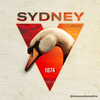
Awesome job on the new swans, did you ever give any more thought to these?I might do it in the future. I'll probably do some older ones like Fitzroy or the Bears. May even try other sporting codes.
Real white swans have that, though.Complete with the strange looking nub on the beak! Great work mate.
RedmanWasHere
Rarely in kitchens at parties.
- Aug 23, 2010
- 26,894
- 29,648
- AFL Club
- Essendon
- Other Teams
- Exers, Gryffindor, Rich+Ess AFLW, Tassie
Gonna give this a bump.
Tassie's turn now WonderT.
Tassie's turn now WonderT.
Similar threads
- Replies
- 28
- Views
- 4K


