- Thread starter
- Moderator
- #326

Follow along with the video below to see how to install our site as a web app on your home screen.
Note: This feature may not be available in some browsers.
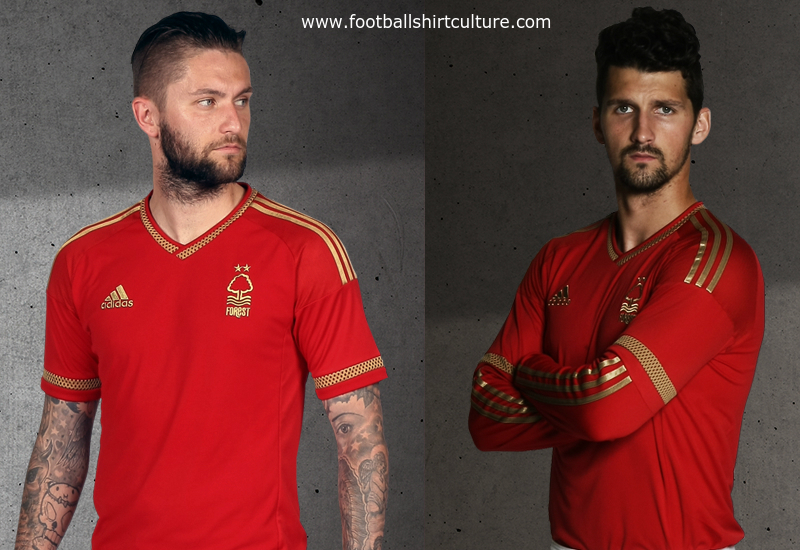
Looks like a normal exercise shirt
I love this from Forest. Hopefully they don't have a sponsor with a horrendous logo.
When did they sign Villa?
I love this from Forest. Hopefully they don't have a sponsor with a horrendous logo.
Bit of Aloisi in him as well.When did they sign Villa?
Was going to say a mix of Aloisi and him.Looks like Djokovic to me.
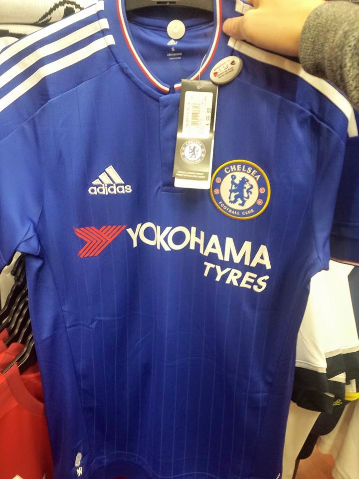
I'm fine with red being on the kit, but the red Yokohama logo is bad IMO. All white and it'd be much better.For the amount of $$$ they are given us I'm not fussed how it looks, though I think it looks good compared to most sponsors logos.
And the red doesn't bother me, we've had it on our kits a heap of times before and it's even in our badge.
Plus who could not love red, white and blue
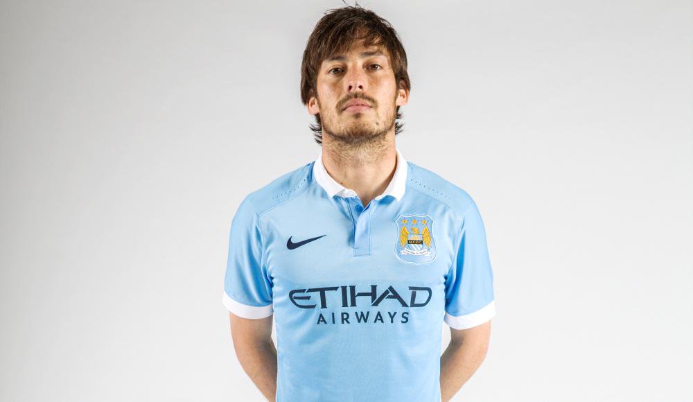
Agreed, it looks great.absolutely adore the kit. the right shade of blue and the white shorts. nailed it.
West Brom unveil their new kit, but their promo leaves a lot to be desired:
You know, when you get a new sponsor and a new kit, you would've thought a better effort would've been put in.