


Yes, I know I have too much spare time. But anyhow...
I've long been concerned by the amount of crap that can appear on a modern AFL jumper and generally lamented the way the standard layout has evolved.
Currently, jumpers:
- have an AFL logo on the right breast (colour) and at the bottom of each player number (monochrome)
- have a front and rear sponsor logo, often in non-team colours.
- have a manufacturer's logo at the neck and a large separate tag on the front lower left.
Some clubs also:
- have a monogram above the player number
- have a club logo above/below the front sponsor
Now, if I Ruled The World... we would do things differently.
The AFL logo: OK, so there's a marketing need to distinguish genuine AFL gear from lower-tier teams that wear the same design. But the AFL logo adds absolutely zip to the game day experience and seriously needs dialing down. I'd move the AFL logo to above the numbers on the back and make it an "enhanced" watermark that complimented the jumper colour rather than a full colour logo. The logo on each number would be similarly printed in a lighter/darker shade of the number colour rather than a high contrast colour (e.g. dark grey logo rather than white logo on black numbers).
Sponsors: a necessary evil of modern sport. The front sponsor moves to the right breast I've just vacated the AFL logo from. The back logo stays as is. Same dimension restrictions as currently exist for both.
Manufacturer: logo can remain at the neck but must be in a club colour. I would remove the lower AFL/manufacturer tag completely.
This would leave the left breast (over the heart) free for club logos, monograms or other special logos (milestone game logos etc.). This seems the most appropriate place for such logos and clubs like St Kilda and Geelong are already trying to shoehorn these in around sponsors. Clubs that have their logo in their jumper (Carlton, WCE etc) would be free to decide what if anything would go best in that space.
Now if you'll excuse me I need to go back to plotting how I'm going to manage the "rule the world" bit...
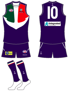
 ) from what is on the jumper. And you can do what football (soccer to you Australians) clubs do and have the stars around the logo to represent flags won, whether it be in a line on top of the logo, like Germany, or encircling the logo, like Brazil.
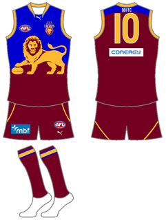


 )
)