Steve Dore
International Trade Facilitator
- Aug 30, 2004
- 36,121
- 64,973
- AFL Club
- Port Adelaide
- Other Teams
- Vikings, Canadiens, Sharks
Hallelujah, a new logo and all our problems are solved.
Follow along with the video below to see how to install our site as a web app on your home screen.
Note: This feature may not be available in some browsers.
That's how Melbourne did it, right?Hallelujah, a new logo and all our problems are solved.

You make a post like this eeeevvvery timeHallelujah, a new logo and all our problems are solved.
Because that bunch of supporters have far more idea than the bunch of supporters that don't think we need to change our logo every season?If there are a bunch of supporters that think the logo needs to change EVERY YEAR, it's probs not a good logo.
Hallelujah, a new logo and all our problems are solved.
Did I quote your post?I did say in my post that I'm not advocating for change right now because we've got bigger fish to fry.
C- for reading comprehension.
Did I quote your post?
E - for reading comprehension
These I could vote for

This is one I made a few months ago where I tried to follow some of the themes in the existing logo ie the blocky, rectangle shape (which has been converted into a more conventional logo shape - a shield). Also the big POWER has been replaced with an EVEN BIGGER PORT.
I dunno, kind of bland innit but we don't have a lot of imagery to work with in the way of nicknames - a Magpie is out of the equation and what even is a power.
View attachment 275482
I don't think it is. Collingwood's (for example) looks terrible on most things.Not 1 peep as regards to the Maggies logo. Because it's good.
Collingwood's logo is one of the best in the league. The Australian flag on it is a bit naff but.I don't think it is. Collingwood's (for example) looks terrible on most thhings.
Honestly, its an awful 'logo'.
Collingwood's logo is one of the best in the league. The Australian flag on it is a bit naff but.
Carlton and Melbourne are the best. St Kilda's would be up there if they remastered it.
Common theme is a good shield/roundel type logo without any cartoony shite like Geelong's or Hawthorn's.

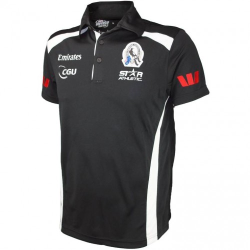
STUFF BLOKES WANT .COM.AUIt looks shite on merchandise = not a good logo these days.
STUFF BLOKES WANT .COM.AU
That is one hideous piece of merch. Anyway, that's why we have a monogram/merch logo
.
Not helped by the fat white stroke they put on it. If they made all of the elements strictly black and white for merch (ie what we did on this hat) it would be much better.Official and cleanest one, still looks crap. If your logo is good, you don't need secondary logos (look at how much better the Westpac one is).
I googled Collingwood Polo shirt and the whatmenwant one came up