Remove this Banner Ad

Mod. Notice Competitions: READ BEFORE POSTING A COMPETITION

🥰 Love BigFooty? Join now for free.

Thoughts on a local footy team comp (new jersey and logo)...I'm sure it's happened before but would be cool to see some new ones (Preferably my clubs haha)


Maybe have 10 teams from the first 10 people who give out their teams name
 
Thoughts on a local footy team comp (new jersey and logo)...I'm sure it's happened before but would be cool to see some new ones (Preferably my clubs haha)


Maybe have 10 teams from the first 10 people who give out their teams name

Not a fan of clubs using the forum to get free design work.
 
Not a fan of clubs using the forum to get free design work.

I don't mind the concept of a league comp centred around a small region of an Australian city. Like for example, the North West Brisbane footy league, where people are required to pick a suburb and pick and local sponsors like a butcher or a pub.

But we've probably got enough competitions at this stage.
We've got enough league style comps for sure. NAFL, Can-Am, FIRA, FLO, and CCRC is more than enough.

But bringing something like Locality of the week might work. Go with the local areas, and come up with a new team to slit into the existing competition.
 

Log in to remove this Banner Ad

We've got enough league style comps for sure. NAFL, Can-Am, FIRA, FLO, and CCRC is more than enough.

But bringing something like Locality of the week might work. Go with the local areas, and come up with a new team to slit into the existing competition.
We could have a weekly comp with a state league sides, from the VFL, WAFL, SANFL, NEAFL and the other major leagues
 
A suggestion/comment on competitions:
FWIW I would like to see more (i.e. at least one) competition/s with stricter guidelines, as more of a design test. I've said this before, but colourising sponsors is a big problem for me. in real life there is no way any corporates (like Rio Tinto and Bankwest, for example) would allow their logos presented in foreign colours after spending a packet to sponsor a team. Designing kits that work with various native sponsor liveries is more of a challenge but also makes for more interesting overall colour palettes. I'm thinking of a competition in which the sponsors are pre-defined, how their logos can be used is pre-definded, team colours and basic parameters of the home shirt are predefined, and the design challenge is in the fine details for the home strip and a completely original away strip. So basically, exactly what a designer is faced with in real life, and not the teletubbie exercises that come up repeatedly here... I know some of you don't like this idea but that's my suggestion, anyway.
 
We could have a weekly comp with a state league sides, from the VFL, WAFL, SANFL, NEAFL and the other major leagues
Don't mind this, when it comes to AFL jumpers we just tend to think of the AFL.

However, interest may drop quickly because there will be large groups of people that don't associate with other state leagues.
 
A suggestion/comment on competitions:
FWIW I would like to see more (i.e. at least one) competition/s with stricter guidelines, as more of a design test. I've said this before, but colourising sponsors is a big problem for me. in real life there is no way any corporates (like Rio Tinto and Bankwest, for example) would allow their logos presented in foreign colours after spending a packet to sponsor a team. Designing kits that work with various native sponsor liveries is more of a challenge but also makes for more interesting overall colour palettes. I'm thinking of a competition in which the sponsors are pre-defined, how their logos can be used is pre-definded, team colours and basic parameters of the home shirt are predefined, and the design challenge is in the fine details for the home strip and a completely original away strip. So basically, exactly what a designer is faced with in real life, and not the teletubbie exercises that come up repeatedly here... I know some of you don't like this idea but that's my suggestion, anyway.
I think a good rule for all the major comps (FIRA, NAFL/Rs, even CanAm) would be that sponsors must meet their styleguide, or simply coloured normally and encased in a box, unless on a neutral background.
 
I see both sides of the argument.

If you want realism and the extra challenge- yes, you should use the original branding of these companies. Working in marketing, I'm quite familiar, and we will go with DiamondGuy using my FLO entry as the example, that Bankwest would allow me to recolour their logo (RioTinto mayyyyy be a different story).

But at the same time, this is a fantasy design forum and I don't think there should be anything stopping designers from recolouring the sponsors to create an overall better look.
 
recolouring the sponsors to create an overall better look.

I don't think it does though. Yes, if the sponsor is white on any plain-coloured background, it looks clean and smart (almost all Liverpool and West Ham shirts, for example). But honestly, for me the most striking and memorable real life kits are those in which the sponsor palette adds colours that are foreign to the team colours:

$_1.JPG eng_pl_2011-12-NORWICH-CITY-PILKINGTON-SHIRT-38-23431_1.jpg a$_35.JPG 20150225_151855_bd7504b8-544f-46ce-95bb-4d9c0caca39f_medium.jpg etc etc etc

I would be prepared to concede this is just a matter of taste but what I don't understand is why no-one else here shares my opinion, instead exhibiting their phobia of colour.

I didn't mean to pick on you Freight man, your Oceania kit is smart and popular. But in the real world, with actual logos, the piece would need some more work to integrate the logos into your black-and-gold scheme, and that for me is the essence of the challenge here.
 
You don't understand why people may prefer to maintain a consistent colour scheme throughout their uniform? It's not as complicated an opinion as you infer.

Regardless, I think your idea is brilliant for a competition or two. It adds a layer of realism which I'm fully supportive of, and it makes us focus on our designs a bit more.

In regards to how we'd apply this to competitions, I'm thinking similarly to you. The comp-runner dictates the sponsors (whether it's the same/different for all teams is up to them) in much the same fashion Manchester United would dictate sponsor logo specifications to potential kit designers.
 
I would be prepared to concede this is just a matter of taste but what I don't understand is why no-one else here shares my opinion, instead exhibiting their phobia of colour.

You won't get an argument from me, DiamondGuy. This has always been a bugbear of mine. Fantasy kits with logos that have been recoloured beyond recognition all in the aim of making it blend in with the jumper design. Its completely unrealistic.

The fact is that in the real world, companies want the exact opposite. They don't pay the big bucks to see their logo fade into the background. They want it to stand out. Now admittedly, most people on here don't like that. But in terms of jumper designing, if we are trying to be as realistic as possible, recolouring should not be allowed OR should be limited to a single, neutral colour on a plain background (think Toyota on the Crows jumper).

Golden arches in green? Flying Kangaroo in blue? Subway logo in red and black? Nope. These just wouldn't fly, and it bugs me when I see examples like them. Making a logo look good on a design when the colours don't match is a challenge that should be embraced. Recolouring is the easy way out IMO.
 
Agree with the likes of McDonalds

Have no problem with recoloured logos that are usually flat and one coloured (usually white) unless their brands hinge that much on colour.
 

Remove this Banner Ad

You don't understand why people may prefer to maintain a consistent colour scheme throughout their uniform?

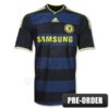
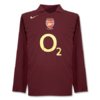
I understand that sometimes you might want to. And it does of course occasionally happen in the real world:
new-chelsea-away-shirt.jpg Chelsea-Away-Kit-2010-2011-800_2485684.jpg ArsHLS0506.jpg everton-15-16-third-kit (1).jpg
I just don't understand why almost everyone here wants to do it almost all the time. People can do whatever they want, I'm not trying to enforce anything, just looking for more variety and realism.
 
Last edited:
Template Competition

This is only a rough idea so give me suggestions/feedback.

I'm thinking only running this for maybe 4 or 5 rounds, see how it goes.

Something like...
Round 1: Australian Rules
Round 2: Soccer
Round 3: American Football
Round 4: Netball
Round 5: Rugby League/Union
But this isn't set in stone.

Anyway, each week contestants are asked to create a template for the given sport. All artwork must be drawn by yourself, but you are absolutely more than welcome to use other images to trace or draw inspiration from. Importantly, you must reference any external sources you do use.

I'm wanting this to be a workshop/competition hybrid type of thing. As in, it's a competition because people will be competing with each other and there will be a poll at the end. But it's also a workshop because I'd really like people to post their work in progress, so that others can give feedback and advice so everyone can create the best possible template that they're able to.

It's optional, but it would be great if people could release their templates publicly for use as well. It would be good to have a larger variety in the template thread.

Basically, this is a fun way for everyone to produce their own high-quality templates for any sport and hopefully the board will be richer for it.
 
There has been abit of interest out of the FFL thread that was recently bumped to have another season. Below is a summary of what the competition is like, thanks to Broken


Small_FFL_Logo.png
Representatives of all fictional realms are currently involved in a series of meetings to try and patch up differences and come up with new ways of promoting themselves.
One of their initiatives was the formation of a new football league - the Fictional Football League (FFL) - to let sport help address some of their issues.
Unfortunately the man assigned creative duties, Edward Scissorhands, failed spectacularly in creating uniforms and the designs will now be outsourced to those in the 'human world'.
Each team in the FFL will be designed by an individual and must adhere to the following criteria:
  • A team name must represent a fictional place (i.e. Sesame Street, Metropolis, Tattooine), however an actual location can be selected , but it must be in a fictional context (i.e. New York - Escape from New York)
  • Two jumpers need to be submitted, one home and one away. Logos, mascots, etc are not required.
  • Each jumper must contain the FFL logo (Full size logo here, however the colours can be modified to suit the jumper.)
  • Jumper sponsors must be associated with the fictional place.

And the original thread can be found here: http://www.bigfooty.com/forum/threads/ffl-trial-season.959777/
 
And less fixtures than the usual 20 or so. Please. I can't stress how much the long as league seasons are "draining."

Holy crap.
I agree with you and liked both of your posts........... we must be best brothers now.

Also i'd like to see it not ruled with an iron fist, make it more about having fun.
 

🥰 Love BigFooty? Join now for free.

There has been abit of interest out of the FFL thread that was recently bumped to have another season. Below is a summary of what the competition is like, thanks to Broken


Small_FFL_Logo.png
Representatives of all fictional realms are currently involved in a series of meetings to try and patch up differences and come up with new ways of promoting themselves.
One of their initiatives was the formation of a new football league - the Fictional Football League (FFL) - to let sport help address some of their issues.
Unfortunately the man assigned creative duties, Edward Scissorhands, failed spectacularly in creating uniforms and the designs will now be outsourced to those in the 'human world'.
Each team in the FFL will be designed by an individual and must adhere to the following criteria:
  • A team name must represent a fictional place (i.e. Sesame Street, Metropolis, Tattooine), however an actual location can be selected , but it must be in a fictional context (i.e. New York - Escape from New York)
  • Two jumpers need to be submitted, one home and one away. Logos, mascots, etc are not required.
  • Each jumper must contain the FFL logo (Full size logo here, however the colours can be modified to suit the jumper.)
  • Jumper sponsors must be associated with the fictional place.

And the original thread can be found here: http://www.bigfooty.com/forum/threads/ffl-trial-season.959777/
8 likes in an hour. 10 is a guarantee. Start your thread sir
 
I reckon should it go ahead, we should have a competition for a new league logo.
The execution wasn't the greatest, but the original logo idea was the mythical Centaur reaching for a mark in the same style as (I think) the AFLPA logo fwiw.
 

Remove this Banner Ad

Remove this Banner Ad

🥰 Love BigFooty? Join now for free.

Back
Top Bottom