Workshop Essendon Logo Concept

Remove this Banner Ad

+Texas, Virginia, Nevada, NSW, WA, Tasmania, ACT.

Maybe one day, but I'm a stickler for preserving anonymity/mystery, reinventing myself, moving around, blending in, being invisible. That site in my sig is kinda philosophical/biographical.

Anyway...let's talk about you instead!

That twitter account certainly is philosophical! :D

As for the website... spooky would be how I put it :p
 
Some of those names are like you say a bit too old-school. But why not anyway? What's so bad about Wasps compared to Tigers? Whats so bad about Tricolors compared to Bulldogs?

There are some kick-ass old-school names tho...Bloods, Same Olds, Gorillas, Shinboners, to name a few. I like many of those old ones.

Also, look at the NRL. Bluebags, Berries, Shoremen, etc. Better than Broncos, Titans, Raiders, Jets, Steelers, Chargers, etc, just copying NFL names.

Lakers is such a cool name, yeah, fine keeping it. Tho didnt make sense to be kept. Like Houston Oilers becoming Tennessee Oilers, needed a name change, they chose Titans. Regionally didnt make sense, like Lakers didnt. Oilers is a cool old-school name, better than Titans tho.

Then you're thinking along the same lines as me, even if we don't agree on some nicknames. But hey, we're not all identical are we :D
 

Log in to remove this ad.

To sort of get back on topic...

If Bombers is unfriendly-family in this PC-crazed world or AFL, I'd vote for Same Olds. If Bombers is fine, but just not having the name there, featuring the mosquito bombadier, that particular one with him in a jacket, as a new logo for Essendon would be fantastic. No matter the nickname.

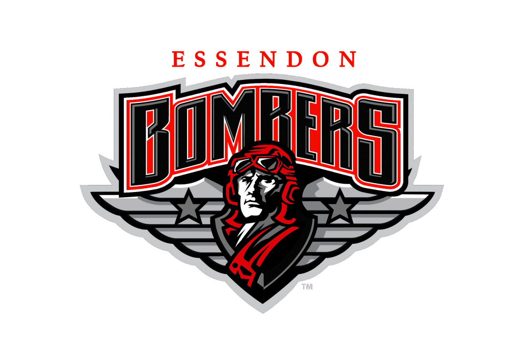
I think a lot of people really dislike the current bombers logo, and it was copied anyway from a US team, which is worse. Make it more Aussie iconic.
 
Brisbane Bears
Carlton Butchers
Essendon Same Olds
Footscray Tricolours
Fitzroy Gorillas
Geelong Pivotonians
Hawthorn Mayblooms
Melbourne Fuchsias
North Melbourne Shinboners
Richmond Wasps
South Melbourne Bloods
St Kilda Seagulls

... Gorillas is best of the lot. Seagulls and Bears hold water but the rest are crap.

"Oh we're from Wasp land, a fighting fury, we're from Wasp land" - ugh.

I smell a design competition coming on. :)
 
Been done, KOTW 21 or 22 (not long after I first visited the board).
I did a Wasps design which many didn't like because - would you believe - IT HAD A CLIPART WASP ON IT. Now everyone's doing it...

Yeah it would have been KOTW 21 as the files are amongst my earliest designs.
 
bombers-9.jpg

Lot to like about this one. Great job GG (noticed they pinched this on One Week at A Time a few weeks back in a graphic about the Bombers' travel woes.)

BTW, which US team did Essendon lift their logo from?
 
If the Bombers ever want a new logo, they now just have to look two states north in another sport.

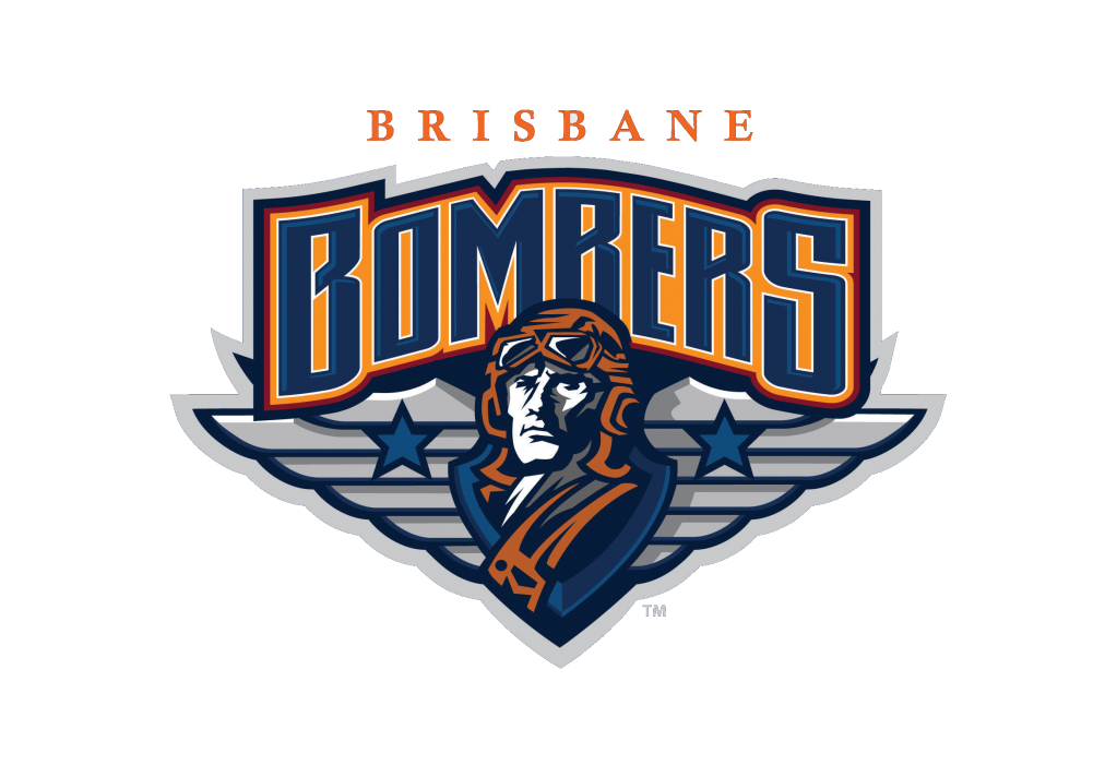
brisbane-bombers.png
EssendonBrisbaneBombers.png

When I saw that in the paper the other day I thought, "s**t that should be ours". Awesome.
 
Not a big fan of the Brisbane Bombers logo tbh. The rendering looks very 90s to me - they try and pack in far too much detail and lots of bevelled edges. The script, wings and Biggles aviator aren't strong enough to stand up on their own. Plus the colours are a bit muddy for mine.
 
Not a big fan of the Brisbane Bombers logo tbh. The rendering looks very 90s to me - they try and pack in far too much detail and lots of bevelled edges. The script, wings and Biggles aviator aren't strong enough to stand up on their own. Plus the colours are a bit muddy for mine.
Here here.
 

(Log in to remove this ad.)

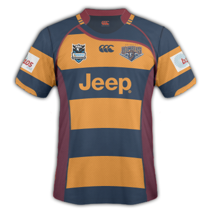
Yeah, I agree, but they do kind of work in jersey form (something I threw together for another forum):

BrisbaneBombersNRL.png
What strikes me the most is its resemblance to the Brisbane Broncos. I know next to nothing about NRL, or any rugby code, but there's definitely a similarity. The dark hues and the the heavy usage of maroon/a 'deep' red is obvious in both teams' colourways.

That's not a knock on you, craegus - in fact, I'm a pretty big fan of yours - it's just another odd decision by the Brisbane Bombers. There's no real originality. Imagine if GWS were called the Western Sydney Panthers and had a red and grey strip...
 
BTW, which US team did Essendon lift their logo from?

I can't remember unfortunately, it was some amateur hockey or lacrosse type of team. The logo exactly the same, same badge shape, same plane drawing, except it was a bomber, whereas the essendon one they removed something and looks more like a jet. This team's logo pre-dating the Essendon one.

I tried doing a google search but i suck at that and couldn't find it. I'll look around some more. Moments like these i have to say, "i could be totally wrong", in case I have to apologize later.
 
What strikes me the most is its resemblance to the Brisbane Broncos. I know next to nothing about NRL, or any rugby code, but there's definitely a similarity. The dark hues and the the heavy usage of maroon/a 'deep' red is obvious in both teams' colourways.

That's not a knock on you, craegus - in fact, I'm a pretty big fan of yours - it's just another odd decision by the Brisbane Bombers. There's no real originality. Imagine if GWS were called the Western Sydney Panthers and had a red and grey strip...

I don't worry I hate the colour scheme myself especially seen it is using 2 Brisbane Broncos colours (maroon and blue) and a close match in the other (yellow - Broncos, Orange - Bombers).

I know that maroon is the colour of Queensland but the other 2 teams (Gold Coast and North Queensland) don't use it, so the Bombers are basically just trying to ride in on the Broncos coat tails.

If we talk bids, I am a Central Coast Bears (should never have been screwed out of the league, was never a supporter, but most people have a soft spot for the Bears) and WA Reds supporter for the next expansion (whenever it happens). And if we go off the last expansion, I supported the Gold Coast (over the Bears and Wellington Orcas as it had the best bid at the time) and we all know what happened with that!!!;)
 
Good design Craegus. You had crap colours to work with though (as you said, FAR too similar to the Broncos. If they make blue the predominant colour, it might look a little less Bronco-ish.
 

Remove this Banner Ad

Back
Top