I don't know where that is sorry. (I am new to the website)
https://www.bigfooty.com/forum/threads/the-template-and-resource-thread.1100538/
More templates than you'll ever know what to do with!
Follow along with the video below to see how to install our site as a web app on your home screen.
Note: This feature may not be available in some browsers.
I don't know where that is sorry. (I am new to the website)
Thankyou!https://www.bigfooty.com/forum/threads/the-template-and-resource-thread.1100538/
More templates than you'll ever know what to do with!
God, how I wish you were right.Let's be honest, Bush League Kits aren't gonna change their collar
That aspect is better. As is getting rid of the little bit of extra black on the sides. Not thrilled by the black collar and cuffs though.Here's how the Giants jumper looks with black rather than charcoal
I still think this black version is the best GWS jumper I've ever seen.GWS
I would like to see a dark GWS clash jumper - I think it could look quite menacing.

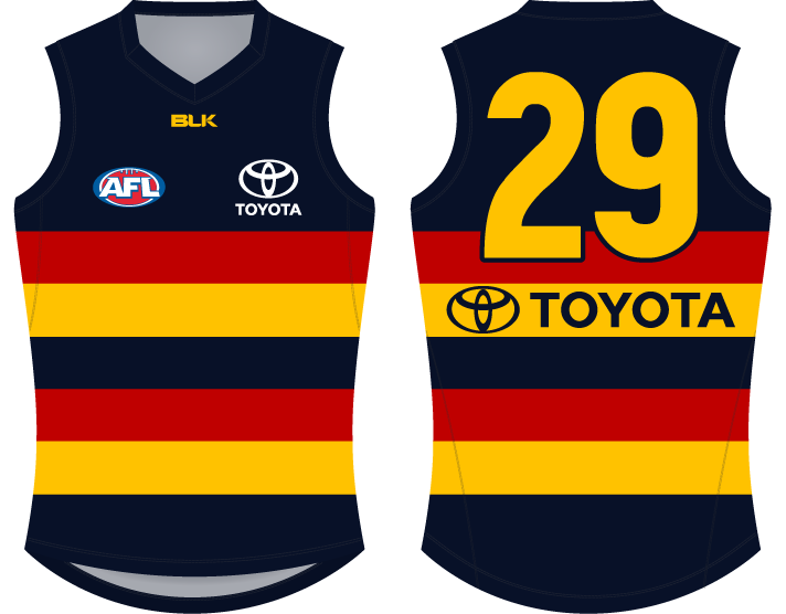
I made this last year- Adelaide's jumper should look like it has two hoops of red and yellow, so the end of the jumper is navy. Really dislike how it continues half cut off.

So so good.
Even the subtlest of changes makes a big difference. Looks greatI made this last year
I think it's been basically confirmed you just need two colours for a good footy jumper. The Suns have ditched sky blue, Freo got rid of green and red, and save for the Lions, Port are really the last three-colour team but when one of them is white and the other is black, the teal is fine. I don't think GWS have a bad colour palette at all, it's great, people are just disappointed they didn't go with sky blue. But you can't go back now. You don't want to go diluting what's becoming a successful brand to right some five year old wrong.
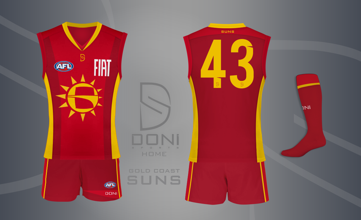
Great effort Andonis1997. The consensus from Suns fans is the logo has to go so thanks for trying to up update it. Ideally the logo would not be on the jumper at all as we would love a more traditional look. Any chance you have some ideas?So, I decided to try and improve possibly the most criticised home design in the AFL at the moment.. The Gold Coast Suns. In order to do this.. I started off with the logo itself.
It's a Sun and there's a (really well) hidden 'G' in the middle.. can you see it? Another thought of mine was: "how cool would it be if the sun's rays made the sun 3D?"
So, I did that. Not thinking about how it would look on a guernsey..
..So here's how it looks on a guernsey.
As you can see, there is now a two-tone red design along with a darker yellow, commonly known as gold. These are Adelaide's red and gold, with a darker shade of red added in the mix. I was hoping to achieve a design that would be simple (like the too-simple current design) but still be interesting, I guess.. I think I did that, but, eh. It's never getting used anyway.
Hey mate, thanks!Great effort Andonis1997. The consensus from Suns fans is the logo has to go so thanks for trying to up update it. Ideally the logo would not be on the jumper at all as we would love a more traditional look. Any chance you have some ideas?
Nothing too different, but gives the Suns a little more than what they currently have.
Do you like this found it off googleIf anyone's has the skills, I certainly don't a Suns jumper that is v like Melbournes but gold at the top and blue under ( but a darker North royal blue and no logo I thing would look traditional and hopefully different enough then other existing guernseys


When will the crow from the training jumpers make it onto the actual jumpers.
And they will, they won't be able to help themselves. I just hope it stays traditional.Hopefully never. We have the perfect set now. I hope it never changes.