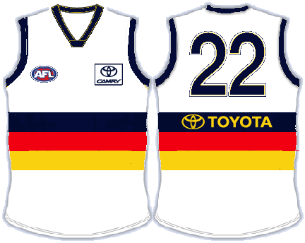
New Clash Guernsey Vote on AFC website

Remove this Banner Ad

Interesting about the AFC bit. Maybe too much like carlton. Get rid of the monogram and it's still a winner IMO.
Is there a suitable alternative? Guess we would need to know the issue with the current monogram...

Something a bit closer to the heritage jumper logo?
 
This is my guess. Still a ridiculous reason to block it.

You could still have a monogram - just modernise it - link the letters horizontally or simply have 'AFC' across the front in a san serif font... or something similar someone with better design than I have could come up with...
 

Log in to remove this ad.

I dont support the current groundswell for this Bulldog guernsey. It is a nice design, but way too similar to the bulldogs for anyone in the AFL or crows or bulldogs to agree to it. You're wasting your time.
However, the yellow version is exactly what we should have! Whatever the design, I want a predominantly yellow jumper, as opposed to white. Its part of our colours, and wont clash!

Of the three options, I like A....as a header for an internet page, or as a logo on the newsletters... but not as the jumper design!
I voted C over B though, not a fan of the wrap-around designs, prefer the jumper to be a footy jumper and not a picture from a kids story book.
does it matter? both clubs arent going to be wearing them when we play each other.
 
I dont support the current groundswell for this Bulldog guernsey. It is a nice design, but way too similar to the bulldogs for anyone in the AFL or crows or bulldogs to agree to it. You're wasting your time.
.

Not true.

Essendon/Richmond. North/Hawthorn/Collingwood.

The bulldogs changed their strip this season anyway.
 
J2Wjr.png


If we can't have the monogram design, then this should be the one. Still infinitely better than the 3 options.

If anyone with design skills wants to mock up a nicer version of this, feel free.
 
I think we need a hashtag #optionD to go with the tweets?
Ive been seeing a few people include something like that.

Im sure the club will get the picture if we do it enough.
 
Not true.

Essendon/Richmond. North/Hawthorn/Collingwood.

The bulldogs changed their strip this season anyway.


Your examples are all traditional jumpers. They also have diff colours for the same design.
The design you want is a traditional bulldog design, with two colours the same, add some yellow. We all know what the AFL is like, they want unique club identities. You think we ask for an away strip that is 90% the bulldogs home strip they'll be OK with that? Its not our traditional design, we have no links , we just want to tweak their jumper a little bit and call it our own.
Hey, good luck to you, but reckon if you're going to all this trouble, this is a view you should consider. Personally, go the yellow version and I support the cause.
 

(Log in to remove this ad.)

Has anyone actually gone to the club and said "Why not make a competition out of this"? Seriously, the alternates you could get on this website etc would far outweigh the design company's three efforts.

Club has promoted itself around the 19th man very successfully this year. Instead of getting the members to wade through three average options, how about getting them to come up with three good ones?

Couldn't agree more. :)
 
How can the monogram a problem when it is part of the Club's shield from 1991? We also used the mongram in the 2004 heriage jumper.

http://www.oztradingcards.com/page91.htm

In fact the monogram, and incorporated shield/logo, have featured on the Club Champion Jacket since its inception.

mickan_91clubchamp_large3.jpg


We should replace the current hideous crow logo with this one on everything!
 
who elects the finalists/winner of this competition though? probably one of the blokes who chose those jumpers we are currently voting on...

I really dont want to leave it to the FB crowd. Otherwise we will be wearing a guernsey designed by the animators of Dragonball Z or pokemon
 
Your examples are all traditional jumpers. They also have diff colours for the same design.
The design you want is a traditional bulldog design, with two colours the same, add some yellow. We all know what the AFL is like, they want unique club identities. You think we ask for an away strip that is 90% the bulldogs home strip they'll be OK with that? Its not our traditional design, we have no links , we just want to tweak their jumper a little bit and call it our own.
Hey, good luck to you, but reckon if you're going to all this trouble, this is a view you should consider. Personally, go the yellow version and I support the cause.

Again the bulldogs changed their strip this season.
 
I dont support the current groundswell for this Bulldog guernsey.

I'm not all that keen either. Sure, it's better than the options presented by the club which is why it has so much support but is it the best possible design? I hope not.

The main problem in attempting any design is that we have three colours already and we're trying to add a fourth (white). That's way too many and already ensures we won't get something to look good. It's near impossible to combine four colours effectively. Three colours is the maximum that should be used.
 
If the monogram on its own is deemed to be an issue, how would people feel about the shield/logo/monogram it its place?

Surely we would own the required copyright and trademarks to be able to use that freely!
 

Remove this Banner Ad

Back
Top