If you think what we have currently looks anything like a crow, sure.A bird head? To replace, the bird head the Crows currently have?
Navigation
Install the app
How to install the app on iOS
Follow along with the video below to see how to install our site as a web app on your home screen.
Note: This feature may not be available in some browsers.
More options
You are using an out of date browser. It may not display this or other websites correctly.
You should upgrade or use an alternative browser.
You should upgrade or use an alternative browser.
Opinion Petition for a new logo?
- Thread starter Skinny_Love18
- Start date
- Tagged users None
- Oct 28, 2014
- 9,851
- 23,918
- AFL Club
- Adelaide
In 2010 we adopted sonic the hedgehog as our mascot, and that’s the logo we have today.A bird head? To replace, the bird head the Crows currently have?
bomberclifford
Importer/Exporter
If your board is planning a rebranding process, my hunch is that you would expect it to be announced/launched when they think you're about to begin your move up the ladder. Could be later this season or next.
FWIW, I'd be recommending an evolution of the current 'raptor' head logo. Get it redrawn so it's more crow like and not as derivative. Coupled with new lettering for the main brand mark, and a custom typeface for marketing activities. Keep the structure more or less the same, just tighten everything. i also reckon there's room for Claude Crow to make a return in someway shape or form.
Regardless of the team I support, it would be a dream job to take the Crows brand and knock it into shape. Only downside would be the power politics involved, and the inevitable backlash against the change.
I don't think it needs to be complicated.If your board is planning a rebranding process, my hunch is that you would expect it to be announced/launched when they think you're about to begin your move up the ladder. Could be later this season or next.
FWIW, I'd be recommending an evolution of the current 'raptor' head logo. Get it redrawn so it's more crow like and not as derivative. Coupled with new lettering for the main brand mark, and a custom typeface for marketing activities. Keep the structure more or less the same, just tighten everything. i also reckon there's room for Claude Crow to make a return in someway shape or form.
Regardless of the team I support, it would be a dream job to take the Crows brand and knock it into shape. Only downside would be the power politics involved, and the inevitable backlash against the change.
Just look like a strong logo that is the equal or the rest of the competition.
Gold Coast is probably the only other logo worse than ours.
bomberclifford
Importer/Exporter
I don't think it needs to be complicated.
Just look like a strong logo that is the equal or the rest of the competition.
Gold Coast is probably the only other logo worse than ours.
The logo is only one small part of a larger system. There's no value in just changing the logo without reviewing the entire visual identity.
- Sep 30, 2014
- 18,956
- 40,126
- AFL Club
- Adelaide
How about a bit like how Sydney have the silhouette of the bridge in there
In our logo we incorporate Adelaide Oval somehow
You know being our home and heartland as the Adelaide crows and all
In our logo we incorporate Adelaide Oval somehow
You know being our home and heartland as the Adelaide crows and all
I can’t remember where I saw it, someone did one with the Cathedral incorporated into it. Kind of a good idea but that one looked too ‘churchy’.How about a bit like how Sydney have the silhouette of the bridge in there
In our logo we incorporate Adelaide Oval somehow
You know being our home and heartland as the Adelaide crows and all
- Sep 30, 2014
- 18,956
- 40,126
- AFL Club
- Adelaide
Yep. That’s do.I can’t remember where I saw it, someone did one with the Cathedral incorporated into it. Kind of a good idea but that one looked too ‘churchy’.
- Sep 30, 2014
- 18,956
- 40,126
- AFL Club
- Adelaide
Adelaide United did a “malls balls” top
bomberclifford
Importer/Exporter
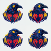
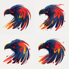
View attachment 1607950A couple more AI generated ones.
If a robot can do better than our current one for free, couldn’t be that hard to pay a couple dollars to someone to do it properly.
View attachment 1607949
Those bottom ones could be used as a based to draw a logo that's less illustrative. They're quite good proportionally and they look more like a crow than your current one. I'd also flip it so it's facing right.
Would be a good evolution.
Last edited:
Yeah I agree, they’re a bit too busy to be logos as they are, but It’s not bad considering it took less than a minute to spit it out.Those bottom ones could be used as a based to draw a logo that's less illustrative. They're quote good proportionally and they look more like a crow than your current one. I'd also flip it so it's facing right.
Would be a good evolution.
- Apr 17, 2021
- 1,180
- 1,349
- AFL Club
- Adelaide
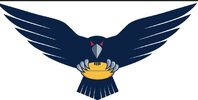
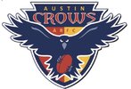
I like the Austin Crows one. A while back I stole it and made this. As much as I like it though, I'm not sure it would look good printed on clothing. I think removing the shield was probably a mistake.I still like the (basically) symmetrical ones that show the crow in action as a logo and would look good enlarged in the centre chest area on an away jumper.View attachment 1608092
View attachment 1608095View attachment 1608097
- Apr 17, 2021
- 1,180
- 1,349
- AFL Club
- Adelaide
I like it a lot but you could be right. Maybe needs some red and gold shape behind the crow so that it reflects the Crows even if the text isn’t used.I like the Austin Crows one. A while back I stole it and made this. As much as I like it though, I'm not sure it would look good printed on clothing. I think removing the shield was probably a mistake.

Maybe gold (and red?) instead of the white profile around the crow in the Austin version?
Last edited:
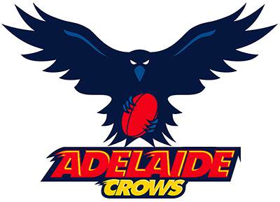
I have not purchased any new Crows merch in over 5 years. I won't be buying any new merch until we have a new logo. A new logo is a must. it must be strong with a traditional footy logo look to it. Last thing we want is a cartoon Americanized looking piece of crapola. Go back to the 90s logo and give it a facelift
I still think this logo holds up. The only thing I don't like is that the colours are slightly desaturated. They should be the same colours as our guernsey.
- Aug 30, 2021
- 15,172
- 27,701
- AFL Club
- Adelaide
You’ve already had your share of muffins
dogs105
Sweet Kennels Proprietor
Would rather the raptor...
No offence
More than my share, let's be honestYou’ve already had your share of muffins
Similar threads
- Replies
- 2K
- Views
- 29K


