Navigation
Install the app
How to install the app on iOS
Follow along with the video below to see how to install our site as a web app on your home screen.
Note: This feature may not be available in some browsers.
More options
Style variation

You are using an out of date browser. It may not display this or other websites correctly.
You should upgrade or use an alternative browser.
You should upgrade or use an alternative browser.
Discussion The best AFL logo
- Thread starter Willo #6
- Start date
- Tagged users None
🥰 Love BigFooty? Join now for free.
Re: The best logo
I honestly love the raven!
Honestly, I can't believe Adelaide has polled a vote, although it is from one of their supporters
I honestly love the raven!
- Joined
- Apr 28, 2007
- Posts
- 1,932
- Reaction score
- 327
- Location
- Melbourne
- AFL Club
- West Coast
- Other Teams
- Subiaco — West Ham
Re: The best logo
I just realised I accidentally voted for GC instead of Geelong, using the touch-voting iPhone can have serious consequences.
How ironic.
Oh well, take off that one and put it on Geelong (making them equal second) with your imagination.
Back on topic, I also think the Cats used their previous "GFC" emblem at a non-commercial level well before (80s?) it was officially implemented.
Log in to remove this Banner Ad
- Joined
- May 11, 2008
- Posts
- 4,716
- Reaction score
- 2,462
- AFL Club
- Essendon
Re: The best logo
I've seen it on an old footy card. I think it's older than the 80s though.
Back on topic, I also think the Cats used their previous "GFC" emblem at a non-commercial level well before (80s?) it was officially implemented.
I've seen it on an old footy card. I think it's older than the 80s though.
Omegaville
Club Legend
- Joined
- May 8, 2010
- Posts
- 2,816
- Reaction score
- 311
- Location
- Croydon
- AFL Club
- Richmond
- Other Teams
- Coburg FC, Melb Vixens, Renegades
Re: The best logo
Which one has the most ochre-like colours?
i cant split brisbane and adelaide
Which one has the most ochre-like colours?
- Joined
- Apr 18, 2009
- Posts
- 4,721
- Reaction score
- 50
- AFL Club
- West Coast
Re: The best logo
HATE HATE HATE HATE the Freo logo
HATE HATE HATE HATE the Freo logo
Daveys a Legend
Draftee
- Joined
- Mar 26, 2009
- Posts
- 17
- Reaction score
- 0
- Location
- shepparton
- AFL Club
- Essendon
- Other Teams
- Katnadra Kats
A big ask
I was wondering if i could all the 2011 afl teams logos. i was hoping i could get them all sized bigger than 300*300. thanks
I was wondering if i could all the 2011 afl teams logos. i was hoping i could get them all sized bigger than 300*300. thanks
D
Del80659
Guest
Re: The best logo
Carlton
Collingwood
Melbourne
St. Kilda
Geelong second
Sydney
Essendon
Richmond
Fremantle
Port Adelaide
Western Bulldogs
North Melbourne
Hawthorn
Brisbane - it's an old hairy man staring at you
West Coast - something very average about it
Gold Coast - big dumb SUNS text that a child probably made on a Mac
Adelaide - seriously the worst. take off the eyes it looks like some terrible cartoon emo hair cut. the old one is 1000000x better to put up with
melbournemartin
Brownlow Medallist
- Joined
- Jul 22, 2003
- Posts
- 23,898
- Reaction score
- 6,440
- Location
- USA
- AFL Club
- Melbourne
- Other Teams
- Genève-Servette HC, Pittsburgh Pens
Re: The best logo
Looking at some of the rubbish other teams are using makes me appreciate Melbourne's even more now.
Looking at some of the rubbish other teams are using makes me appreciate Melbourne's even more now.
shanenine
Debutant
- Joined
- Oct 9, 2007
- Posts
- 81
- Reaction score
- 0
- Location
- Eastside
- AFL Club
- Hawthorn
- Other Teams
- Team Australia
Re: The best logo
Top 4:
1. Sydney
2. Melbourne
3. Geelong - Modern
4. Hawthorn
The Average:
5. Collingwood
6. Carlton
7. St. Kilda
8. Port Adelaide
9. North Melbourne
10. Essendon
11. West Coast
12. Western Bulldogs
13. Richmond
Bottom 4:
14. Fremantle
15. Brisbane
16. Gold Coast
17. Adelaide
Top 4:
1. Sydney
2. Melbourne
3. Geelong - Modern
4. Hawthorn
The Average:
5. Collingwood
6. Carlton
7. St. Kilda
8. Port Adelaide
9. North Melbourne
10. Essendon
11. West Coast
12. Western Bulldogs
13. Richmond
Bottom 4:
14. Fremantle
15. Brisbane
16. Gold Coast
17. Adelaide
- Joined
- Oct 10, 2006
- Posts
- 1,603
- Reaction score
- 1,318
- AFL Club
- Collingwood
Re: The best logo
I love ours as well, I just wish they'd change the font.
Of the rest I'd say Sydney's is the best, very unique and classy.
I've always loved ours and thought it looks very traditional. Other favourites are Hawthorn's (much better than previous attempts) and Geelong's alternate. Carlton's also for simplicity. Melbourne's one is great but I prefer it in the non-glossy version.
Don't know why West Coast's hasn't been gone on about yet. Just the head would be alright but the brand still needs a re-boot (guernseys, logos) and being so wide the logo looks really bad lined up to all the others on the AFL website.
I love ours as well, I just wish they'd change the font.
Of the rest I'd say Sydney's is the best, very unique and classy.
Southside
Team Captain
- Joined
- Dec 26, 2009
- Posts
- 339
- Reaction score
- 2
- Location
- Never there
- AFL Club
- Richmond
- Other Teams
- Burnley
Re: The best logo
Melbourne and Hawthorn are my top two.
Carlton, Collingwood and Essendon are average.
Below average: Richmond, North, WCE, St Kilda, Geelong.
As for the rest, the less said the better.
Melbourne and Hawthorn are my top two.
Carlton, Collingwood and Essendon are average.
Below average: Richmond, North, WCE, St Kilda, Geelong.
As for the rest, the less said the better.
SJ
Premium Platinum
Re: The best logo
I would love to see someone mock up a Geelong emblem in the style of the Melbourne shield, but using the 'GFC' from the previous logo, blue and white hoops on the shield, and the cat from the current 'formal' logo.
I would love to see someone mock up a Geelong emblem in the style of the Melbourne shield, but using the 'GFC' from the previous logo, blue and white hoops on the shield, and the cat from the current 'formal' logo.
Cory
Brownlow Medallist
Re: The best logo
Here you go Whipped this up just a few minutes ago hope you like it

I would love to see someone mock up a Geelong emblem in the style of the Melbourne shield, but using the 'GFC' from the previous logo, blue and white hoops on the shield, and the cat from the current 'formal' logo.
Here you go Whipped this up just a few minutes ago hope you like it

SJ
Premium Platinum
Re: The best logo
Not bad, not bad. I'd prefer more stripes (across the whole shield) and less navy though. And you could have the GFC monogram navy and bigger, and in the middle of a stripe like on the old shield.
Thanks though!
Not bad, not bad. I'd prefer more stripes (across the whole shield) and less navy though. And you could have the GFC monogram navy and bigger, and in the middle of a stripe like on the old shield.
Thanks though!
kolja51
Debutant
- Joined
- Oct 20, 2005
- Posts
- 110
- Reaction score
- 22
- Location
- Manama, Bahrain
- AFL Club
- Hawthorn
- Other Teams
- Hajduk Split, Crystal Palace
Re: The best logo
my favorite is Geelong alternate, great shield, simple cat, banner is nice touch. Second best is Freo new logo, again, simple and effective, then Bombers and Roos, typical American style logos that are done well.
West Coast, Western Bulldogs, Port and Sydney have decent logos.
Collingwood is way too busy, I would compare it with Liverpool. If they would use just Pie and have nice writing bellow (think Tottenham) that would be sweet. Carlton's monogram could be better. Newly updated Adelaide and Brisbane are just poorly done. Hawks are a bit better, but still not giving me a powerful feel, and Hawk just don't have a character. Melbourne took a good road, but overdid it, could do it with little bit less items.
And then we come to St. Kilda and Richmond, they are in dire need of a rebranding, but not complete rebranding just modernizing the logos they have. Tiger needs to be simplified and cross needs to get a new dimension.
🥰 Love BigFooty? Join now for free.
- Joined
- May 11, 2008
- Posts
- 4,716
- Reaction score
- 2,462
- AFL Club
- Essendon
Re: The best logo
It might be worth mentioning that Melbourne has a simplified alternative to their official logo. In fact so far I think the simplified one is being used more than the original.
It might be worth mentioning that Melbourne has a simplified alternative to their official logo. In fact so far I think the simplified one is being used more than the original.
- Joined
- Oct 17, 2000
- Posts
- 20,329
- Reaction score
- 18,413
- Location
- Melbourne
- AFL Club
- Brisbane Lions

- Other Teams
- Fitzroy Football Club
- Staff
- #46
Re: The best logo
Brisbane have two logos at the moment. The Fitzroy lion logo must appear on all
The Fitzroy lion logo is clearly the best in my book.
Brisbane have two logos at the moment. The Fitzroy lion logo must appear on all
- Club stationery: letterhead, with compliments slips, business cards, fax headers, electronic correspondence etc for the next 14 years.
- Club publications: Season Guide, Season Review and Lions Tale magazines, Club Annual Reports and electronic Lions Online newsletters for the next 14 years.
- Membership and corporate sales marketing material for the next 14 years.
The Fitzroy lion logo is clearly the best in my book.
The Jaguar
Senior List
- Joined
- Oct 15, 2010
- Posts
- 237
- Reaction score
- 3
- Location
- In The Jungle
- AFL Club
- Port Adelaide
- Other Teams
- Jacksonville Jaguars
Re: The best logo
Yeah the poll needs a Fitzroy Lion option.
It is clearly better than the paddlepop lion, which should never have seen the light of day. I hate that they've thrown out the Fitzroy straight yoke on the jumper aswell.
Brisbane went from one of the best jumper/logo combos to one of the worst overnight.
Brisbane have two logos at the moment. The Fitzroy lion logo must appear on all
The Fitzroy lion logo is clearly the best in my book.
- Club stationery: letterhead, with compliments slips, business cards, fax headers, electronic correspondence etc for the next 14 years.
- Club publications: Season Guide, Season Review and Lions Tale magazines, Club Annual Reports and electronic Lions Online newsletters for the next 14 years.
- Membership and corporate sales marketing material for the next 14 years.
Yeah the poll needs a Fitzroy Lion option.
It is clearly better than the paddlepop lion, which should never have seen the light of day. I hate that they've thrown out the Fitzroy straight yoke on the jumper aswell.
Brisbane went from one of the best jumper/logo combos to one of the worst overnight.
Re: The best logo
Brisbane had one of the worst logos before as well. Whilst the Fitzroy lion is great, and was great by itself (Costa's the guy that did the updated Fitzroy lion is better), like it was on the guernsey; The logo was not just the fitzroy lion, it was a stupid (AFL logo shaped) oval with a horrible gradient and terrible text, with the lion small and in the O.
Before that they had the VFL shield with the Brisbane Lions text still looking terrible and overpowering the lion.
Yeah the poll needs a Fitzroy Lion option.
It is clearly better than the paddlepop lion, which should never have seen the light of day. I hate that they've thrown out the Fitzroy straight yoke on the jumper aswell.
Brisbane went from one of the best jumper/logo combos to one of the worst overnight.
Brisbane had one of the worst logos before as well. Whilst the Fitzroy lion is great, and was great by itself (Costa's the guy that did the updated Fitzroy lion is better), like it was on the guernsey; The logo was not just the fitzroy lion, it was a stupid (AFL logo shaped) oval with a horrible gradient and terrible text, with the lion small and in the O.
Before that they had the VFL shield with the Brisbane Lions text still looking terrible and overpowering the lion.
- Joined
- Aug 5, 2008
- Posts
- 388
- Reaction score
- 621
- AFL Club
- Richmond
- Other Teams
- Knights
Re: The best logo
Well they’re all very pretty.
Pretty bloody awful.
1. Adelaide.
There were blind, armless, cave men 50,000 years ago who could draw a better crow on a cave wall... with a piece of dung.
Absolutely appalling. MASSIVE FAIL.
As a side note: NONE of the bird logos are flying. Why not? Birds look fantastic in flight and is what they are famous for. Bizarre.
2. Brisbane.
Take one of most badass animals on the planet and make it look stupid. Lions have great big fearsom teeth and claws. I can see neither. Here is one I made a miniscule change to, and it already looks better (kind of ). just removed the whites of its eyes.
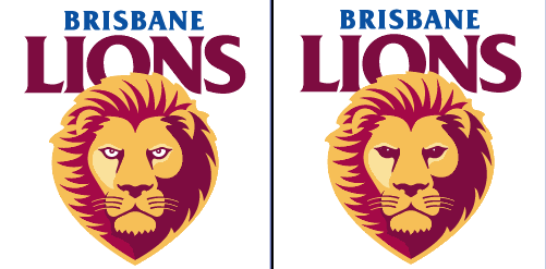
How do get a lion logo so wrong? FAIL.
3. Carlton.
Well, its a monogram. CFC. pretty straight forward. cant fault it too much except its a bit boring. PASS.
4. Collingwood
WHY ISN’T THE BIRD FLYING?
At least it looks like a football logo and even tells me that it is. Has an ‘established date’ which I like.
But bird not flying. FAIL.
5. Essendon.
I’m sorry but that does not look like a bomber. Nobody thinks it does. Why does it have sleeves?
Why are the wings made from giant knives?The shading and perspective is all wrong. The nose cone is on the wrong angle.
Bombers are very cool pieces of machinery and could look awesome. With a redraw Essendon could have one of the best sporting logos ON THE PLANET.
FAIL.
6. Fremantle.
Why is their logo a picture of a stick man speading its legs? very inappropriate.
I would have thought an anchor would be a more suitable logo. FAIL
7. Geelong.
Make your mind up and pick ONE logo. The ‘cat face one’ looks like a tire tread that ran over a cat and squished it. FAIL.
The ‘other’ one is actually quite good. has a cat that looks like a real cat. has an established date. looks like a football logo. My only concern is that the cat seems to be pretending its a teapot. PASS.
8. Gold Coast.
WOW. Someone got carried away with the gradient tool didn’t they?
Would look great on a packet of cereal. Suns are round, not oval. FAIL.
9. Hawthorn.
Its always going to be tough with those colours. But its not a bad logo at all. The Hawk actually looks like a Hawk.
BUT ITS NOT FLYING! FAIL.
10. Melbourne.
A massive improvement on the old ‘cigarette packet’ logo. But they’ve gone from too simple, to waaaay too complicated.
If they really tried they might have been able to fit another 500 elements into it. FAIL.
11. North.
That is the worst picture of a kangaroo I have ever seen. Why does it have a horn on its shoulder? Please dont tell me that’s ment to be a tail. Kangaroos dont have segmented tails. FAIL.
12. Port.
Simple, bold lines and shapes. Doesn’t really look like a football logo (more of a protest march poster) but its OK. PASS.
13. Richmond.
Tigers always look good, even if they’re drawn badly. Thats the way C. Darwin invented them.
This one is looking a bit dated and the font is ordinary at best. BUT TIGERS DONT HAVE YELLOW NOSES. FAIL.
14. Saints.
The K.F.C letters are a bit unfortunate, and always make me think of chicken. But thats not St Kildas fault.
Could use a slight freshening up, but is simple and distict. PASS.
15. Sydney.
WHY IS THE SWAN NOT FLYING! Actually, it looks like its falling asleep. FAIL.
16.West Coast.
Don’t evenTRY and tell me this eagle is flying. It is quite clearly bobsledding. FAIL
17. Bulldogs.
Well, it seems to be shooting a laser beam out of its eyes, and we all like lasers. So thats a good thing.
It does look like a cardboard cut out though. Bulldogs are cool looking animals and this logo should be so much better than it is. FAIL.
18. GWS.
Its a big G. G is for Giant. Gee whizz. They must have known that vandals will ad the letters ‘A’ and ‘Y’. Not that there’s anything wrong with that, but come on, just write the whole word properly. Lazy.
Would be a good logo for a spanner or wrench company. FAIL.
So... 4 passes out of 19 logos. AFL FAIL.
Geelong would get my vote, but, with 2 logos and only 1 pass, its only half a vote. And I can’t give half a vote so I give my vote to nobody.
Nah I kid. They all look awesome") .
.
Well they’re all very pretty.
Pretty bloody awful.
1. Adelaide.
There were blind, armless, cave men 50,000 years ago who could draw a better crow on a cave wall... with a piece of dung.
Absolutely appalling. MASSIVE FAIL.
As a side note: NONE of the bird logos are flying. Why not? Birds look fantastic in flight and is what they are famous for. Bizarre.
2. Brisbane.
Take one of most badass animals on the planet and make it look stupid. Lions have great big fearsom teeth and claws. I can see neither. Here is one I made a miniscule change to, and it already looks better (kind of
). just removed the whites of its eyes.
How do get a lion logo so wrong? FAIL.
3. Carlton.
Well, its a monogram. CFC. pretty straight forward. cant fault it too much except its a bit boring. PASS.
4. Collingwood
WHY ISN’T THE BIRD FLYING?
At least it looks like a football logo and even tells me that it is. Has an ‘established date’ which I like.
But bird not flying. FAIL.
5. Essendon.
I’m sorry but that does not look like a bomber. Nobody thinks it does. Why does it have sleeves?
Why are the wings made from giant knives?The shading and perspective is all wrong. The nose cone is on the wrong angle.
Bombers are very cool pieces of machinery and could look awesome. With a redraw Essendon could have one of the best sporting logos ON THE PLANET.
FAIL.
6. Fremantle.
Why is their logo a picture of a stick man speading its legs? very inappropriate.
I would have thought an anchor would be a more suitable logo. FAIL
7. Geelong.
Make your mind up and pick ONE logo. The ‘cat face one’ looks like a tire tread that ran over a cat and squished it. FAIL.
The ‘other’ one is actually quite good. has a cat that looks like a real cat. has an established date. looks like a football logo. My only concern is that the cat seems to be pretending its a teapot. PASS.
8. Gold Coast.
WOW. Someone got carried away with the gradient tool didn’t they?
Would look great on a packet of cereal. Suns are round, not oval. FAIL.
9. Hawthorn.
Its always going to be tough with those colours. But its not a bad logo at all. The Hawk actually looks like a Hawk.
BUT ITS NOT FLYING! FAIL.
10. Melbourne.
A massive improvement on the old ‘cigarette packet’ logo. But they’ve gone from too simple, to waaaay too complicated.
If they really tried they might have been able to fit another 500 elements into it. FAIL.
11. North.
That is the worst picture of a kangaroo I have ever seen. Why does it have a horn on its shoulder? Please dont tell me that’s ment to be a tail. Kangaroos dont have segmented tails. FAIL.
12. Port.
Simple, bold lines and shapes. Doesn’t really look like a football logo (more of a protest march poster) but its OK. PASS.
13. Richmond.
Tigers always look good, even if they’re drawn badly. Thats the way C. Darwin invented them.
This one is looking a bit dated and the font is ordinary at best. BUT TIGERS DONT HAVE YELLOW NOSES. FAIL.
14. Saints.
The K.F.C letters are a bit unfortunate, and always make me think of chicken. But thats not St Kildas fault.
Could use a slight freshening up, but is simple and distict. PASS.
15. Sydney.
WHY IS THE SWAN NOT FLYING! Actually, it looks like its falling asleep. FAIL.
16.West Coast.
Don’t evenTRY and tell me this eagle is flying. It is quite clearly bobsledding. FAIL
17. Bulldogs.
Well, it seems to be shooting a laser beam out of its eyes, and we all like lasers. So thats a good thing.
It does look like a cardboard cut out though. Bulldogs are cool looking animals and this logo should be so much better than it is. FAIL.
18. GWS.
Its a big G. G is for Giant. Gee whizz. They must have known that vandals will ad the letters ‘A’ and ‘Y’. Not that there’s anything wrong with that, but come on, just write the whole word properly. Lazy.
Would be a good logo for a spanner or wrench company. FAIL.
So... 4 passes out of 19 logos. AFL FAIL.
Geelong would get my vote, but, with 2 logos and only 1 pass, its only half a vote. And I can’t give half a vote so I give my vote to nobody.
Nah I kid. They all look awesome
.
Similar threads

- Poll
- Replies
- 2
- Views
- 249
- Poll
- Replies
- 2
- Views
- 340
- Replies
- 10
- Views
- 563