Discussion The best AFL logo

The best logo?

  • Adelaide

    Votes: 0 0.0%
  • Brisbane

    Votes: 0 0.0%
  • Carlton

    Votes: 0 0.0%
  • Collingwood

    Votes: 0 0.0%
  • Essendon

    Votes: 0 0.0%
  • Fremantle

    Votes: 0 0.0%
  • Geelong

    Votes: 0 0.0%
  • Gold Coast

    Votes: 0 0.0%
  • Hawthorn

    Votes: 0 0.0%
  • Melbourne

    Votes: 0 0.0%
  • North

    Votes: 0 0.0%
  • Port

    Votes: 0 0.0%
  • Richmond

    Votes: 0 0.0%
  • St.Kilda

    Votes: 0 0.0%
  • Sydney

    Votes: 0 0.0%
  • WCE

    Votes: 0 0.0%
  • Western Bulldogs

    Votes: 0 0.0%

  • Total voters
    0
  • Poll closed .

Remove this Banner Ad

Re: The best logo

A very hard taskmaster Mowse :p

Yeah sorry about that. The meds have run out.

In all seriousness though, I do find it odd that none of the bird logos show a full bird in flight. Eagles kind of do, but where is the tail and talons? hawks and crows used to be flying, but not anymore.:(
 
Re: The best logo

The good
Geelong
Hawthorn (a little bias)
Collingwood
Carlton
Sydney
North
St.Kilda
WB
Essendon

The bad
Richmond (Tiger head is great but banner is plain and outdated)
West Coast
Melbourne
Port (Is fine but could do with an update)

The ugly
Fremantle
Brisbane
Adelaide
GC

Richmond and Collingwood's look the best.

Outdated by so are Led Zepo and Pink Floyd and Miles Davis lol.:D
 

Log in to remove this ad.

Re: The best logo

For mine, Richmond is in front of Collingwood, Essendon and Geelong (2)
Melbourne looks like it was designed by committee, and everyone got their part included.
Hey, we should put the jumper in. OK
Yeah, and the original rules. OK
Well, we're one of the oldest clubs, so that has to go in. OK
What about the Demons, we need something like a trident. OK
And a footy, we're a footy club. OK
What about the Southern Cross, that would be cool. OK
Yeah, and what about a flame for all the ex-servicemen. OK
Which ones will we pu in? All of them.
OK, now give it to Jaxzon the Photoshop guy and see what we can come up with.
Honestly, it's very well done, but I prefer Freo's simplicity to the Melbourne logo.
 
Re: The best logo

I don't disagree with a lot of what Mowse said, but you seriously want a Swan to be flying on a logo? I can't say they're really renowned for their flying, more their swimming.
 
Re: The best logo

I actually found the official thing of the Fremantle logo!
Fremantle-logo-2011.gif
 
Re: The best logo

My favourite would have to be the North logo. Dunno why, but just like the set up of it.

For my club, love the idea of it, and the effort really shows. Just not sure if its a little busy with all the things going on. I adore the simple version of it. But still, boh look great. Would be my second favourite easily (bit biased)
 
Re: The best logo

Well they’re all very pretty.
Pretty bloody awful.

1. Adelaide.
There were blind, armless, cave men 50,000 years ago who could draw a better crow on a cave wall... with a piece of dung.
Absolutely appalling. MASSIVE FAIL.

As a side note: NONE of the bird logos are flying. Why not? Birds look fantastic in flight and is what they are famous for. Bizarre.

2. Brisbane.
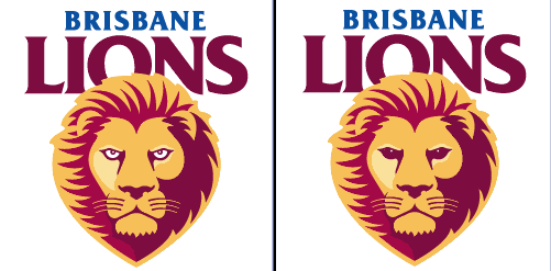
Take one of most badass animals on the planet and make it look stupid. Lions have great big fearsom teeth and claws. I can see neither. Here is one I made a miniscule change to, and it already looks better (kind of:(). just removed the whites of its eyes.
BRISLOGO2.gif

How do get a lion logo so wrong? FAIL.

3. Carlton.
Well, its a monogram. CFC. pretty straight forward. cant fault it too much except its a bit boring. PASS.

4. Collingwood
WHY ISN’T THE BIRD FLYING?
At least it looks like a football logo and even tells me that it is. Has an ‘established date’ which I like.
But bird not flying. FAIL.

5. Essendon.
I’m sorry but that does not look like a bomber. Nobody thinks it does. Why does it have sleeves?
Why are the wings made from giant knives?The shading and perspective is all wrong. The nose cone is on the wrong angle.
Bombers are very cool pieces of machinery and could look awesome. With a redraw Essendon could have one of the best sporting logos ON THE PLANET.
FAIL.

6. Fremantle.
Why is their logo a picture of a stick man speading its legs? very inappropriate.
I would have thought an anchor would be a more suitable logo. FAIL

7. Geelong.
Make your mind up and pick ONE logo. The ‘cat face one’ looks like a tire tread that ran over a cat and squished it. FAIL.
The ‘other’ one is actually quite good. has a cat that looks like a real cat. has an established date. looks like a football logo. My only concern is that the cat seems to be pretending its a teapot. PASS.

8. Gold Coast.
WOW. Someone got carried away with the gradient tool didn’t they?
Would look great on a packet of cereal. Suns are round, not oval. FAIL.

9. Hawthorn.
Its always going to be tough with those colours. But its not a bad logo at all. The Hawk actually looks like a Hawk.
BUT ITS NOT FLYING! FAIL.

10. Melbourne.
A massive improvement on the old ‘cigarette packet’ logo. But they’ve gone from too simple, to waaaay too complicated.
If they really tried they might have been able to fit another 500 elements into it. FAIL.

11. North.
That is the worst picture of a kangaroo I have ever seen. Why does it have a horn on its shoulder? Please dont tell me that’s ment to be a tail. Kangaroos dont have segmented tails. FAIL.

12. Port.
Simple, bold lines and shapes. Doesn’t really look like a football logo (more of a protest march poster) but its OK. PASS.

13. Richmond.
Tigers always look good, even if they’re drawn badly. Thats the way C. Darwin invented them.
This one is looking a bit dated and the font is ordinary at best. BUT TIGERS DONT HAVE YELLOW NOSES. FAIL.

14. Saints.
The K.F.C letters are a bit unfortunate, and always make me think of chicken. But thats not St Kildas fault.
Could use a slight freshening up, but is simple and distict. PASS.

15. Sydney.
WHY IS THE SWAN NOT FLYING! Actually, it looks like its falling asleep. FAIL.

16.West Coast.
Don’t evenTRY and tell me this eagle is flying. It is quite clearly bobsledding. FAIL

17. Bulldogs.
Well, it seems to be shooting a laser beam out of its eyes, and we all like lasers. So thats a good thing.
It does look like a cardboard cut out though. Bulldogs are cool looking animals and this logo should be so much better than it is. FAIL.

18. GWS.
Its a big G. G is for Giant. Gee whizz. They must have known that vandals will ad the letters ‘A’ and ‘Y’. Not that there’s anything wrong with that, but come on, just write the whole word properly. Lazy.
Would be a good logo for a spanner or wrench company. FAIL.

So... 4 passes out of 19 logos. AFL FAIL.

Geelong would get my vote, but, with 2 logos and only 1 pass, its only half a vote. And I can’t give half a vote so I give my vote to nobody.


Nah I kid. They all look awesome:).

This post...FAIL
 
Re: The best logo

what the dogs should change to .... or something like it..... a smaller Cede Nullis
fclool.jpg
 

(Log in to remove this ad.)

Re: The best logo

lil grif,here's updated version of that logo:
WB.jpg


And I can see Bulldogs spotting that logo
 
Re: The best logo

lil grif,here's updated version of that logo:
WB.jpg


And I can see Bulldogs spotting that logo

I like it but his facial expression and his the shape of his body (he looks fat to me) could use some tampering with.
 
Re: The best logo

I like it but his facial expression and his the shape of his body (he looks fat to me) could use some tampering with.

And depressed.

Depressed cause he is fat? Highly probable.

A little bit more aggressive and you have a beaut of a logo.
 
Re: The best logo

Kolja51 I applaude you that's a fantastic logo. Top Stuff! :thumbsu:

I had a dig at a Brisbane one.

BrisbaneLogoCustom.jpg
 
Re: The best logo

I reckon that'd be quite well received over on the Brisbane board. Maybe chuck up a thread over there workhorse?
 
Re: The best logo

Cheers lads. That bulldog I illustrated over a photo, and to me those bulldogs always look sad and fat. Maybe I should find a better photo of a bulldog.
 
Back
Top