- Sep 6, 2005
- 145,204
- 95,061
- AFL Club
- Fremantle
Follow along with the video below to see how to install our site as a web app on your home screen.
Note: This feature may not be available in some browsers.
")
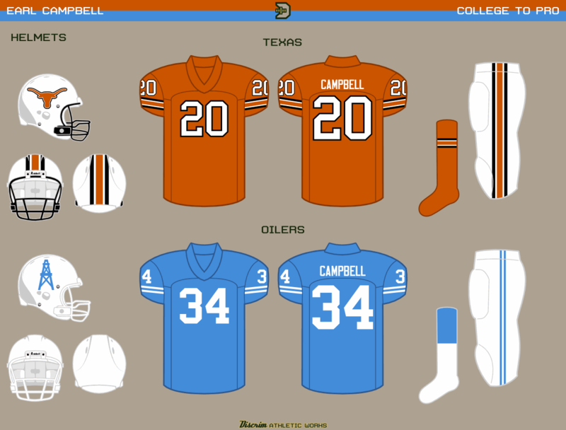
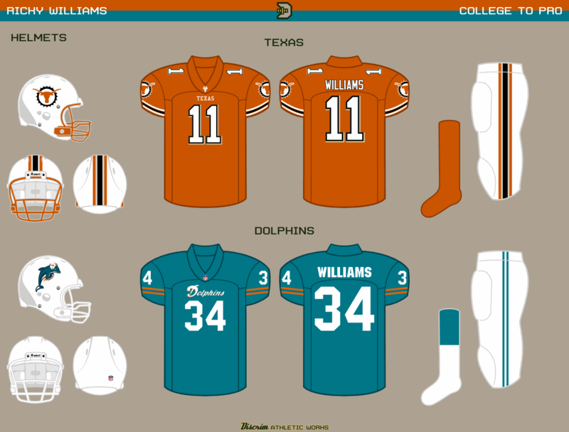
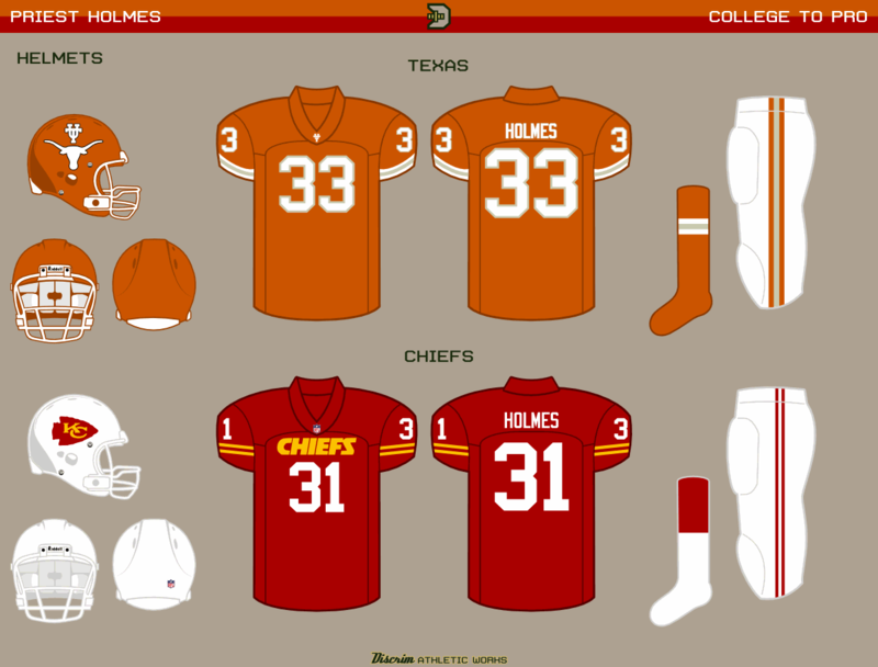
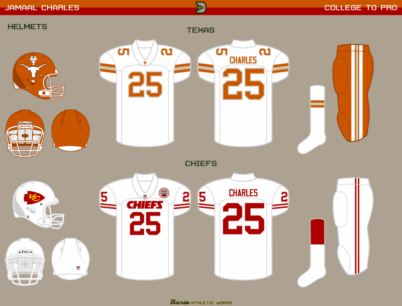
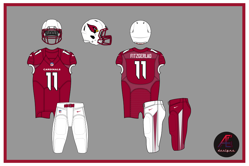
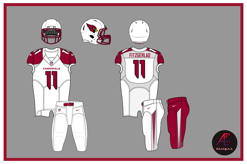
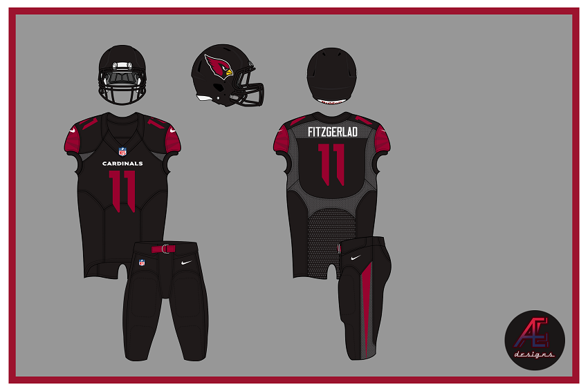
That's awesome.New season. I feel like designing some new uniforms as well. Starting with the Cardinals.
The red is darker. The facemask is no longer grey. More angled, 'bird-like' font (really just the Oregon font) and a new pants stripe. Also note the nod to the Arionza state flag across the sleeves. This is basically what the Cardinals would look like if they were a college team, right down to the blackout uniform.
Broncos are all good in the hood GGWould love to see what you can do re-designing the Falcons and Broncos....they both need it.
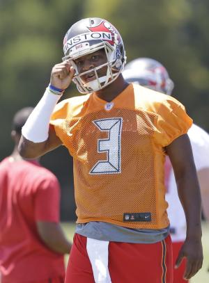
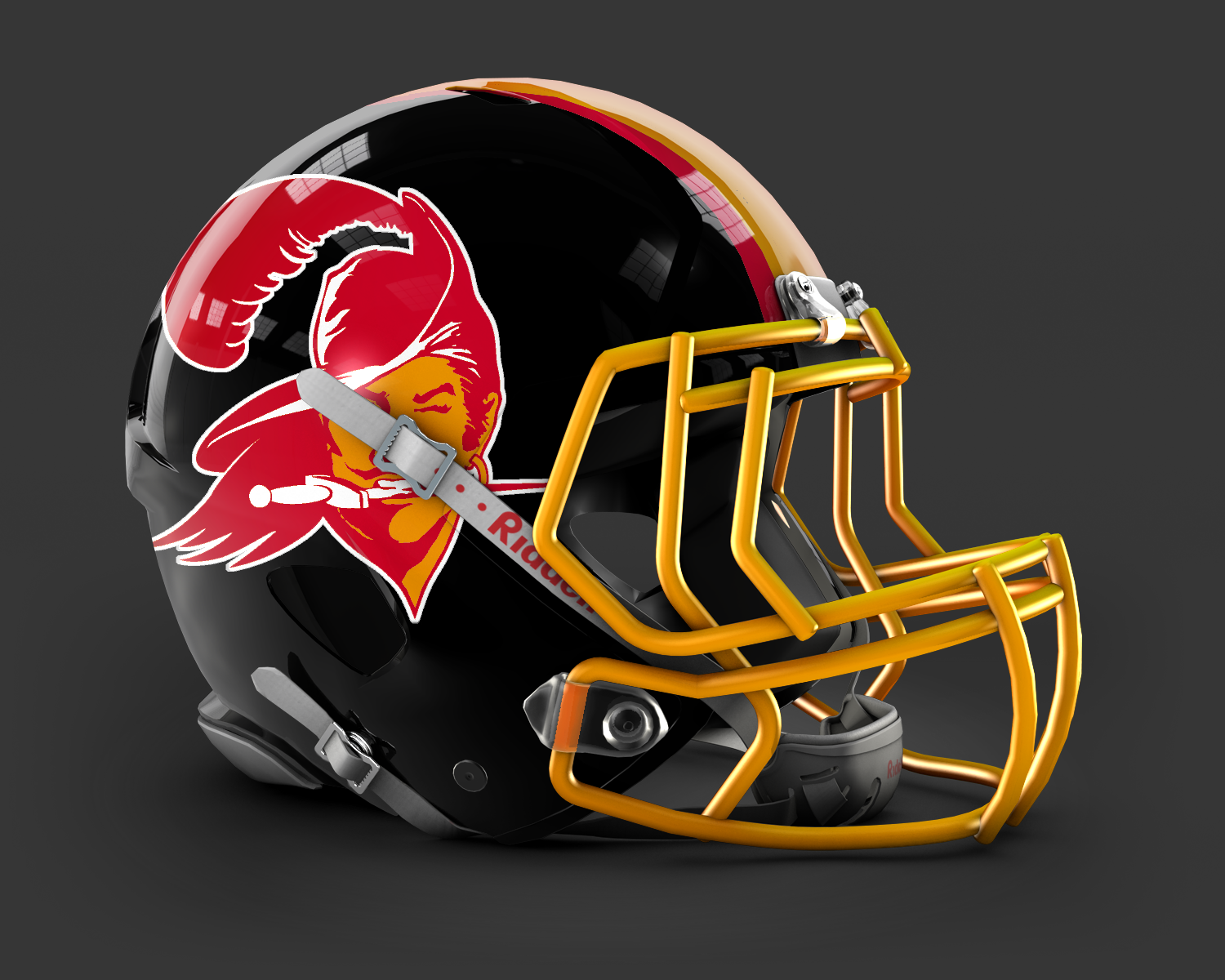
No, one of the great uni'sAm I the only one who'd like to see the Bucs back in orange again?
but I can comment on design 
Especially the logo. The swashbuckling Errol Flynn was so much better than borrowing from the Raiders.
Not safe for anyone lol.NSFW
He likes EVERYTHINGThat's one post you didn't have to 'like'.....
But you did
I fixed it for you. SFW now.That's one post you didn't have to 'like'.....
But you did
Am I the only one who'd like to see the Bucs back in orange again?