- Oct 6, 2013
- 9,139
- 6,331
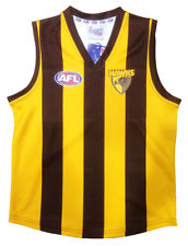
- AFL Club
- Hawthorn
- Other Teams
- Sixers, Exers, GWS Womens
I would have liked one like the Power Ranger but instead of the gold bit be more a yellow-ish, brown parts to stay the same and for the top part to be smaller so then we can fit the monogram(club logo) on it underneath. Does that make sense?

Wish i were good at Editing Guernseys
Wish i were good at Editing Guernseys