Groupie_
time to return the traditional Richmond yellow
there are many many supporters that chose to support the tigers as kids cos of the fantastic colours of yellow and black while we had either a. no sponsors or b. neutral coloured sponsors
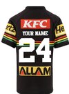
guess what, now that wont be happening anymore because no child who chooses to support a club will be choosing a fluro yellow, green nib, red kfc , blue latitude guernsey... they'll simply choose another club
and guess what, guernsey sales are the lowest they've been since the reebok days after we've massively grown our supporter base because of the horrendous colours on the guernsey. at this point choosing black sponsors that dont pay us a cent to be on our guernsey wouldve been a better option cos we would have sold a shite tonne of guernseys and surpassed the ugly coloured sponsors $$$


