


The predominately grey clash one is worse imo. But this one isn't far off.Yeesh horrid freakin' guernsey
Navigation
Install the app
How to install the app on iOS
Follow along with the video below to see how to install our site as a web app on your home screen.
Note: This feature may not be available in some browsers.
More options
You are using an out of date browser. It may not display this or other websites correctly.
You should upgrade or use an alternative browser.
You should upgrade or use an alternative browser.
Rumour Jumper Change
- Thread starter cmpower
- Start date
- Tagged users None
- Status
- Not open for further replies.
- Jul 22, 2009
- 9,536
- 19,741
- AFL Club
- Port Adelaide
- Other Teams
- Nottingham Forest
His shot at goal after taking that mark was horrendousThe GOAT
Tommy Logan's mark in that jumper vs the Hawks! Brilliant.
tribey
ʎǝlʞuᴉH ʞɔɐS
I was at that game and Tredders 7 goals showed everyone the champion he still was.The footy record that day had a picture of Roughead on it saying what a champion he was.I can't actually remember him getting a kick.He certainly has developed since though as it was probably6 or 7 years ago now.
Troy Chaplin destroyed him. Troy Chaplin.
- Mar 1, 2014
- 13,955
- 17,611
- AFL Club
- Port Adelaide
- Other Teams
- Cronulla Sutherland Sharks
It is to do with marketing.Many will buy a new guernsey or polo even if the sponsors label changes.More so if an actual subtle design of the jumper is a foot. Some of course still have their old maggies duffle coats or Port Power gear from 97 and have no need for change.
I do not think a small number of hard to please supporters wanting to change something that ain't broke has anything to do with marketing.
I appreciate that from time to time the Club will play in a variation just to drum up cash. Hopefully improving our corporate inventory will eliminate the need to do this as often. I have no problem with one off guernseys worn on special occasions and the collectors buying them but changing something to raise money is something the lesser clubs do. I see our guernsey as sacrosanct and if we want to build tradition we have to stick with what we have.
tribey
ʎǝlʞuᴉH ʞɔɐS
I do not think a small number of hard to please supporters wanting to change something that ain't broke has anything to do with marketing.
I appreciate that from time to time the Club will play in a variation just to drum up cash. Hopefully improving our corporate inventory will eliminate the need to do this as often. I have no problem with one off guernseys worn on special occasions and the collectors buying them but changing something to raise money is something the lesser clubs do. I see our guernsey as sacrosanct and if we want to build tradition we have to stick with what we have.
Every club should have four regular season strips plus one preseason/marketing/experimental rotation strip, not unlike any other professional league on the planet. Having an alternate strip, as opposed to an away/clash, isn't cause for the sky to fall in.
1. Home: Black w/ teal & white chevrons, black shorts, black socks.
2. Alternate: Black w/ teal & white chevrons (possible white accents), white shorts, black (or variant) socks.
3. Away/Clash: White w/ teal & black chevrons, white shorts, black (or variant) socks.
4. Heritage/Retro: Black & white prisonbars, black/white shorts, black socks.
5. Preseason/Promo: Whatever (currently Teal w/ white and black chevrons, etc.)
Dalphonso
Premiership Player
- Oct 10, 2009
- 3,716
- 1,905
- AFL Club
- Port Adelaide
- Other Teams
- Territory Thunder,Waratahs FC
I have never seen a mock up of the reverse wharf pylons although it has probably been done? With the black back square and white numbers.Every club should have four regular season strips plus one preseason/marketing/experimental rotation strip, not unlike any other professional league on the planet. Having an alternate strip, as opposed to an away/clash, isn't cause for the sky to fall in.
1. Home: Black w/ teal & white chevrons, black shorts, black socks.
2. Alternate: Black w/ teal & white chevrons (possible white accents), white shorts, black (or variant) socks.
3. Away/Clash: White w/ teal & black chevrons, white shorts, black (or variant) socks.
4. Heritage/Retro: Black & white prisonbars, black/white shorts, black socks.
5. Preseason/Promo: Whatever (currently Teal w/ white and black chevrons, etc.)
RussellEbertHandball
Flick pass expert
I know someone that refers to this guernsey as "the Gay Dolphins".
fireboy calls it the Dead Dolphins.
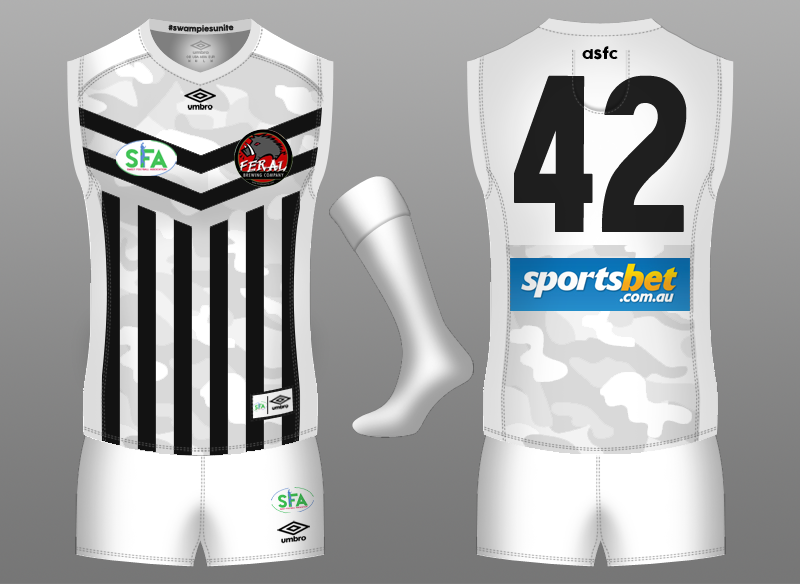
Pardon the low quality but you get the idea.I have never seen a mock up of the reverse wharf pylons although it has probably been done? With the black back square and white numbers.


spookism
Brownlow Medallist
I have never seen a mock up of the reverse wharf pylons although it has probably been done? With the black back square and white numbers.
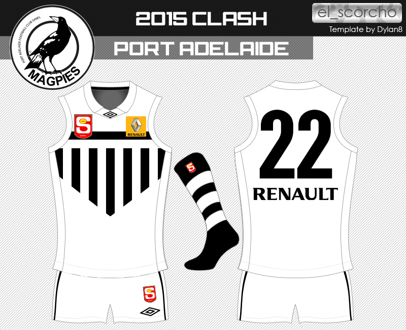
El_Scorcho did this for myself for that Fantasy Footy thing I kick around in...
El_Scorcho made this one a while back that isn't exactly what you described but I'll take any excuse to look at it again:I have never seen a mock up of the reverse wharf pylons although it has probably been done? With the black back square and white numbers.
I'm talking about an away jumper. Why on earth would I be suggesting that we wear a different kit at home?Why would we have a clash with Carlton and Freo ? Like us have a reverse design that they wear when we play at home and when we play away we wear our clash design. To Freo and Carlton's credit they have adopted a proper clash strip unlike the other teams you mentioned. Collingwood and Richmond should be told to do what Carlton and Essendon have done and come up with a clash strip.
As I see it we are OK and should not have to change a damned thing.
Oh and Collingwood's clash jumper is not only one of the most effective in the league, it's quite possibly the best looking. Essendon on the other hand have a s**t clash strip which is branded as 'heritage', so I'm not really sure why you're commending them either.
I didn't think I'd say this but...
You know what. I don't mind the top one. That would be the perfect clash IF we had the PB guernsey at home. But we already have perfect home and clash guernseys. #finally
In real life it's amazing and should be their home kit, in AFL Live playing Collingwood as Port is such a head* with both teams being a bit black and a bit white no matter what kits you select. Yeah it doesn't matter but it still annoys me enough to be the first thing I think of.Never understood the angst over Collingwood's clash kit. It does exactly what a clash kit is supposed to do.
Literally the only thing wrong with it is that it isn't seen often enough. Should be their home strip, they suit white better than black.Never understood the angst over Collingwood's clash kit. It does exactly what a clash kit is supposed to do.
It's like how i think St Kilda's clash is better than their home.
The black back panel looks pretty weird and could potentially create a clash like Carlton did in the last round of 2013. Keep the back all white. It's perhaps taking this whole back panel obsession a bit far.
Was only when Eddie decided the guernsey didnt look hard enough that they changed it to the White on Black.
I actually thought it was to deliberately cause a clash with our SANFL jumper, thus heading off any attempt by us to wear the PB/wharf pylon design upon our AFL entry...
I actually thought it was to deliberately cause a clash with our SANFL jumper, thus heading off any attempt by us to wear the PB/wharf pylon design upon our AFL entry...
They changed in 2001.I actually thought it was to deliberately cause a clash with our SANFL jumper, thus heading off any attempt by us to wear the PB/wharf pylon design upon our AFL entry...
Can we please just stop this carry on?
")
Dalphonso
Premiership Player
- Oct 10, 2009
- 3,716
- 1,905
- AFL Club
- Port Adelaide
- Other Teams
- Territory Thunder,Waratahs FC
That was what I was getting at.Maybe a once off clash jumper for merchandise sales?
- Status
- Not open for further replies.
Similar threads
- Replies
- 351
- Views
- 12K
- Replies
- 553
- Views
- 17K
- Replies
- 274
- Views
- 11K
- Locked
- Replies
- 288
- Views
- 13K
- Locked
- Replies
- 303
- Views
- 11K
