- Jun 3, 2015
- 750
- 765
- AFL Club
- Port Adelaide
Red shorts is a pleasant surprise with their third jumper, their second away jumper is with white shorts and black on the back
Follow along with the video below to see how to install our site as a web app on your home screen.
Note: This feature may not be available in some browsers.
Teal stitching at the bottom and the pinstripe on the vee makes the edge looked blurred AF!Some shots of Port Adelaide's clash jumper from the trial game v Fremantle currently underway:
View attachment 1619594View attachment 1619596
(Official AFL Website of the Port Adelaide Football Club)
Silver pinstripe in black side stripe
Wow the looks poor, I've never liked the crest / sponsors logos entering the white.
The Fitzroy Lion is suffering from a photocopy of a photocopy syndrome. Scorch's one is probably far closer to what it is intended to look like.View attachment 1574131
It's closer to the one on the jumper from 1968 - 1979.
Some saints fans.But that's the thing.
Saints fans want a bigger white panel. They get it.
Then they want a bigger Saints logo. They get it.
Now people are not happy that both encroach into the white panel.
What do people want/expect with this design?
The panels also need to be brown white and pink.Some saints fans.
White panel needs to be smaller and the logos only in the red and black. Also black colar and cuffs!

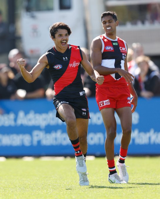
In round 3 at the G though St Kilda is the home team as part of their 150th anniversary celebrationsdo these two play eachother (ess home, saints away) during the season? hopefully they wear this match up
and, the important and
if they play eachother and saints are at home, essendon wear their red (and ideally red shorts not white)!
Defiantly, Giants almost in Memphis Grizzle/Tennessee Titans kind of colours. Never made sense to me why they would choose such a ugly clash with the Swans.Ideally, in my mind, the Giants are in a sky blue and something and the Suns are in red orange and yellow.
Yes, true, it was embroidered onto the jumpers, so it's difficult to know how much was the limitation of the embroidery and how much was logoThe Fitzroy Lion is suffering from a photocopy of a photocopy syndrome. Scorch's one is probably far closer to what it is intended to look like.
Must be a lighting thing cause it looks brown on the clubs videos in the room

Some saints fans.
White panel needs to be smaller and the logos only in the red and black. Also black colar and cuffs!
So the saints at home in black red and white and essendone will be in red and white shortsIn round 3 at the G though St Kilda is the home team as part of their 150th anniversary celebrations
He is, he's been very vocal on the black collar and cuffs for years.You’re probably part of a very small minority who wanted those things. Most of the saints fans on our board jumper thread seemed happy with the changes and very few were a fan of the wetsuit jumper with the black collar and cuffs
Yesterday's game could be all the excuse Essendon need to be allowed to swap to red shorts.So the saints at home in black red and white and essendone will be in red and white shorts
Definitley a darker brown (maybe slightly reddish) much better than some of the other browns they've used that looked slightly green at times.Must be a lighting thing cause it looks brown on the clubs videos in the room View attachment 1620928
Red Rooster couldn't just invert their logo?
"Men's health", so mostly boner pills and hair loss treatment.Nvm. I’ll google it