
Piggy Smalls
Piggy’s in the middle
- Nov 30, 2018
- 7,022
- 17,499
- AFL Club
- Fremantle

They all pale into insignificance against this beauty of a design.
Follow along with the video below to see how to install our site as a web app on your home screen.
Note: This feature may not be available in some browsers.
I personally liked it better when we didn't have the sash go all the way around.At one point Richmond did not have the sash go around the back.
Any kit that doesn't have a dominant and a secondary base colour, from a design perspective is a poorly designed kit.
West Coast, Western Bulldogs and Gold Coast have fundamentally poorly designed colours. They need to darken there blues and reds respectively. Seems like their colours were picked by preschoolers.

That’s the one thing about the Giants and Suns jumpers, they were not locked into historical colors or shapes.It’s got to be GWS doesn’t it? Don’t mind the colours but the design is putrid.
Carlton’s white jumper is pretty crappy
2023 wasn’t too bad, but the 2024 version is no good. Just gotta keep it simple.

That looks terribleSomeone posted this on jumper designs a few months back, would look awesome.
View attachment 1877168
That’s horridSomeone posted this on jumper designs a few months back, would look awesome.
View attachment 1877168

I reckon a dark green like the sth african cricket team and toffee apple red would suit the tassie team with a black tassie devil logo.I've got a feeling Tasmania's will be horrendous, especially if it has a graphic of the island on it. It depends on what they are called I guess - the Tasmania Devils, Tasmania Theythems, Tasmania Twoheads

A reverse tapir?Someone posted this on jumper designs a few months back, would look awesome.
View attachment 1877168
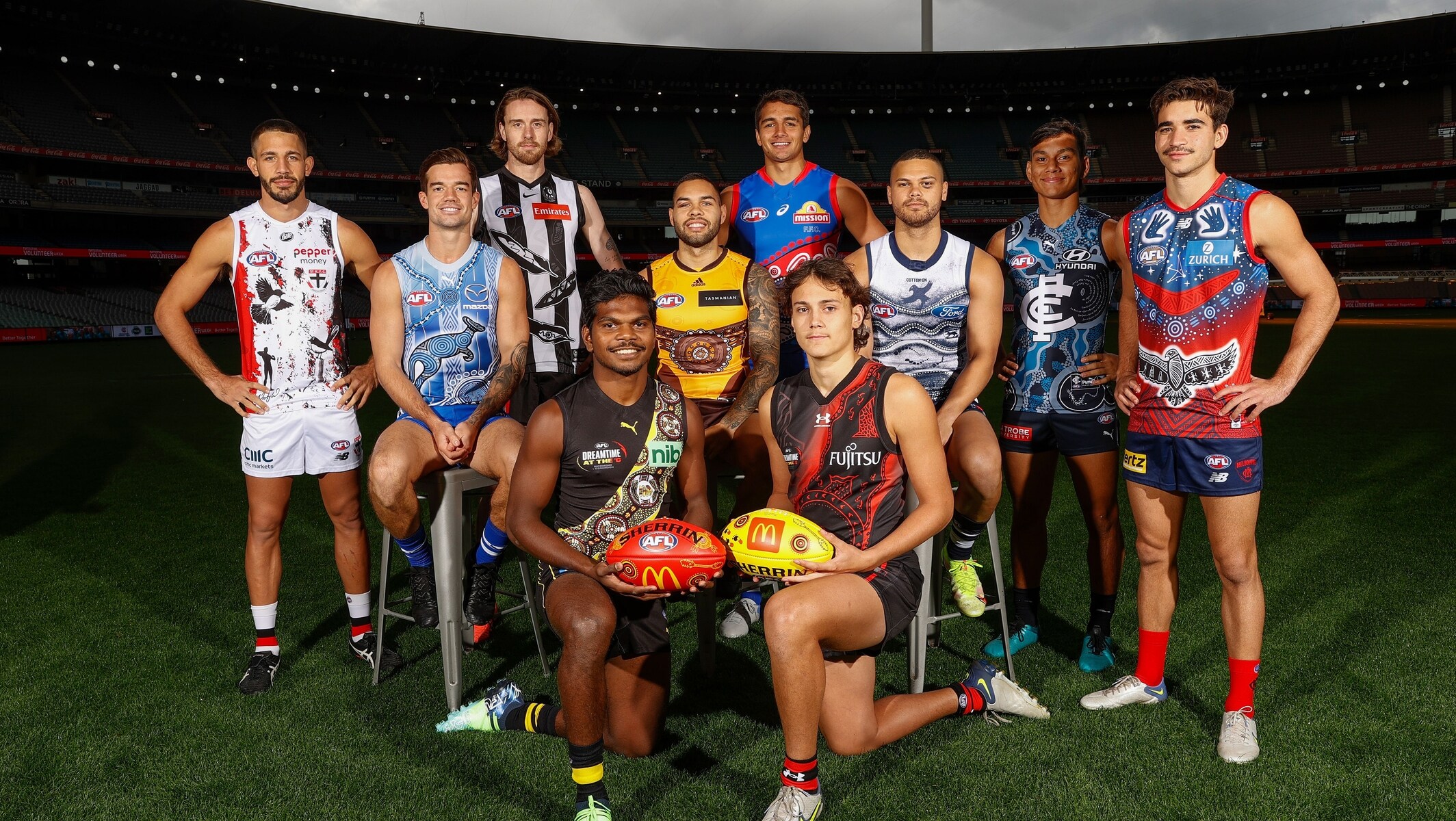
Yeah, sure.... if we all continue to pretend the Indigenous Round jumpers don't look like Possum Tjapaltjarri dropped a tab of acid and threw up all over the canvas.

Hey that was me!Someone posted this on jumper designs a few months back, would look awesome.
View attachment 1877168
That looks terrible
Oh... I mean, I wonder who made that crapThat’s horrid

Hey that was me!
Oh... I mean, I wonder who made that crap
In all seriousness, the average footy follower doesn't really know what looks good/bad and why they think that's the case. This idea came about because some Blues boomers didn't like the club going with a navy monogram on a white base, forcing them to go with the eyesore clash kit they've rolled out for the past 2 years featuring a monogram with a navy stroke around it. Mine was an attempt to reconcile that idea in a way that's actually graphically interesting and fresh - instead we now have what the Blues pulled out for their 2024 clash kit...
