


Black crow, yellow eye for me.
Sent from my SM-G900I using Tapatalk
Sent from my SM-G900I using Tapatalk
Follow along with the video below to see how to install our site as a web app on your home screen.
Note: This feature may not be available in some browsers.
So that's what AmericanCrow looks like?
Looks like he's lost his little oneSo that's what AmericanCrow looks like?


Same here. Tail is the one thing that needs changing for me.Curved shield, yellow eye and navy crow
It looks awesome mate
Thanks! I agree with all three elements.Curved shield, yellow eye and navy crow
It looks awesome mate
Will keep at it... no promises though!Same here. Tail is the one thing that needs changing for me.
Ok, I've just been looking back in the thread for any requests that I missed, and one key one was the shape of the shield.
Here's a comparison, I still personally prefer the curved shield.
View attachment 472329
Just a side note; I'm still working at getting the tail feathers 'right' as per some requests, but it's not quite happening. Will give it a bit more effort but if it doesn't work, it doesn't work. Sorry.

 , fashionable and appeal to a large audience. Also I found it interesting how Lyon used their colour scheme on their clothes. Lyon has similar colours to the Crows yet they don't beat you over the head with garish colour schemes, for example on their white polo shirts they have the sleeves with a red and blue band, its simple and restrained but it is there
 . also they carry oxford shirts with Lyon's classic lion emblem
 , could you imagine wearing a shirt with the current crows logo to work.
I saw your design on the footy jumpers board and I'd like to give some feedback. I think that if you do go for the curved shield, then you need to curve the type along with it to prevent it from looking from looking like an afterthought.Ok, I've just been looking back in the thread for any requests that I missed, and one key one was the shape of the shield.
Here's a comparison, I still personally prefer the curved shield.
View attachment 472329
Just a side note; I'm still working at getting the tail feathers 'right' as per some requests, but it's not quite happening. Will give it a bit more effort but if it doesn't work, it doesn't work. Sorry.
That bears a resemblance to the 3rd Reich's logoI saw your design on the footy jumpers board and I'd like to give some feedback. I think that if you do go for the curved shield, then you need to curve the type along with it to prevent it from looking from looking like an afterthought.
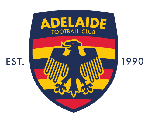
I'd also ditch the white line inside the shield give the stroke around the crow some real weight, this will give it that real punch that it is missing at the moment. I've done a rushed job using an old shield logo I was working on and the DFB eagle in the absence of a decent crow in the same style to show what I'm talking about:

I did say that it is from the German Football logo, so it is obviously the same bird.That bears a resemblance to the 3rd Reich's logo
Adelaide has good German history so wouldn’t be the wurst!I did say that it is from the German Football logo, so it is obviously the same bird.
Thanks Fancyscum, really appreciate the feedback - will have a play around with the design changes that you have mentioned. A fair few different ideas have been posted here to differing levels of approval, which has lead to the design which was posted on the FJGD board.I saw your design on the footy jumpers board and I'd like to give some feedback. I think that if you do go for the curved shield, then you need to curve the type along with it to prevent it from looking from looking like an afterthought.
I'd also ditch the white line inside the shield give the stroke around the crow some real weight, this will give it that real punch that it is missing at the moment. I've done a rushed job using an old shield logo I was working on and the DFB eagle in the absence of a decent crow in the same style to show what I'm talking about:
Thanks ChinaCrow! To be presented on a navy background would involve some design alterations for the shield... good point.Just stumbled across this thread and had to comment... superb work!! They all look great but somehow the final curved one with the navy crow just looks the biz.
How will it look on a navy blue background, does it need a white boarder around the outside instead of the inner one?
I actually think the no white border like this does work as long as the blue border isn’t too thickThanks Fancyscum, really appreciate the feedback - will have a play around with the design changes that you have mentioned. A fair few different ideas have been posted here to differing levels of approval, which has lead to the design which was posted on the FJGD board.

For a guernsey the crow on the chest with 3 hoops coming off either side (tip of wing to tip of tail) would look strong. Leaving between the wings like a VHi guys, just some updated versions based on today's ideas.
BTW love your ideas Canuck_Crow, I'm just a bit too far down this rabbit hole to change focus now. I do think that the crow icon alone on this design could be used on merch (or even a guernsey... should the need ever arise):
View attachment 472777
Red eye doesn’t workHow about something incorporating the below?


