A reworking of either of those would be fine.
Follow along with the video below to see how to install our site as a web app on your home screen.
Note: This feature may not be available in some browsers.
This idea about kids being the be all and end all is what’s ruining sport in Australia.
Should sport have Kid component - yes
Should they be the main target audience - No
They are not the main target Audience, they are however important when it comes to merchadise sales. and new supportersThis idea about kids being the be all and end all is what’s ruining sport in Australia.
Should sport have Kid component - yes
Should they be the main target audience - No
I like that second one.
A reworking of either of those would be fine.

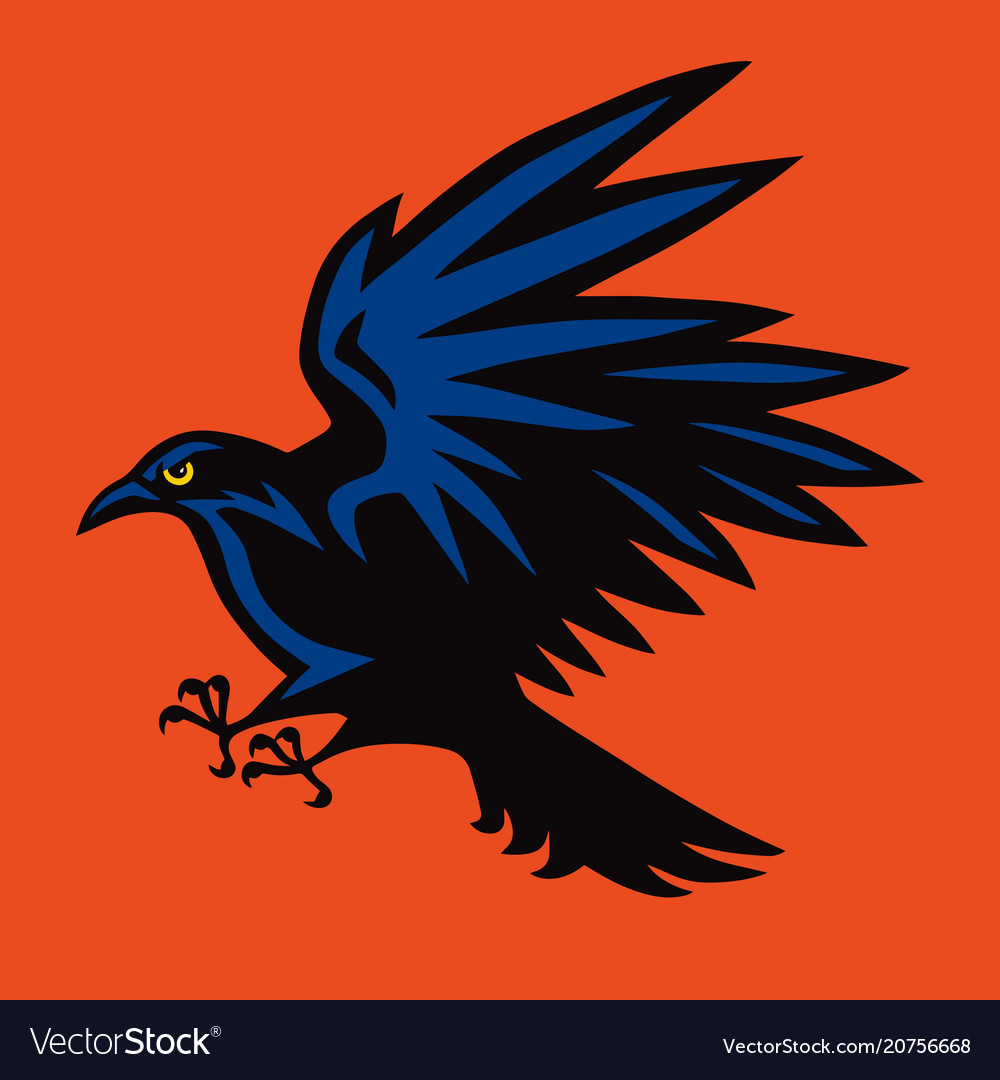
That's what I had in mind except with a modern version of Claude.Forgive the intrusion, but I was fluffing about with the Claude Crow logo and knocked this up.
Only rough but thought you guys might like it.
View attachment 775316
Yeah I do agree Claude and the logo should be separate.The carton charater is an Mascot ie Claude the Crow, the Logo is and has to seperate, cannot mix the two, for varied reasons.
Yes make a cartoon out of Cluade, but he cannot be our Logo. Does not work in the long run for a sporting organisation. Sure the marketing poeple on BF would be able to explian it better than me.
The logo will change eventially, but it will be designed to appeal to large partcentage of poeple who buy the mechandice. Mainly Kids.
And each generation has different views. Whether us old timers like it or not, they will pay a marketing team to do the sums.
Personnaly I am suprised they do not have 2 logos, the main logo ie coat of arms type, and one for the marketing sales.
Plus the Claude range which is and should be a seperate area.
These are quite good.Forgive the intrusion, but I was fluffing about with the Claude Crow logo and knocked this up.
Only rough but thought you guys might like it.
View attachment 775316
Personnaly and I am one of the Older supporter I woul;d have prefer the old Coat of Arms,Yeah I do agree Claude and the logo should be separate.
But use Claude more for the kids, and 90s nostalgia, and have an official logo for other graphical purposes.
Sent from my SM-G930F using Tapatalk
Thats what I was talking aboutForgive the intrusion, but I was fluffing about with the Claude Crow logo and knocked this up.
Only rough but thought you guys might like it.
View attachment 775316

Like the grey back ground more so than the black. Like the crow but not sure about the circle.
Yeah, I was only playing around with it. I have a bit of a soft spot for the crow.Like the grey back ground more so than the black. Like the crow but not sure about the circle.
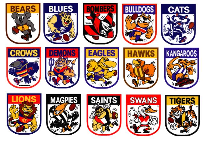
The gaming style logos will be the new flavour of the month soon, kids will eat it up
View attachment 775265
View attachment 775266
View attachment 775267
Bringing back artwork from the 90's is one of the stupidest ideas ever. It's old and stale and it needs to die.Forgive the intrusion, but I was fluffing about with the Claude Crow logo and knocked this up.
Only rough but thought you guys might like it.
View attachment 775316
Bringing back artwork from the 90's is one of the stupidest ideas ever. It's old and stale and it needs to die.


Bringing back artwork from the 90's is one of the stupidest ideas ever. It's old and stale and it needs to die.
It's not really heritage that is exclusive to our club though. Heaps of clubs had one of those style logos made for it in the 90's.90's retro is very in right now, it also harks back to our founding and greatest moments, as a club we should embrace the 90's look and make it a part of our long term vibe. Let's embrace our heritage.