mcgarnacle
Norm Smith Medallist
- Dec 2, 2003
- 9,825
- 4,225
- AFL Club
- Sydney
Follow along with the video below to see how to install our site as a web app on your home screen.
Note: This feature may not be available in some browsers.
The black back is a predominantly black jumper that does its job of making a dark strip…
Port Adelaide’s is a white back on a black jumper, completely unnecessary and completely different.
Lol. What an odd sentimentNothing with an animal logo is, as you say, 'classy'.
Their early VFL guernsey - royal blue with white V, and blue shorts, would be better.
View attachment 1956109
Lol. What an odd sentiment
Yes god forbid a club tried to turn a one off clash jumper into a bit of a throwback/potential kids fave.Not really. It looks childish, and s**t for grown men to wear in a footy game.
Keep the monikers to the logo or crest, and fan merchandise. Not on the match guernsey.
With black and white jumpers, it's all about visual perception. Under the same illumination, white reflects much more light to the eye than black does, so it will pop more.
Collingwood's away guernsey looks clearly white because of this phenomenon. Also. the white on their home guernsey will pop more than the black stripes on white.
With the white stripes on their home guernsey now expanding in width and around to the side, their home guernsey has an even more white appearance on the front.
Not really. It looks childish, and s**t for grown men to wear in a footy game.
Keep the monikers to the logo or crest, and fan merchandise. Not on the match guernsey.
Yes god forbid a club tried to turn a one off clash jumper into a bit of a throwback/potential kids fave.
You must be a STACK of fun at parties.
Yeah I've said before I think we would look better sometimes in the yellow based bears strip (as much as I love my Fitzroy classic).Dees v Brissy was probably an example of when the white shorts do come in handy. It's not the worst clash ever but still a bit of a visual mish-mash. Maybe the shorts just get it to a 6 on the contrastometer. Ideally the Lions would be in their mainly yellow kit, but their desire to appease the old Fitzroy supporters probably takes priority.
Dees v Brissy was probably an example of when the white shorts do come in handy. It's not the worst clash ever but still a bit of a visual mish-mash. Maybe the shorts just get it to a 6 on the contrastometer. Ideally the Lions would be in their mainly yellow kit, but their desire to appease the old Fitzroy supporters probably takes priority.

It works well in that shot, but for some reason, a team mainly blue with a bit of red at the top v a team mainly red with a bit of blue at the top causes me a little annoyance for some reason even though the major colours contrast.I think red shorts would look better for this match-up. Would be almost all navy versus all red without introducing white and would set each other off really well.
I know Fitzroy isn't traditionally red shorts but I think it looks okay and is still unmistakably Fitzroy.
View attachment 1957064
C'mon, there's no huge issue here.Ffs. Essendon should be in black shorts (or clash jumper with red short). Dont introduce white ffs
View attachment 1958006
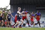
Casey v Port Melbourne today. It’s just a melange, just pigheadedness from clubs that say can’t come up with a viable clash kit
White shorts in this was fine.Black shorts be better.
Then youd have one dark team and one light team. as it is now which of the two teams is the dark team?
Absolutely no need for white shorts. Black and blue are fine as a match up. Both jumpers and shorts.
Like this in the 1980s ffs
View attachment 1957505
Yeah not a fan of that jumper. A simple small navy crow right in the center would be plenty, if at all, not the artsy, off to the side, oversized cluster* crow, which defeats the purpose of the jumper, and a casual viewer probably couldn't even tell it was a crow. Shithouse graphic design all round. But I'm happy the Crows won.This Carlton at home vs Adelaide away is great except in tight with the navy shoulder quarter
