Jumper clash fails

Remove this Banner Ad

I agree that home teams should be able to wear mostly what they want, but I do think that at least the broad colour scheme they want to wear needs to be known well in advance (ie before the season starts at least). It would be so useful to know in advance that Adelaide for example is going to wear a full dark dark strip on these weeks, there for their opposition will need an appropriate strip in their set of uniforms.

Its come up enough times over Anzac of indigenous rounds that teams have announced a uniform like a week out that works poorly against their opposition. Clearly no communication happened before to avoid this
That’s probably fair. Again adelaide announced this jumper at least a few weeks back and Melbourne really needs a third kit regardless but the before the season announcement would make sense.
 

Log in to remove this ad.

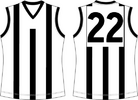
Collingwood's home guernsey is predominantly white front, black back. Like Port, it does create some issues. Are they doing it to enable Carlton, Essendon and Richmond to wear their home guernseys in the away fixtures for those clubs? Perhaps that was the reasoning for Freo. Carlton do it, so will they. And that is the problem. You give some club's an exception, others will want to follow.

However, the AFL should've made the call that Collingwood's whole uniform (including the shorts, and to a lessor degree the socks) is predominantly black, and Freo had to wear white.

I've often noted that on here about the Pies' so called dark strip.

Port's white number panel cops a lot of flak round here, rightly so in my opinion, but Collingwood's black back is right up there too.

A lot of issues could be tidied up if Port & Collingwood just swapped the backs of their home jumpers - the upper portion anyway.
 
Easy fix tonight - Dees should be in red or white (or another light colour if they wanted something completely different)

No reason at all why they can’t, they’ve worn the colours heaps of time.

View attachment 1950062

View attachment 1950063

View attachment 1950064

View attachment 1950065

View attachment 1950066

View attachment 1950068

View attachment 1950069

View attachment 1950070

View attachment 1950071

There’s nine options without even designing something new. White ones with white shorts or red ones with red shorts.

That silver one can be fed into an incinerator! I would much rather see the Dees in the predominantly red. But just out of interest, do we know if their 'alternate' lighter kit is as light as the Dogs home kit? I guess just to play Devil's Advocate, that could be your argument if your the Dees - that any match involving a black/dark kit v the Dogs in royal blue is not considered a clash, so our royal passes too. But don't get me wrong, I think they should do better.
 
I've often noted that on here about the Pies' so called dark strip.

Port's white number panel cops a lot of flak round here, rightly so in my opinion, but Collingwood's black back is right up there too.

A lot of issues could be tidied up if Port & Collingwood just swapped the backs of their home jumpers - the upper portion anyway.

The black back is a predominantly black jumper that does its job of making a dark strip…

Port Adelaide’s is a white back on a black jumper, completely unnecessary and completely different.
 
The black back is a predominantly black jumper that does its job of making a dark strip…

Port Adelaide’s is a white back on a black jumper, completely unnecessary and completely different.
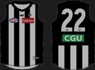
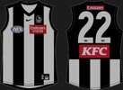
The Dees fan is correct, the Pies home jumper design changed when we went to Nike.

Instead of having 3 white stripes on a black jumper, from the front it now is almost 2 black braces on a white jumper. Considerably less black then we used to have.

Old
Screenshot_20240407_223356_Samsung Internet.jpg
Screenshot_20240407_222036_Samsung Internet.jpg

Recent
Screenshot_20240407_222909_Samsung Internet.jpg
Screenshot_20240407_222056_Samsung Internet.jpg

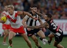
It is still clearly a dark kit and doesnt clash with a team in white, like Sydney in Rd1.

Screenshot_20240407_222449_Samsung Internet.jpg

But no idea why we are introducing more white to our black home jumper.
 
Last edited:
The Dees fan is correct, the Pies home jumper design changed when we went to Nike.

Instead of having 3 white stripes on a black jumper, from the front it now is almost 2 black braces on a white jumper. Considerably less black then we used to have.

Old
View attachment 1953326
View attachment 1953309

Recent
View attachment 1953327
View attachment 1953310

It is still clearly a dark kit and doesnt clash with a team in white, like Sydney in Rd1.

View attachment 1953316

But no idea why we are introducing more white to our black home jumper.
The black stripes look thicker to me too though... Im not sure it actually is anymore white is it? If it is it would be negligible
 

(Log in to remove this ad.)

The white stripes under the numbers do look wider as well. Its definitely an increase in white on all sides which is a shame
Yeah they've widened the white stripes and this has virtually eliminated the black side panels depending on the player.

The ratio on the adidas jumpers was perfect creating a clear black kit and a clear white kit. Now it's like 51/49 with the number panel creating the only major difference.
 
Yeah they've widened the white stripes and this has virtually eliminated the black side panels depending on the player.

The ratio on the adidas jumpers was perfect creating a clear black kit and a clear white kit. Now it's like 51/49 with the number panel creating the only major difference.
The away white jumper is still very much a white dominant jumper.

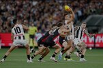
Pies use that to avoid a clash with all dark based clubs when we are away.

Pies used white away kit against the Saints this year.
Screenshot_20240408_201802_Samsung Internet.jpg
Pies used white away kit against the Lions this year.
Screenshot_20240408_202025_Samsung Internet.jpg
The problem is the likes of Carlton and Essendon refusing to play in their away clash when the away team against a fellow traditional rival.
 
Last edited:
This thread is over 6 years old and has nearly 7,000 replies and its just a dozen different conversations just repeating themselves over and over.

Says a lot that the AFL still refuse to step in and use their power to fix these issues.

But instead the new footy boss is too busy trying to tell the MRO, Tribunal and Umpires how to do their job despite no understanding of football but can't fix this simple issue...
 
Says a lot that the AFL still refuse to step in and use their power to fix these issues.

But instead the new footy boss is too busy trying to tell the MRO, Tribunal and Umpires how to do their job despite no understanding of football but can't fix this simple issue...
The one thing I will say is I can’t stand how everything is fed thru Mitch Cleary and Tom Morris, whenever a clubs in trouble for bullshit things

“The AFL has asked for an explanation”

How about just do your bloody job Laura and let the clubs get on with it
 
I have an idea, Collingwood/Carlton/Essendon/Richmond NEVER have any double ups, and Collingwood are to host every game against the other 3.

Until the day Carlton/Essendon/Richmond decide they're not bigger than the game, they take the economical hit. Once they do what's best for the fans, they can suffer.

Once they wear a clash. They can then host Collingwood and get double up games (hence more home games) against the others.
 
The away white jumper is still very much a white dominant jumper.

Pies use that to avoid a clash with all dark based clubs when we are away.

Pies used white away kit against the Saints this year.
View attachment 1954051
Pies used white away kit against the Lions this year.
View attachment 1954052
The problem is the likes of Carlton and Essendon refusing to play in their away clash when the away team against a fellow traditional rival.
And the extra white on the Collingwood Black jumper helps with this. Well done Collingwood, looks good.
 
The ratio on the adidas jumpers was perfect creating a clear black kit and a clear white kit. Now it's like 51/49 with the number panel creating the only major difference.

Nah can't agree. It was better, but still had too much white on the front to be a truly dark strip for mine.

I reckon the white stripes need to be half as thick as the black, or less. It's such an easy fix.

Here's a good light strip....

1712651455078.png

Now just invert it for a good dark one..
 
North breaking out the training jumpers again for the annual belting at Geelong
 

Attachments

  • 20240410_201042.jpg
    20240410_201042.jpg
    572.6 KB · Views: 27

Remove this Banner Ad

Back
Top