NFL New NFL Uniforms/Logos

Remove this Banner Ad

Unpopular opinion time: I hate the pats' uniforms, the font is dumb and I hate it when teams do an outline of numbers (and I don't mean giving the number an edge, just putting an outline around it), the side paneling is meh as well. I reckon they should look more like Buffalo, only make the blue darker and replace the white with grey.

Anyone with me? :$
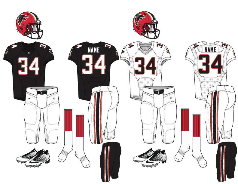
Can't say I am. They're the rare example of doing everything right with the different aspects of their uniform.

Their numbers are done well. The block number style is synonymous with the NFL, so that's a plus and their outline isn't too garish (like the Cowboys) it's quite subtle and works well with the colour scheme.
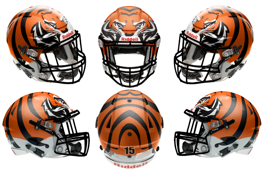
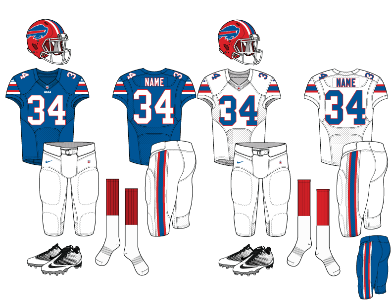
The side piping is pretty subtle and not too ugly (like the Bengals or the Bills about a decade ago) and it works well.
The shoulder stripe is probably the weak point but, again, it works well with the entire uniform.
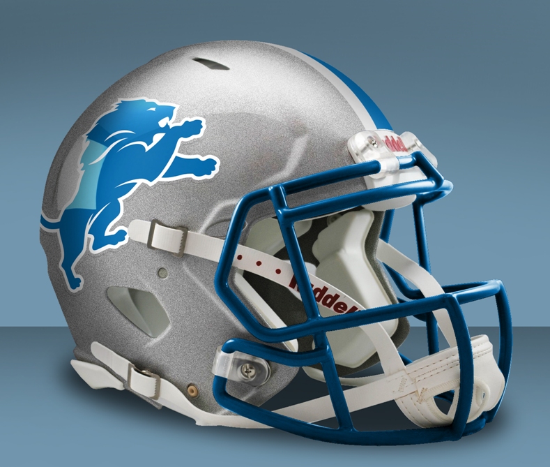
The helmet logo is simple. If one was to criticise, the triangle aspect of it is similar to the Panthers, but I've always felt a good NFL logo is something that can be replicated by somebody with the simplest of drawing skills, which this logo has the advantage over the old Minuteman logo.
 
I saw this mockup on the Sportlogos forums, not a bad design.
Bengals%20Speedflex%206%20view_zpsfaf27h41.png


and speculation of the Lions new helmet from that site too

58920f3854d15_lions-noblack.jpg.5be306a50dd939b6c159bb7144eec4b4.jpg
 

Log in to remove this ad.

and speculation of the Lions new helmet from that site too

58920f3854d15_lions-noblack.jpg.5be306a50dd939b6c159bb7144eec4b4.jpg

Lions are changing again? if they wanted to change the helmet they should of done it a few years back when they changed the logo.
 

(Log in to remove this ad.)


I'm not a fan of teams reinventing the wheel with their design and colours, but in the Chargers case I think that's the best option for them. They've dumped all over their San Diego fan base, they're playing second fiddle to the Rams and having a similar colour scheme to the Rams isn't going to help them. A fancy new uniform and/or colours could go some way to winning over new fans.

I've always been a fan of this Seattle layout, looks nice. Your work LA?
 
I'm not a fan of teams reinventing the wheel with their design and colours, but in the Chargers case I think that's the best option for them. They've dumped all over their San Diego fan base, they're playing second fiddle to the Rams and having a similar colour scheme to the Rams isn't going to help them. A fancy new uniform and/or colours could go some way to winning over new fans.


I've always been a fan of this Seattle layout, looks nice. Your work LA?
Nah not my work, I wish I could do that stuff but have no idea

http://s360.photobucket.com/user/delasean002/media/Kansas-City-Chiefs_zps87627968.png.html

Can scroll thru every team. Some are just the same as current designs
 
Lions getting rid of the black is sweet news to my ears. Finally we rid ourselves of Millen Error. Honolulu Blue & Silver has always been the Lions trademark and it should never have changed.
Hoping like hell that we go back to that sweet 90s uni. One of the best in the league.
IMG_8383.JPG IMG_8384.PNG

Gotta say though, still hate the font. Very ordinary.

IMG_8385.JPG
 

Remove this Banner Ad

Back
Top