fancyscum
Radical Crommunist
Thatsbait.gifSurely the new AFL logo will have a rainbow though it for Diversity
Follow along with the video below to see how to install our site as a web app on your home screen.
Note: This feature may not be available in some browsers.
Thatsbait.gifSurely the new AFL logo will have a rainbow though it for Diversity
Rainbows don't represent diversity.Surely the new AFL logo will have a rainbow though it for Diversity
I reckon the second one is the best of the two, but to echo what everyone has already said, these are really good.View attachment 763999View attachment 764000
Couldn't decide between these two, leaning towards the first. wanted a throwback to the old VFL logo, something iconic and simple


Really well done and incorporates the naming rights sponsorship superbly!Based on the original AFL logo, this variant has the Commonwealth Star to signify the national competition, goal posts superimposed on the 'A', very clear AFL lettering, and is simple enough that it can be recoloured to suit any club.
I'm actually really proud of this one, I feel like this fulfils the brief pretty well and could comfortably sit alongside any league logos around the world.
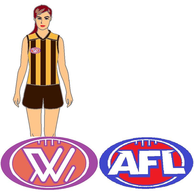
No why?Next thing needs to be a logo for the AFL organisation and then a M for men's to go with a W for women's.
One for the AFL Men's premiership and one for the AFL Women's.No why?
Uh oh here we go againOne for the AFL Men's premiership and one for the AFL Women's.
You make a great point.One for the AFL Men's premiership and one for the AFL Women's.
That'd be the MBBL.You make a great point.
Then the AFLM can sit alongside the NBAM, NFLM, EPLM, BBLM as esteemed competitions around the world.
Alongside?You make a great point.
Then the AFLM can sit alongside the NBAM, NFLM, EPLM, BBLM as esteemed competitions around the world.

These are great, which is why its going to be so disappointing when the AFL announce logos that look like they were done in paint by someone with no arms.Based on the original AFL logo, this variant has the Commonwealth Star to signify the national competition, goal posts superimposed on the 'A', very clear AFL lettering, and is simple enough that it can be recoloured to suit any club.
I'm actually really proud of this one, I feel like this fulfils the brief pretty well and could comfortably sit alongside any league logos around the world.
Print these out in colour and send to afl headquarters. Include a note saying the electronic versions are available for 2x lifetime afl membership tickets.Based on the original AFL logo, this variant has the Commonwealth Star to signify the national competition, goal posts superimposed on the 'A', very clear AFL lettering, and is simple enough that it can be recoloured to suit any club.
I'm actually really proud of this one, I feel like this fulfils the brief pretty well and could comfortably sit alongside any league logos around the world.
...instead these were done in paint by someone who works in a library.These are great, which is why its going to be so disappointing when the AFL announce logos that look like they were done in paint by someone with no arms.
Rumour has it the AFL wants to do thisNext thing needs to be a logo for the AFL organisation and then a M for men's to go with a W for women's.
These are very crisp logos, definitely some of the best designs put forwardBased on the original AFL logo, this variant has the Commonwealth Star to signify the national competition, goal posts superimposed on the 'A', very clear AFL lettering, and is simple enough that it can be recoloured to suit any club.
I'm actually really proud of this one, I feel like this fulfils the brief pretty well and could comfortably sit alongside any league logos around the world.

This was backtracked at least publically about 3 days ago tooRumour has it the AFL wants to do this
There is no "Men's," though. It is simply "Open". It is the category in which the best play, regardless of anything.Next thing needs to be a logo for the AFL organisation and then a M for men's to go with a W for women's.