News New joint major partner - CareerOne

Remove this Banner Ad

Aug 26, 2004
99,829
191,592
CHANEL BOUTIQUE!
AFL Club
Carlton
Other Teams
"Goddess"
Welcome Career One!


@CarltonFC is thrilled to welcome @CareerOne as its new joint major partner: http://cfcblu.es/WelcomeCareerOne… #BoundByBlue

CTffepxVAAA93PK.jpg
 

Log in to remove this ad.

  • Thread starter
  • Moderator
  • #8
Acquire Learning extends it's partnership for 2 more seasons!


http://www.carltonfc.com.au/carlton/news/2015-11-11/carlton-and-careerone-boundbyblue

In addition, official education partner Acquire Learning has extended its partnership with Carlton for a further two seasons.

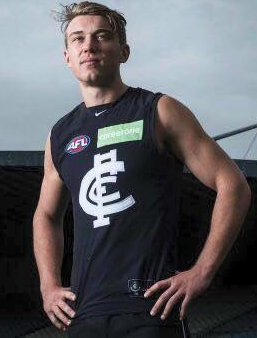
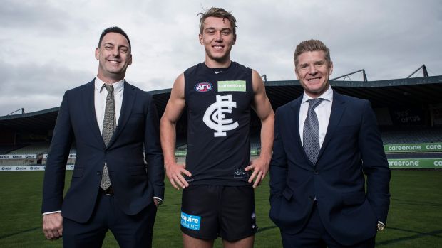
The CareerOne logo will now appear on all official Blues apparel including the front of the Carlton away guernsey and the back of the home guernsey.

Acquire Learning’s brand will continue to adorn the Blues’ match-day and training shorts, with both brands to be featured on the Carlton media backdrop.
 
That logo is definitely an eyesore on what is usually a stunning guernsey. Just looks so unbalanced. I understand they won't alter the shape of their branding with career one in a straight line but I wonder if we can stitch the name on without the background.
 
That logo is definitely an eyesore on what is usually a stunning guernsey. Just looks so unbalanced. I understand they won't alter the shape of their branding with career one in a straight line but I wonder if we can stitch the name on without the background.

As per Aph's post above - it will only be on the front of our away guernseys, while the home guernseys will feature it on the back.

Reckon the one on Crippa's tit is just a big temporary sticker for the purposes of this photo shoot.
 
As per Aph's post above - it will only be on the front of our away guernseys, while the home guernseys will feature it on the back.

Reckon the one on Crippa's tit is just a big temporary sticker for the purposes of this photo shoot.

I know. Still it's 11 games per year. Happy for the sponsorship but hoping they can tweak it a little. Will go well on the back. Very suited.
 
If they pay us enuff, we could switch to a green strip as a once off and auction the aquamarine outfits to help pay off the debt.

Not the first time a sponsor has come on board, e.g. a special commemorative jumper for Luke O'Sullivan's fiftieth match.
 

(Log in to remove this ad.)

I know. Still it's 11 games per year. Happy for the sponsorship but hoping they can tweak it a little. Will go well on the back. Very suited.

Reckon it will be smaller than the one shown in the photo - based on Crippa's Wednesday height it's probably a bumper sticker off one of the exec's cars.

Something like this:

Guernseys.JPG
 
Not sure how to take this sponsorship, it's owned by Acquired Learning so its hardly a new sponsor. Is it just a case of John Hall being a massive Carlton fan and therefore pouring money into the club or have we formed a strong business relationship with Acquired Learning that they see a benefit in handing over more cash and giving exposure to Career One.
 
Reckon it will be smaller than the one shown in the photo - based on Crippa's Wednesday height it's probably a bumper sticker off one of the exec's cars.

Something like this:

View attachment 192279


They need to do SOMETHING about the logo, my eyes are pretty crap (and I am colour blind too) but I cannot even read the logo in a photo let alone it having any function in live action during a game. You would think that the 1st sign of a good logo is for it to be recognizable and understandable, and this logo is neither IMO.


EDIT. Sad thing is that that design doesn't even come up in a Google image search for career one. Is it new/specifically for the sponsorship?
 
Last edited:
They need to do SOMETHING about the logo, my eyes are pretty crap (and I am colour blind too) but I cannot even read the logo in a photo let alone it having any function in live action during a game. You would think that the 1st sign of a good logo is for it to be recognizable and understandable, and this logo is neither IMO.


EDIT. Sad thing is that that design doesn't even come up in a Google image search for career one. Is it new/specifically for the sponsorship?

I managed to find it OK - quick Google image search and there you go.

As per my post above, there are a few ways they can integrate the logo. Most companies have slight variations to maximise visibility depending on where the logo is appearing. I can read and understand it without any issues - it says CareerOne, and searching for that on the internet takes me straight to their page where I can find a new career.

I'd prefer the logo without the green background (the right-hand image above) for the away guernsey - looks much more elegant. The green box will probably stand out more on the back of the home guernsey.

You're judging the logo based on a PR photo shoot that isn't designed to highlight said logo, and by your own admission have poor vision and colour-blindness. I suspect that a 60" HD TV will probably improve the image quality substantially.
 
I managed to find it OK - quick Google image search and there you go.

As per my post above, there are a few ways they can integrate the logo. Most companies have slight variations to maximise visibility depending on where the logo is appearing. I can read and understand it without any issues - it says CareerOne, and searching for that on the internet takes me straight to their page where I can find a new career.

I'd prefer the logo without the green background (the right-hand image above) for the away guernsey - looks much more elegant. The green box will probably stand out more on the back of the home guernsey.


I can't find that ugly background colour and ALL WHITE lettering anywhere .........
 
I can't find that ugly background colour and ALL WHITE lettering anywhere .........

As I said, different versions for different purposes - maybe it's a new one, maybe it's what they had lying around. Their website features a small text logo up the top laid over an image. White text, no green background, unobtrusive because you're already on their site and have better things to be looking at. The Herald Sun has the green background with white/purple text, because it stands out on a black and white page.

They've said the logo will appear on the back of the home guernsey, so the image above is for PR purposes only and not an official guernsey. As I said, probably a promo sticker they slapped on for the purposes of the shoot.

Until they unveil the actual match gear, it's probably not worth slamming them for their colour choice - which wouldn't have been chosen based on a possibility of sponsoring the CFC at some point.
 

Remove this Banner Ad

Back
Top