Opinion New North Melbourne Emblem

Remove this Banner Ad

I didn't "hate" it either mate.

Two wooden spoons with means I do really hate it.

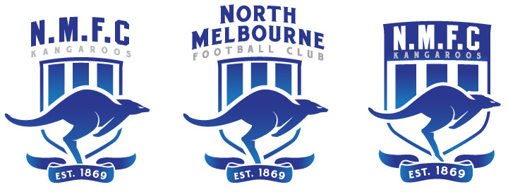
We sure can still keep the current logo whilst working on another for next year?

ps; a few examples were provided in page 1. All are much better than ours at the moment.

1666500697913.png

We should be working off that as a template imo.

Hell you can even cut it in half, use the kangaroo and replace "roos" with NMFC..

1666500866597.png
 
NMFC_Concepts_905.jpg


All are great, but the middle one is brilliant, whoever designed them needs to send them to Sonja.

I Love It Tears GIF by Disney Channel


Send to Sonja ASAP
 
Well mate if our marketing is aimed primarily at children, not the broader supporter group that are adults, then to me that is a huge mistake.

They do both. I’m just pointing out why they do the cartoon stuff and mascots.

As long as we’re NMFC then they can do what they want with the mascot.
 

Log in to remove this ad.

They do both. I’m just pointing out why they do the cartoon stuff and mascots.

As long as we’re NMFC then they can do what they want with the mascot.

As I'm required to call you Mr Donkey I will.

Mate that is complete and utter nonsense.

Are children our most important people now? Just do both!

* the emblem off and move forward as a club.
 

(Log in to remove this ad.)

The 2007 logo was looking dated, on top of that it reminded me too much of the whole Gold Coast relocation craziness as well. The current logo is an improvement but yeah any of the bounding kangaroo logos posted by DEVO are much cleaner, more professional and a lot more ellogant vs the last 2 "realistic" cartoon logos.
 
Not my work but excellent.

Look at this....

View attachment 1541778
Good selection.

In order:
1 - Too busy but wouldn't be the worst as an inclusion in a more modern emblem to nod to history.
2 - Good
3-6 - Solid
4 - Probably my fave of the 90's - 00's era. Clean, sharp. I'm no huge on the Kangaroos though. I'd be inclined to drop the text completely or just have NMFC under it.
5 - Abomination (probably extra tarnished by the 2007 era trauma but it is hideous, bland and weak looking)
6 - Better than the last by some margin. Not amazing.
7 Meh.

Mostly agree 100% with your assessment.

The key point ill make is my favourite is 1 but not in the way it looks there.

It's a mess/busy i agree shintemaster but I think could be amended (graphic design not my strong suit) to make it look far better.
 
Last edited:

Remove this Banner Ad

Back
Top