Less dark? Why?
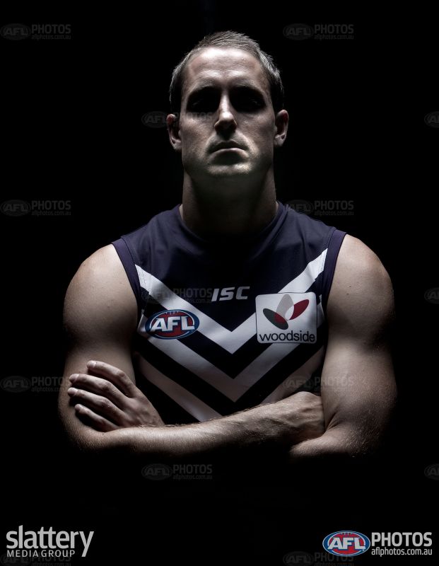
We never did anything better then these promoshots:

We never did anything better then these promoshots:
Follow along with the video below to see how to install our site as a web app on your home screen.
Note: This feature may not be available in some browsers.

Am now very comfortable with the 'Dockers' brand - but only after so long have grown used to it.
Always frustrated me they didn't go down either the Pirates (Skull + Crossbones flags, etc etc) or the Vikings (I mean, hats with horns, what more could you want?) as both have a nautical and aggressive feel.
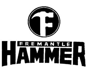
Always crack up just how useless and unwieldy that Freo hammer would be, if we had been the Hammers I reckon we'd have had the chevrons by June 1995.
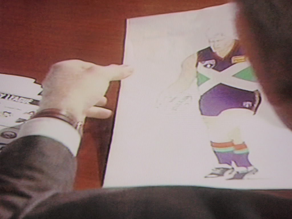
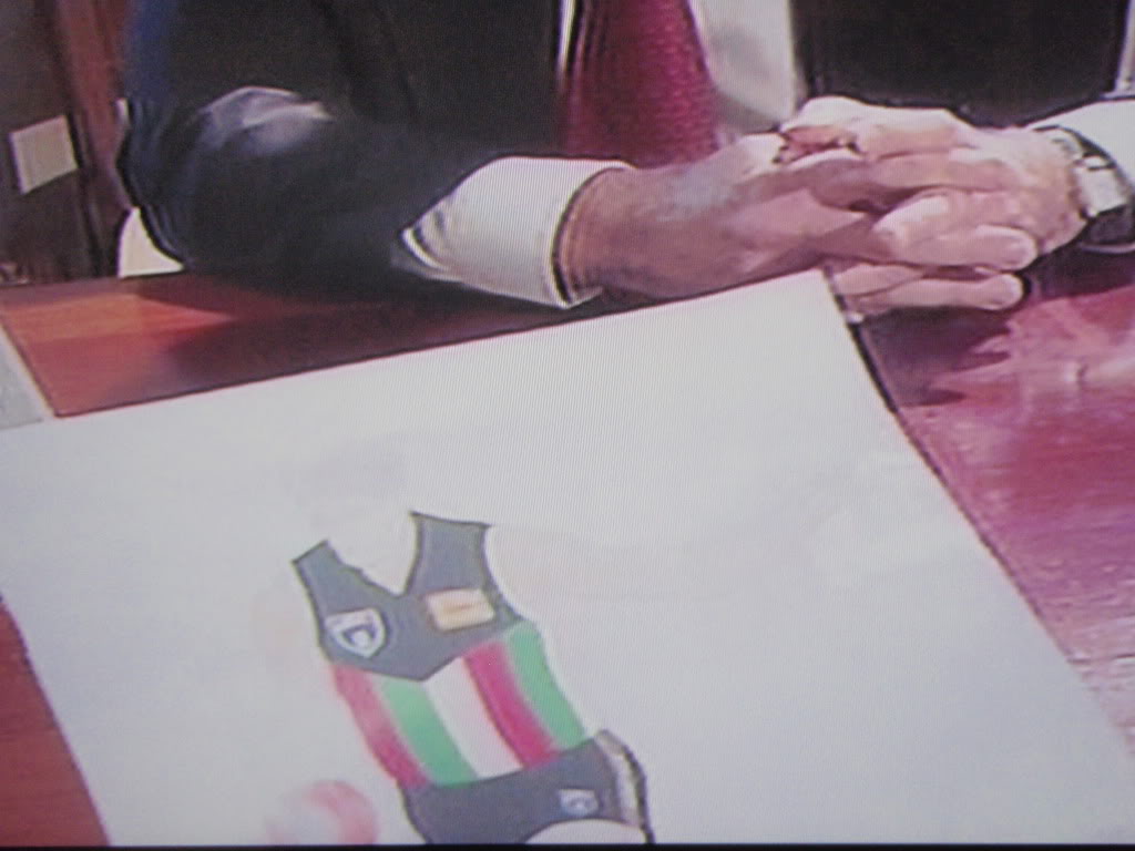
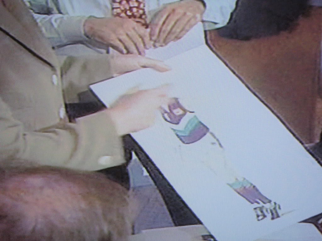
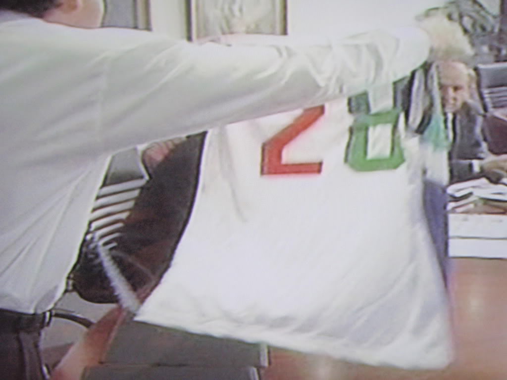
FWIW all possible names were just generic marketing terms ala Giants/Suns with no real tangible connection to place. Power is a classic example.
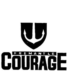
Fremantle Courage
Fremantle Dockers
Fremantle Hammers
Fremantle Mariners
Fremantle Stokers
Fremantle Union


Funnily enough a lot of names people like for Freo were registered to Port Adelaide: Sharks, Pirates (and Mariners).
I quite like the way everything is at the moment but these "what if" concept designs make me wish a little bit we were the marinersList of teams
[Time] ago we asked

Poll will run for 3 days
Winner picks next team from this list and gets their name on the honour roll
As for teams with more than 1 nickname next to them, The team will still be used until all nicknames have been done
eg. If you choose Gold Coast, it must be followed by one of the available nicknames.
Now with links to past polls!
Former
Mergers
Proposed
- Melbourne Hawks (Melbourne Demons and Hawthorn Hawks merger)
- Melbourne Lions (Melbourne Demons and Fitzroy Lions merger)
- Fitzroy Bulldogs (Fitzroy Lions and Footscray Bulldogs merger)
- Norwood-Sturt merger for AFL spot
- North Melbourne relocation to the Gold Coast
- North Fitzroy Kangaroos (North Melbourne Kangaroos and Fitzroy Lions merger)
- Glenelg - South Adelaide merger for AFL spot
- Sydney - Brisbane Bears Merger (1992)
- The Cartel (Players from Central Dist, North Adel, West Adel, Woodville-West Torrens picked from their respective sides to play AFL Football) - More Info
- Carlton - St Kilda merger
- Sydney - North Melbourne Merger INFO
- Sydney Lions (Sydney Swans and Fitzroy Lions merger)
- Fremantle Sharks (East Fremantle and South Fremantle merger)
VFL Expansion
- Sydney Celtics
- Tasmanian Team
- ACT Team
- Southport Sharks to the AFL - 1996
- Melbourne team relocation to Los Angeles: More Info
- Fremantle
- Hammers
- Mariners
- Union
- Courage
- Dolphins
- Stokers
- Greater Western Sydney
- Wolves
- Pride
- Stallions
- Adelaide
- Port Adelaide
- Raiders
- Pirates
- Mariners
- Sharks
- Gold Coast
- Brisbane
- Rockets
- Breakers
NEW ADDITIONS
Click Here for details on the teams listed
- Brunswick - 1925
- City FC (North Melbourne - West Melbourne Merger) - 1908
- North Melbourne/Essendon - 1921
- Coburg - 1924
- Brighton Penguins -1925
- Port Melbourne - 1925
- Prahran - 1925
- Public Service FC - 1925
- Trans Australian Airlines - played under 19s VFL in the 1940s, aka North Essendon
Entry 1 _Damo_

Entry 2 KBLT

Entry 3 just_kick_it

Entry 4 Mac Ropod

Entry 5 Cainozz

Entry 6 just_kick_it

The Red Russian Army's version of the Volga Boatman makes the hair on the back of my neck stand, it's awesome.Should be the sharks, most fearsome creature on earth, freo history and endemic to Wa. Should have the volga boatman version of the song, that’s an awesome original to base something on.
I reckon the logo, chevrons, and purple are all great.
I don't know a single footy fan who calls us anything other than Freo, so the nickname isn't really a big deal, but I'm happy enough with the Dockers, Mariners feels too American for me. I'm surprised we don't unofficially get called the wharfies more often though
FWIW all possible names were just generic marketing terms ala Giants/Suns with no real tangible connection to place. Power is a classic example.
Fremantle Courage
Fremantle Dockers
Fremantle Hammers
Fremantle Mariners
Fremantle Stokers
Fremantle Union


Funnily enough a lot of names people like for Freo were registered to Port Adelaide: Sharks, Pirates (and Mariners).
Not a big deal to a certain, limited extentWhy don't we just change it to Freo Thunder and go with AC/DC as our official theme.
Still prefer the Purple haze jumper.
Not a big deal to a certain, limited extent
Why settle with something as sensible as the Thunder? Why don't we go all out and re-brand as the Freo Lyons?
Apparently we're not giving enough kudos to Freo so next rebrand, welcome the Fremantle Fremantles.
