News Hawthorn and Skechers sign on for 2023 and beyond

Remove this Banner Ad

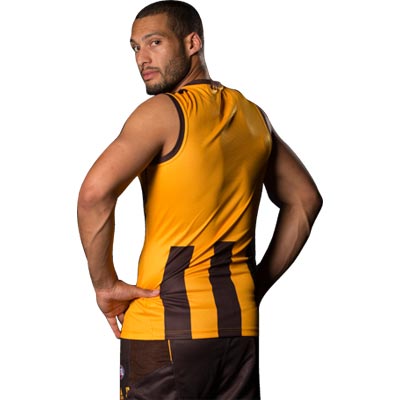
Indigenous guernsey is really great, almost tempted to grab one of those.

It is a shame to have a second or third tier brand like ISC doing our gear, and having to auction off their logo to place another sponsors logo there. But ISC have done an okay enough job for what they are.

Would love to be one of the lucky clubs like the Pies or Swans with Nike, or Roos, Giants, Tigers or Blues with Puma but here we are. I don't really think the fact that some brands have other clubs to look after too means that we're going to get crap stuff. All the Pies on and off field stuff is very good quality and whilst they're not always cutting-edge designs, they're classic and the logo of a big company adds to that. It's just a little nitpick because it's not the end of the world but I do wish our club was still associated with a big brand.
 

Log in to remove this ad.

Interesting with the new stuff there's some celebration of the 10yr anniversary of 2014 Premiership... but nothing for our 100th season in the comp.
 
Interesting with the new stuff there's some celebration of the 10yr anniversary of 2014 Premiership... but nothing for our 100th season in the comp.

The celebration of these types of sporting milestones seem to have reverted to the season that is the year + 100 rather than being done in the actual 100th season. The Druggers did their 150th in 2022 from 1872, the Raiders in the NRL did their 40th in 2022 also from 1982. Very annoying but I dare say you'll see this recognition in 2025.
 
Ditch the brown shoulder panels, ffs. And it needs to be a fully gold back. None of this Collingwood/North below sponsor stripes bullshit. Stupid Adidas.
 
Ditch the brown shoulder panels, ffs. And it needs to be a fully gold back. None of this Collingwood/North below sponsor stripes bullshit. Stupid Adidas.

I like the all-round stripes personally - looks like someone did half the job when they are only on the front. If I could change anything about the back it would be making the sponsors words only not panels - so just have the words KFC in red and the iinet logo in their respective colours to lessen the impact of them. Of course sponsors aren't going to sign up to that.
 

(Log in to remove this ad.)

On sketchers , they really are trying to break into the market and compete with the big boys. Joel embiid is reportedly signing his next deal with them.

They have Harry Kane also. Have had Corey Seager for a while too and he just won his second World Series MVP. It's clear they are building to compete - I am glad we got in on the ground floor with it.
 
I like the all-round stripes personally - looks like someone did half the job when they are only on the front. If I could change anything about the back it would be making the sponsors words only not panels - so just have the words KFC in red and the iinet logo in their respective colours to lessen the impact of them. Of course sponsors aren't going to sign up to that.
Its current implementation isn't Hawthorn, though. This was:


Will Langford pwning Geelong will always be a vibe.
 
Last edited:
Its current implementation isn't Hawthorn, though. This was:


Will Langford pwning Geelong will always be a vibe.


We’ve had back stripes in one form or another for more of our history than those with no back stripes - so to say that it isn’t Hawthorn is simply false.
 
We’ve had back stripes in one form or another for more of our history than those with no back stripes - so to say that it isn’t Hawthorn is simply false.
Excuse my pedantry, but prior to Adidas coming on board at the end of 2012, we had played 32 of 88 seasons with full stripes on the back of our jumper (a vast majority with a number panel). The rest were without (full gold or brown back). Our present jumper irks me as it's a lazy adoption of Collingwood's design by Adidas, and the same as one of our fiercest rival's in North.

Left is the Pies' 2011 number, and right is our 2013 design.

1699006715861.jpeg
imagerender


Before being asked to remove it, Adidas actually had 3 stripes as a design element (just below the neck) upon initial release in late 2012.

201802_ADIDAS_HOME_GUERNSEY_GIBSON_BACK_02.jpg


Perhaps adopting the cut-off stripes on the back was a subtle attempt at extending their branding opportunity :sweatsmile:. All in all, we went back to back to back in this design, so it's a notable part of our history now.. (at least, that's how I'll choose to look at it moving forward). The brown shoulder panels can still go, though.

Some Friday night I'm having.
 
Excuse my pedantry, but prior to Adidas coming on board at the end of 2012, we had played 32 of 88 seasons with full stripes on the back of our jumper (a vast majority with a number panel). The rest were without (full gold or brown back). Our present jumper irks me as it's a lazy adoption of Collingwood's design by Adidas, and the same as one of our fiercest rival's in North.

Left is the Pies' 2011 number, and right is our 2013 design.

View attachment 1845374
imagerender


Before being asked to remove it, Adidas actually had 3 stripes as a design element (just below the neck) upon initial release in late 2012.

201802_ADIDAS_HOME_GUERNSEY_GIBSON_BACK_02.jpg


Perhaps adopting the cut-off stripes on the back was a subtle attempt at extending their branding opportunity :sweatsmile:. All in all, we went back to back to back in this design, so it's a notable part of our history now.. (at least, that's how I'll choose to look at it moving forward). The brown shoulder panels can still go, though.

Some Friday night I'm having.

Laugh react is for the final line which made me giggle.

Differing opinions I guess - for mine I liked the Adidas direction because it allowed for back stripes but doesn’t require the white number panel which I’m not overly fond of as it looks like a polo jersey. A full stripe wouldn’t work with the numbers. The all gold back just looks unfinished to me so the Adidas blend really worked for my liking - but hey different strokes for different folks!
 
Playing jumpers would look a lot better with the gold AFL logo too
The annoying thing about AFL jumpers is they don't seem to allow proper contrast logos / advertising on the jumpers. They're all full brand colour and it can look glaring.
 
The obtrusive
logofeatured.png
on the back of our on-field merch held me back from multiple purchases last year and that continues this time around. As you touched on Ned, surely there's a more tasteful (rimshot) way of implementation.

I know numerous Brissie supporters who've opted against buying a guernsey this year due to the McDonalds logo on the sternum.
 
The annoying thing about AFL jumpers is they don't seem to allow proper contrast logos / advertising on the jumpers. They're all full brand colour and it can look glaring.

Agreed - the way sponsor logos have been incorporated into NBA jersey’s colour schemes should be how they’re done.
 
The obtrusive
logofeatured.png
on the back of our on-field merch held me back from multiple purchases last year and that continues this time around. As you touched on Ned, surely there's a more tasteful (rimshot) way of implementation.

I know numerous Brissie supporters who've opted against buying a guernsey this year due to the McDonalds logo on the sternum.
Stop being a pussy-cat and go get a bucket of chicken.

Love those wicked wings

On SM-A546E using BigFooty.com mobile app
 
The obtrusive
logofeatured.png
on the back of our on-field merch held me back from multiple purchases last year and that continues this time around. As you touched on Ned, surely there's a more tasteful (rimshot) way of implementation.

I know numerous Brissie supporters who've opted against buying a guernsey this year due to the McDonalds logo on the sternum.
“I don’t care, I love it”’
 

Remove this Banner Ad

Back
Top