Rubber Arm
AFL Sucks
- Oct 10, 2018
- 1,643
- 3,575
- AFL Club
- North Melbourne
- Other Teams
- ^ I don't actually go for North.
bruhPort should adopt this design
Follow along with the video below to see how to install our site as a web app on your home screen.
Note: This feature may not be available in some browsers.
bruhPort should adopt this design
I don't think you'd be allowed into South Australia anymore.Port should adopt this design
I actually really like the goldy-green look of the hawks, it would be super unique to them too
Whipped up a couple of Hawthorn alternate's based on their 'carbon' and 'orbit green' training gear and media polos (probably too similar to Collingwood).
And with white shorts looks weak. Combine that with the AFL’s stupid white short application that’s what it’s always paired with.
It’s a better look than their current home guernsey
YesNah.
Nah
Teal guernsey and black shorts yep
Looks heaps better than the port magpies prison barsPort should adopt this design
they also wore the top one against Brisbane in 2014It has to be one of those 3, I bet it'll be the top one since they wore the 1997 away SBS jumper against St Kilda in 2017
Giants this time
Never Surrender moved to home, some brief accents added to the kits too. My personal favourite white yoke added to the first alternate, and second is purely a mix of the never surrender and the classic design with the "side G". Toyo Tires has also had the box removed.
View attachment 1302464
I've always felt the white takes away from the design a bit. I get the home kit one, but the current design is only 1 year old, i would much rather a mix of the designs myself.Personally I reckon you should add the white outline to the full orange clash, and that the current home should still feature somewhere.
On iPhone using BigFooty.com mobile app


piss stain vs ochre in a match would be a sight for sore eyes
the only gradient that belongs in footy is the Ochre
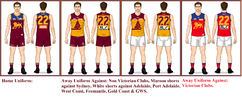
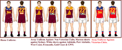
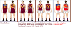
I suggested to Brisbane lions on the phone this morning for away games against Non Victorian clubs for brisbane lions to wear The Brisbane Bears Uniform. Option 1 is their Home uniform from 1987, option 2 is their clash uniform from 1987 and option 3 is their 1992 to 1996 Uniform. The red away one for away games in Victoria.I've always preferred Fitzroy's red ("light maroon"), blue and gold outfit to the dark maroon and navy. Same with Brisbane's current jumpers. The red one they tend to use in Melbourne is the definite preference.