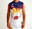
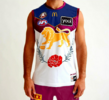
When I go back and look at Bears guernseys in other photos, it does look a couple of shades darker. Maybe the photo I posted above of Adam Kerinaiua has had the brightness turned up. Still, I do prefer a redder maroon to a purpler maroon.Is that even maroon?
Navigation
Install the app
How to install the app on iOS
Follow along with the video below to see how to install our site as a web app on your home screen.
Note: This feature may not be available in some browsers.
More options
You are using an out of date browser. It may not display this or other websites correctly.
You should upgrade or use an alternative browser.
You should upgrade or use an alternative browser.
News Lions kits and supporter gear discussion
- Thread starter Nickimus Rex
- Start date
- Tagged users None
Does anyone have a size L or XL 2023 mens media polo they'd be willing to sell? The new polos look much looser in their fitting and don't have as much blue.
Lion_LegacyXL
Club Legend
- Aug 22, 2019
- 1,664
- 2,112
- AFL Club
- Brisbane Lions
BuntonRules
long term substance abuser
- Dec 30, 2008
- 6,743
- 8,868
- AFL Club
- Brisbane Lions
- Other Teams
- Whitsunday SeaEagles
x gazillion. The paddlepop is the symbol of a loser. The Lion is our heritage.
Lion_LegacyXL
Club Legend
- Aug 22, 2019
- 1,664
- 2,112
- AFL Club
- Brisbane Lions
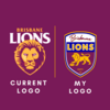
someone needs to get you a meeting with the club because this is so much better than what we have currently
I would make a great retro logo, but in all honesty it doesn't look very professional and is clearly a re-jig of our previous logos with the 80s/90s inspired text and graphics. The BBFFC is not easily seen either.
I'm a staunch advocate of the traditional Fitzroy Lion (I even feel modernising is completely unnecessary and would rather preserve the traditional lion), however the paddlepop as a standalone corporate logo is not that offensive to me.
The clumsy re-design of our traditional guernsey with the paddlepop was offensive for a myriad of reasons (not least of all the lack of supporter consultation with its introduction) and is generally symbolic of a dark period in club's history both on and off-field.
I'm all for more Fitzroy lion to be incorporated on merchandise and branding and perhaps even a prominent feature on our next club logo.
I must say the Essendon and AFL logos have withstood the test of time quite well.
Lion_LegacyXL
Club Legend
- Aug 22, 2019
- 1,664
- 2,112
- AFL Club
- Brisbane Lions
That's the point it's meant to be an updated version of the 90's logo with some additional tweaks. It's not meant to appear professional, it's just a 1 hour project I made in canva.would make a great retro logo, but in all honesty it doesn't look very professional and is clearly a re-jig of our previous logos with the 80s/90s inspired text and graphics.
That's the point it's meant to be an updated version of the 90's logo with some additional tweaks. It's not meant to appear professional, it's just a 1 hour project I made in canva.
I enjoyed the throwback. I'll always associate the "Brisbane" font with success and many hours of trying to replicate it by hand.
DreadBat5701894
Senior List
- Jan 28, 2024
- 159
- 293
- AFL Club
- Brisbane Lions
Lion_LegacyXL
Club Legend
- Aug 22, 2019
- 1,664
- 2,112
- AFL Club
- Brisbane Lions
royboy2
Average Old Bastard
- Dec 7, 2007
- 13,042
- 15,130
- AFL Club
- Brisbane Lions
- Other Teams
- Rabbitohs, Villa, McLaren F1, ENG
It could do without the Tramp stamp
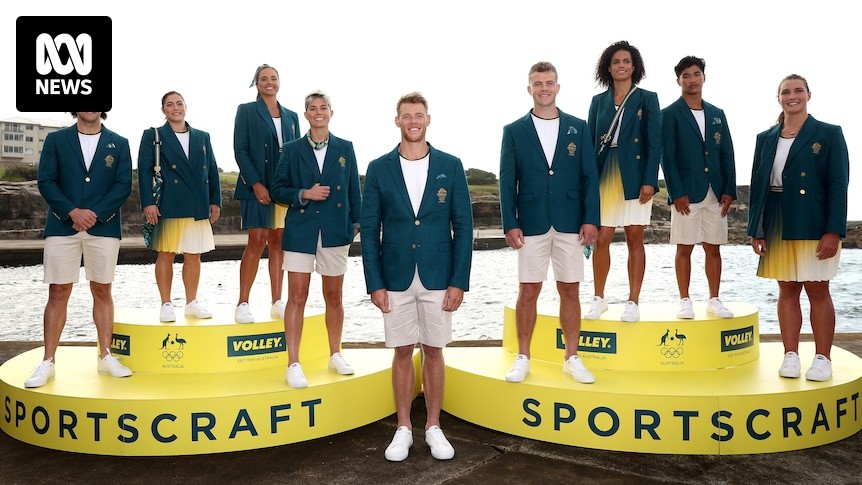
In somewhat related news, it appears the Australian Olympic uniform for Paris has been inspired by the club's infamous piss-stain clash guernsey.
 www.abc.net.au
Australia's uniform for Paris Olympic Games opening ceremony unveiled
The outfits that Australia's Olympians will wear into the opening ceremony of the Paris Games in July have been unveiled.
Lion_LegacyXL
Club Legend
- Aug 22, 2019
- 1,664
- 2,112
- AFL Club
- Brisbane Lions
Thanks, always wanted us to have a predominantly royal blue jumper. Would make perfect sense in Q-Clash games against Gold Coast.That jumper is awesome, love it.
Dalions
Premium Platinum
- Aug 12, 2016
- 17,077
- 26,822
- AFL Club
- Brisbane Lions
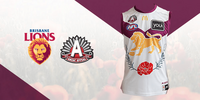
Doesn’t appear to have been a lot of thought go into it.Not a fan of this years Anzac guernsey, don't like any of our predominately white kits.
View attachment 1962123
Lion_LegacyXL
Club Legend
- Aug 22, 2019
- 1,664
- 2,112
- AFL Club
- Brisbane Lions
Lion_LegacyXL
Club Legend
- Aug 22, 2019
- 1,664
- 2,112
- AFL Club
- Brisbane Lions
The blue definitely improves it but still wouldn't add it to my collection... I have 6 Guernseys, 7 Polo shirts and an inordinate number of caps.
Lion_LegacyXL
Club Legend
- Aug 22, 2019
- 1,664
- 2,112
- AFL Club
- Brisbane Lions
Not a fan of white jumpers for us, this design feels like a regression and they could of done a better effort. Don't understand what was wrong with our current Gold/Maroon clash jumper.The blue definitely improves it but still wouldn't add it to my collection... I have 6 Guernseys, 7 Polo shirts and an inordinate number of caps.
DreadBat5701894
Senior List
- Jan 28, 2024
- 159
- 293
- AFL Club
- Brisbane Lions
If I had to guess, the AFL doesn't think our clash jumper provides sufficient contrast to GWSNot a fan of white jumpers for us, this design feels like a regression and they could of done a better effort. Don't understand what was wrong with our current Gold/Maroon clash jumper.
Similar threads
- Replies
- 103
- Views
- 6K
- Replies
- 126
- Views
- 12K
- Replies
- 2K
- Views
- 58K
- Replies
- 557
- Views
- 46K


