RossFC
Moderator
- Moderator
- #51
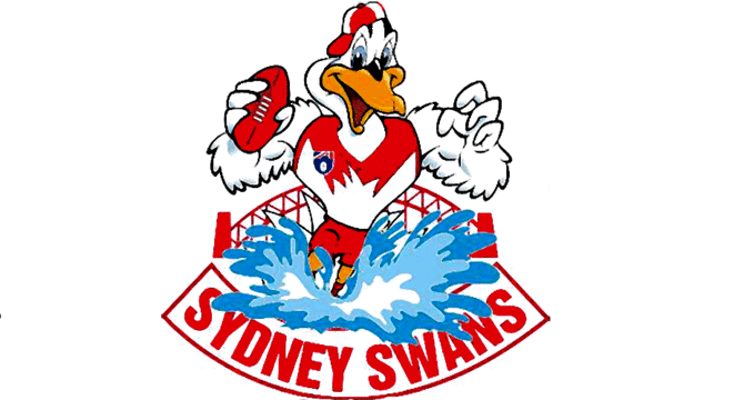
To me it's less majestic and more menacing.View attachment 1004453
View attachment 1004482
New Swans logo leaked by AFL store website by looks of it
Follow along with the video below to see how to install our site as a web app on your home screen.
Note: This feature may not be available in some browsers.
To me it's less majestic and more menacing.View attachment 1004453
View attachment 1004482
New Swans logo leaked by AFL store website by looks of it
It is owned by the government, in form of the opera house trust. There has been an arrangement by all teams using the logo with the trust, of varying values. The Kings were paying a small fee but when that deal was up the trust decided, as is there right, to make the fee more commercially sound; which led to the kings dropping the house. There was suggestions it would affect the other Sydney teams. Whether this is a direct result of this is still up in the air.Have I missed something?
I didn't know you could own or copyright silhouettes?
I get someone probably owns the Opera House (although I would have thought it was owned by the government) and own images of it ' but skylines would be public domain?
It's certainly iconic, that's for sure.The Opera House yoke is one of the best jumpers in footy. Hope it stays.
YesCould the red knob thing on the bill also be a reference to the bloods, kinda looks like a blood droplet, or is that reaching?

View attachment 1004453
View attachment 1004482
New Swans logo leaked by AFL store website by looks of it
I personally think the Swans have been in Sydney long enough they should be able to stand on their two feet and just be Sydney now.I think it's interesting that the club is going with a bold new "SYDNEY" wordmark, omitting any reference to the Swans nickname in the logo. I wonder if this may mean a change to the way the club is referred to on AFL fixtures, etc? I wouldn't bet on it, but it's a point of discussion all the same.
Same reason why Melbourne changed their logo to say MELBOURNEI think it's interesting that the club is going with a bold new "SYDNEY" wordmark, omitting any reference to the Swans nickname in the logo. I wonder if this may mean a change to the way the club is referred to on AFL fixtures, etc? I wouldn't bet on it, but it's a point of discussion all the same.
Nice.. see they like to call the jumper feathers on over the SOH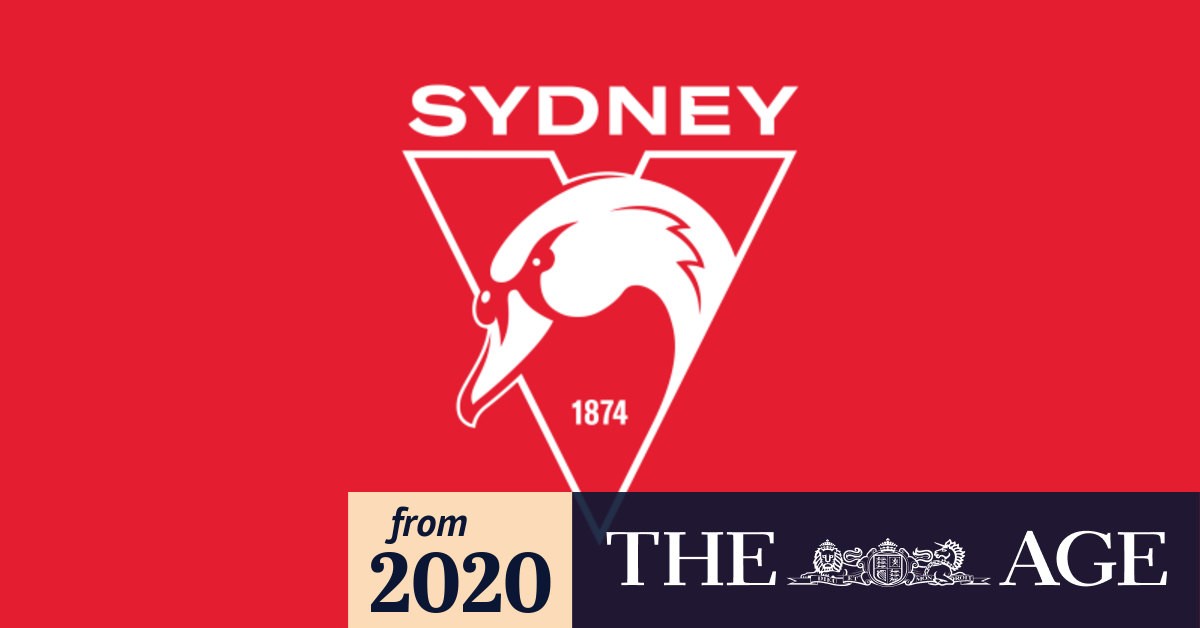
Swans launch new logo, but Kings could keep theirs amid fresh Opera House talks
The updated Swans design includes the traditional red 'V' with the year of the South Melbourne Football Club's formation, 1874, inside.www.theage.com.au
"A club spokesperson confirmed its authenticity and that the Swans had been planning to launch a fresh visual identity for some time - but said it has not been triggered by any increased financial demands by the Sydney Opera House Trust."
"The club spokesperson also said there will be no change to the Swans' guernsey, which has had the 'feathers' design at its heart since 1987."
Announcement coming today too according to article.
Yeah, because it will cost them 50k if they say it is the Opera House.Nice.. see they like to call the jumper feathers on over the SOH
I was right they are feathers! People on this board laughed. LAUGHEDNice.. see they like to call the jumper feathers on over the SOH
They should dispute that purely for being the blandest crest in world footballHas there been a dispute with this as well?
View attachment 1004786
Nothing screams "elite football club" like PremierLeague.ttf from dafont.comThey should dispute that purely for being the blandest crest in world football
looks like a generic one made up by EA for pro clubs