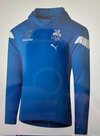
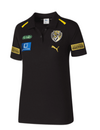
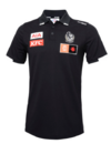
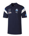
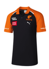
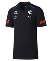
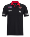
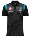
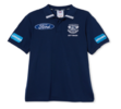
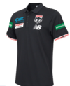
Who’s queuing up to buy the new Carlton polo?

Remove this Banner Ad

Do you actually buy the ‘media’ shirt anyway?

This would have to be one of our least biggest sellers.
Who gives a s**t, honestly?!

Kids want the guernseys & old pricks want hoodies.
Fair.

I buy whatever is left over end of year that looks good and is on sale, the indigenous round ones when they're noice, the odd jumper because ya never too old and training tops to pretend I'm fit.
 
Last edited:
awkward topic but here I go…

I think we all know the royal blue is the best colour, but its visual strengths are onfield, not off.

Buying the old polo for family for xmas felt like buying just anther guernsey.

The darker blue is way more casual, works better just walking to the shops, and will sell a lot more.

Also makes me look less fat.
 

Log in to remove this ad.

awkward topic but here I go…

I think we all know the royal blue is the best colour, but its visual strengths are onfield, not off.

Buying the old polo for family for xmas felt like buying just anther guernsey.

The darker blue is way more casual, works better just walking to the shops, and will sell a lot more.

Also makes me look less fat.
Using that logic, a dusty black or a very dark grey might have been better.
 
I don't disagree but we just made off like bandits in the first round of the National Draft and we're whinging about the polo shirts.
And they say only women can multi-task. :)
 

(Log in to remove this ad.)

Looks like Carlton or Geelong left overs rebranded. We are not now and never will be navy blue. Even the Foxtel crew had a crack at it.

They also had a crack at us drafting Phillips over McDonald.

* Foxtel.
 
I loved the colour of last years polo despite it not being North's exact colours. Not as fond of this years only because there is such a similarity to Carlton.
 

Attachments

  • thumbnail_IMG_4018.jpg
    thumbnail_IMG_4018.jpg
    80.8 KB · Views: 19
Last edited:
Using that logic, a dusty black or a very dark grey might have been better.


No need to go extreme and negative, but that basically is the idea.
The darker ones look better and the bright coloured ones look cheap.

And for those complaining that it looks too similar to others... well yeah lol, most do, but ours looks the best

1700538184147.png 1700538234921.png
1700538206513.png 1700538274943.png
1700538260576.png 1700538290109.png
1700538389615.png 1700538481379.png
1700538639633.png 1700538724929.png
 
Last edited:

Remove this Banner Ad

Back
Top