Navigation
Install the app
How to install the app on iOS
Follow along with the video below to see how to install our site as a web app on your home screen.
Note: This feature may not be available in some browsers.
More options
You are using an out of date browser. It may not display this or other websites correctly.
You should upgrade or use an alternative browser.
You should upgrade or use an alternative browser.
No Oppo Supporters General AFL discussion and other club news
- Thread starter Strapping Young Lad
- Start date
- Tagged users None
cryptor
Brownlow Medallist
- May 11, 2008
- 23,525
- 58,923
- AFL Club
- Hawthorn
Just got mine too. My reasons are slightly different though. I just think it would be funny for them to have more members than the shinbeggars before they've even got a team.Not a Tasmanian local, but currently 15 dollars for a membership, name gets put on the stadium and you get some stickers.
I'm getting behind it cause I reckon a Tas team is good for the league and for the code!
The hands of stone
Norm Smith Medallist
- Sep 13, 2020
- 6,369
- 17,467
- AFL Club
- Hawthorn
Did they tell you when your 12 memberships are arriving ?Just got mine too. My reasons are slightly different though. I just think it would be funny for them to have more members than the shinbeggars before they've even got a team.

cryptor
Brownlow Medallist
- May 11, 2008
- 23,525
- 58,923
- AFL Club
- Hawthorn
2-8 business daysDid they tell you when your 12 memberships are arriving ?
Strapping Young Lad
Moderator
- Apr 19, 2006
- 97,500
- 236,179
- AFL Club
- Hawthorn
- Other Teams
- Storm, Spurs, Socceroos
- Thread starter
- Moderator
- #15,530
I do like the Aunty Donna boys.
The AI jumper looks great.
If AI came up with the actual design they're going with you'd laugh and say AI will never replace real designers.
Why does the jumper need the letter T on it? There's already a bloody map of the state.
If AI came up with the actual design they're going with you'd laugh and say AI will never replace real designers.
Why does the jumper need the letter T on it? There's already a bloody map of the state.
Hodgey 15
Premiership Player
- Aug 2, 2013
- 4,349
- 10,540
- AFL Club
- Hawthorn
- Other Teams
- Tasmania
Having a national AFL competition without a Tassie team is even sillier.Having 19 teams is silly
On SM-S906E using BigFooty.com mobile app
Hodgey 15
Premiership Player
- Aug 2, 2013
- 4,349
- 10,540
- AFL Club
- Hawthorn
- Other Teams
- Tasmania
I'm not sure about the "T" but otherwise that looks really awesome.They should try and do a design where it’s front facing, yellow and works a red T in there. Make it more inspired by the historical design.
AI concept. Unfortunately I couldn’t get it to understand that a Tasmanian devil was a real animal so this was as close as I could get. The T could also be more subtle if the eyes and nose were slightly red and then an open mouth with a red tongue completes it.
View attachment 1932134
On SM-S906E using BigFooty.com mobile app
Hey can you run a Hawthorn one through the same AI? I’d love to see what it would come out as.They should try and do a design where it’s front facing, yellow and works a red T in there. Make it more inspired by the historical design.
AI concept. Unfortunately I couldn’t get it to understand that a Tasmanian devil was a real animal so this was as close as I could get. The T could also be more subtle if the eyes and nose were slightly red and then an open mouth with a red tongue completes it.
View attachment 1932134
Strapping Young Lad
Moderator
- Apr 19, 2006
- 97,500
- 236,179
- AFL Club
- Hawthorn
- Other Teams
- Storm, Spurs, Socceroos
- Thread starter
- Moderator
- #15,535
Whoever designed the devil logo is taking the piss, surely?
It’s an illustrator file from a newb gone bad. Horrendous.
It’s an illustrator file from a newb gone bad. Horrendous.
cryptor
Brownlow Medallist
- May 11, 2008
- 23,525
- 58,923
- AFL Club
- Hawthorn
cryptor
Brownlow Medallist
- May 11, 2008
- 23,525
- 58,923
- AFL Club
- Hawthorn
Just got mine too. My reasons are slightly different though. I just think it would be funny for them to have more members than the shinbeggars before they've even got a team.
MISSION ACCOMPLISHED
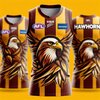
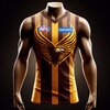
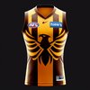
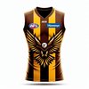
The third one isHere’s a few of the better ones I could get out of it…
View attachment 1932330View attachment 1932331View attachment 1932332View attachment 1932333

arupist
Premium Platinum
Nah, looks like spiderman.The third one is
Call me old fashioned but I don’t like modern graphics on jumpers. Jumper design should be something a child can draw. 2-3 colours max in hoops, stripes, sashes, V’s, solid colours, etc etc
I’ve never been a fan of the overdone graphics on some jumpers.
I’ve never been a fan of the overdone graphics on some jumpers.
DogDaySonny
Team Captain
- May 4, 2023
- 464
- 1,003
- AFL Club
- Hawthorn
Strapping Young Lad
Moderator
- Apr 19, 2006
- 97,500
- 236,179
- AFL Club
- Hawthorn
- Other Teams
- Storm, Spurs, Socceroos
- Thread starter
- Moderator
- #15,542
The A.i seems to be very confused as to the differences between an Eagle and a HawkHere’s a few of the better ones I could get out of it…
View attachment 1932330View attachment 1932331View attachment 1932332View attachment 1932333
cryptor
Brownlow Medallist
- May 11, 2008
- 23,525
- 58,923
- AFL Club
- Hawthorn
All it can do is plagiarize the stuff it's been trained on, which in terms of sports team graphics will be mostly eagles.The A.i seems to be very confused as to the differences between an Eagle and a Hawk
TassieGrown
All Australian
- Aug 2, 2020
- 751
- 1,885
- AFL Club
- Hawthorn
The jumper with the T is the foundation jumper, been like this for eons.The AI jumper looks great.
If AI came up with the actual design they're going with you'd laugh and say AI will never replace real designers.
Why does the jumper need the letter T on it? There's already a bloody map of the state.
Stranglers
Club Legend
- Nov 22, 2010
- 2,100
- 3,714
- AFL Club
- Hawthorn
Mercy Seat
Norm Smith Medallist
100%Call me old fashioned but I don’t like modern graphics on jumpers. Jumper design should be something a child can draw. 2-3 colours max in hoops, stripes, sashes, V’s, solid colours, etc etc
I’ve never been a fan of the overdone graphics on some jumpers.
The graphics of the cartoony mascots date so quickly. Something timeless about the simplicity of traditional strips.
hawk65
Club Legend
MISSION ACCOMPLISHED
Yeah but how many are dogs and cats??
Aren't their memberships literally $15?
Are they counting both heads or just one?
Hodgey 15
Premiership Player
- Aug 2, 2013
- 4,349
- 10,540
- AFL Club
- Hawthorn
- Other Teams
- Tasmania
Similar threads
- Locked
- Sticky
- Replies
- 3
- Views
- 2K
- Replies
- 6K
- Views
- 469K
- Replies
- 34
- Views
- 15K
- Locked
- Replies
- 27K
- Views
- 2M
- Replies
- 7K
- Views
- 554K


