quotemokc
Brownlow Medallist
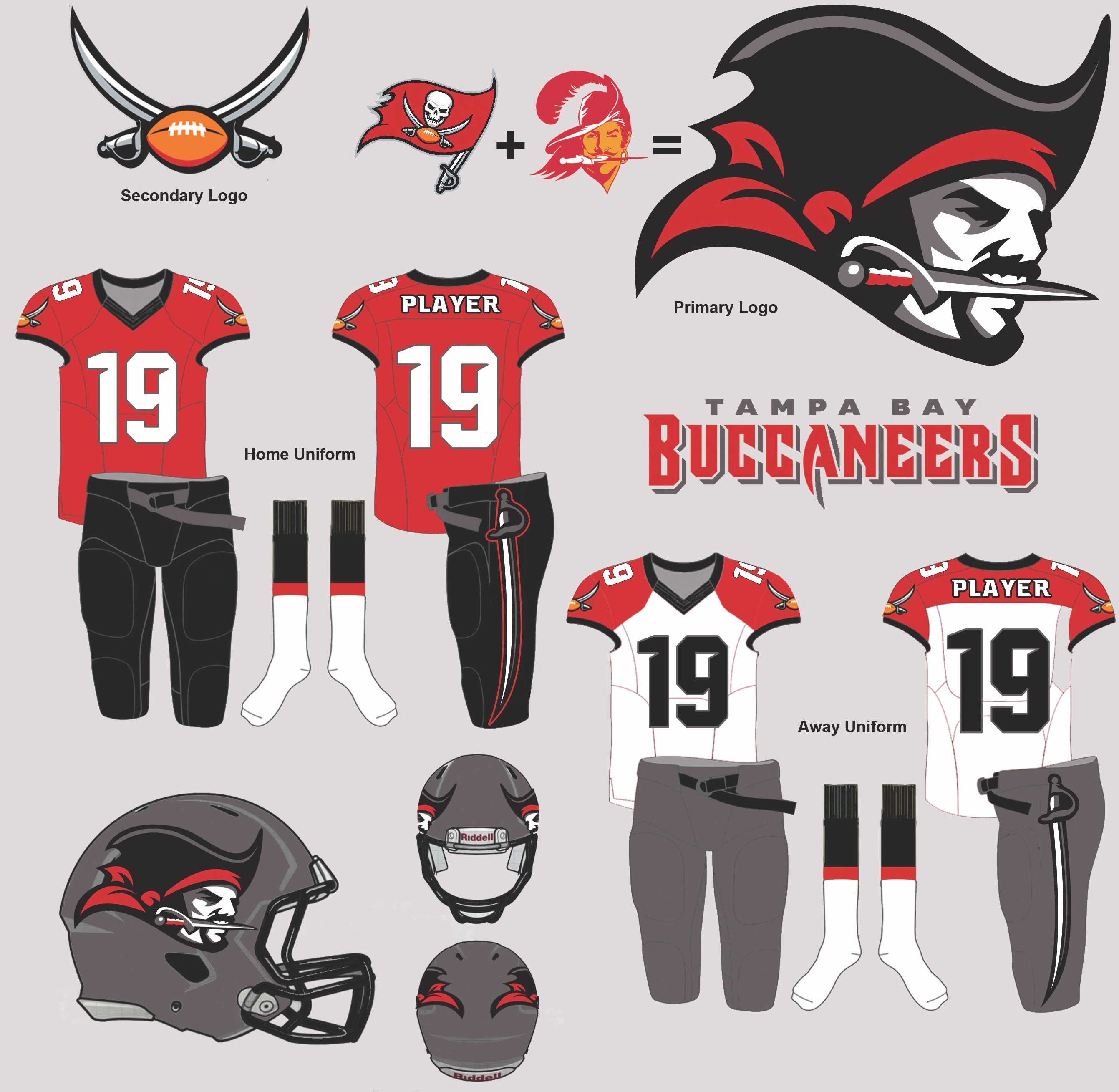
The logo is getting a slight change too.
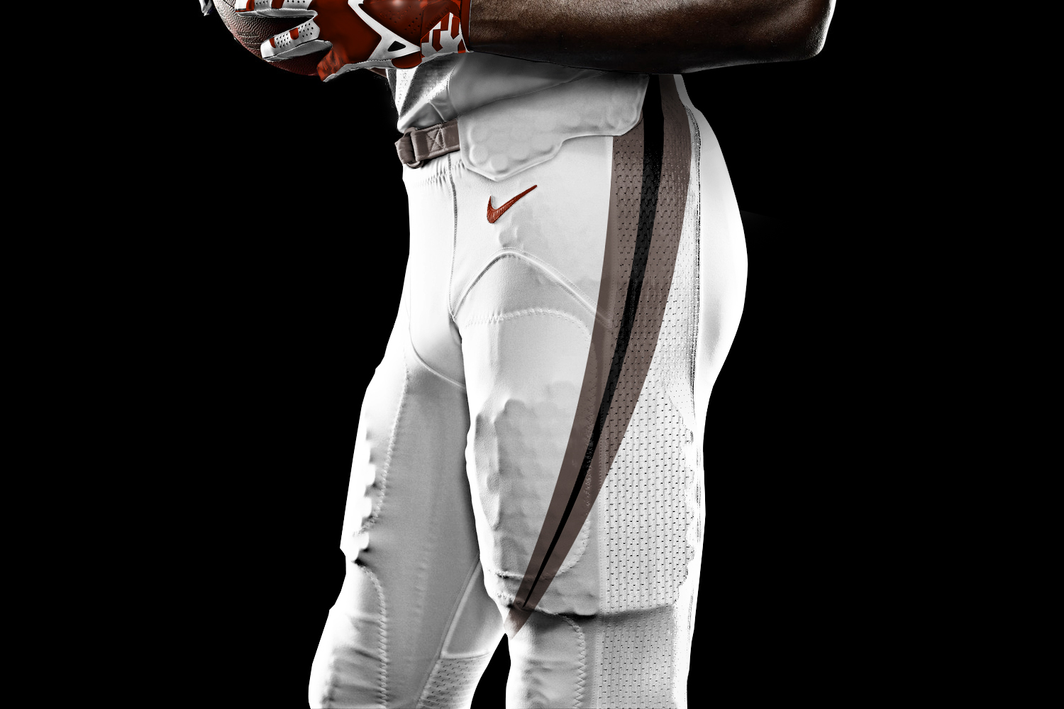
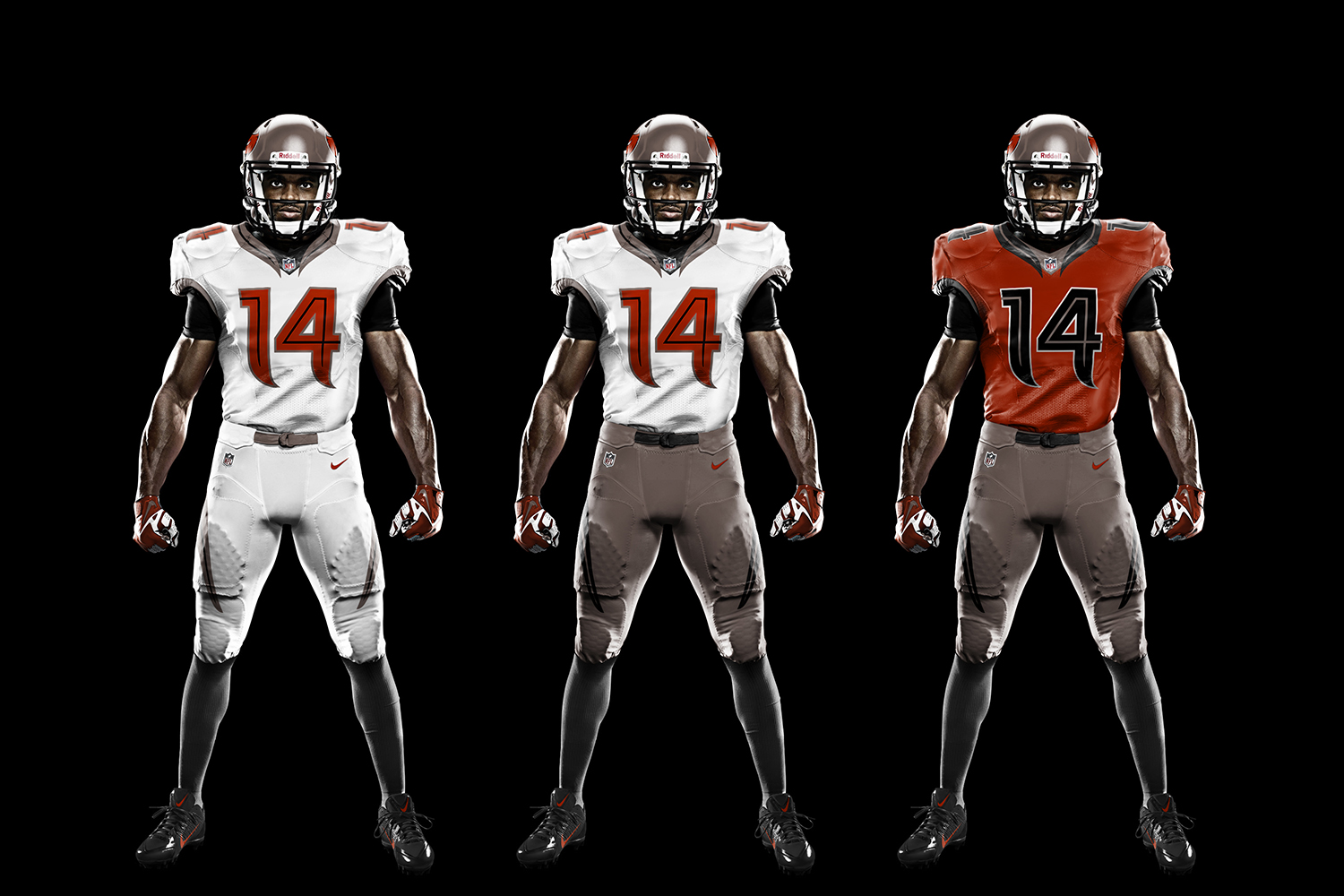
I just want to avoid any grey, especially pants.
I just want to avoid any grey, especially pants.
Follow along with the video below to see how to install our site as a web app on your home screen.
Note: This feature may not be available in some browsers.
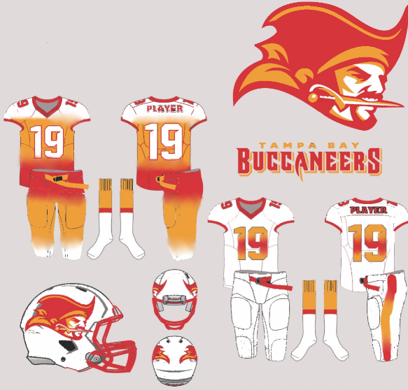
Black helmet, white+red old falcon logo, red jersey, black pants, red socks.The logo is getting a slight change too.
I just want to avoid any grey, especially pants.
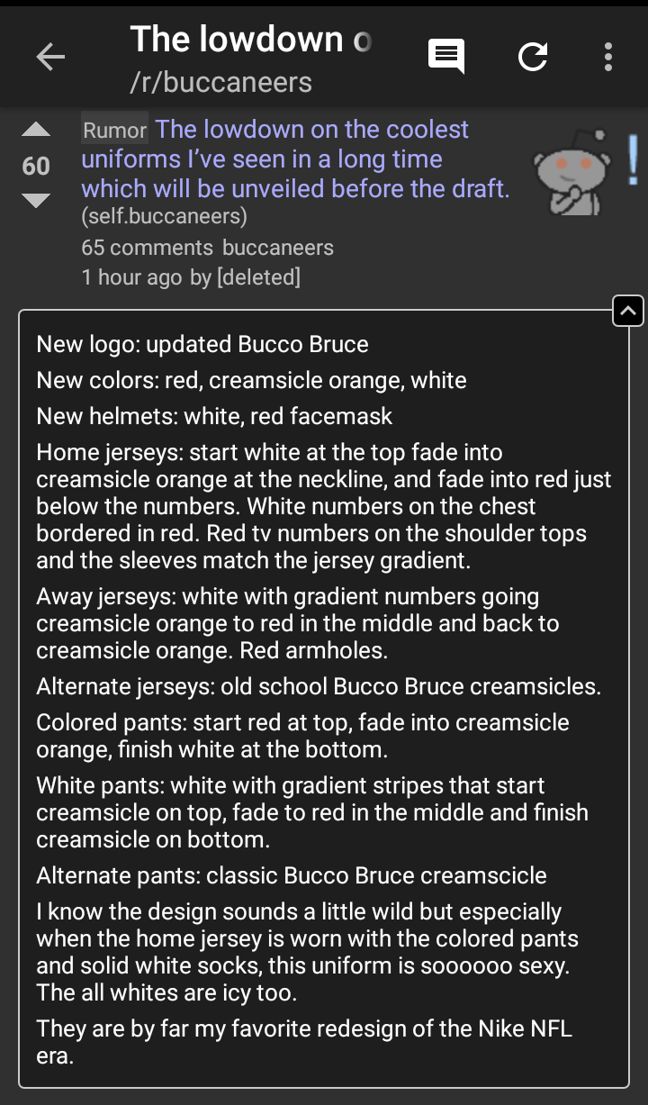
Trash logoLeaks
Makes no sense because the video has pewter in it

probably a troll.Leaks
Makes no sense because the video has pewter in it
0:25: The first real hint I could spot beyond confirming that there will be new uniforms is the bright red cable this man pulls out from his backpack. The red looks like the color rush color.
0:38: While the man is pulling out the cables, you can spot his creamsicle colored watch. This watch can be seen at the beginning while he opens the garage door, but this is a clearer view.
0:39: A newspaper clipping reads "Return to Glory," referring to Michael Spurlock's kickoff return touchdown against the Falcons- the first ever for the Bucs. The Bucs were wearing the red uniforms from our Super Bowl era that day.
0:42: The glue to paste these clippings to the wall is a bright white. This would match the infamous reddit post, but this is really the only time we see bright white in the video.
0:47: Another newspaper headline reads "Tampa gets NFL Franchise." Obviously, this references the Creamsicles when talking about uniforms.
0:48: Very briefly you can see "Many Happy Returns" and "Believe It" as newspaper headlines, both referencing the Super Bowl team (and uniforms).
0:53: The headline for the change to the 2014 hideous uniforms reads "Bucs New Uniforms Mold Old With New."
1:01: A newspaper headline references the Bucs last trip to the playoffs "2007 NFC South Division Champs."
1:11: "A Bold New Era" and "Wait No Mo" can be seen in the collage, these are shots at Bucs Nation your typical pieces to hype up the change.
1:14: Finally, we see the grand finale. The Bucs pirate ship with a blend of colors. The pirate ship looks like a modern version of the logo, not really any more like the Super Bowl uniforms or the 2014 ones. The biggest takeaway here is the colors. The blend seems to be mostly made of red and pewter with touches of the creamsicle orange.
 theramswire.usatoday.com

Matt Tabeek is a columnist for AtlantaFalcons.com and does a mailbag for fans to ask questions pertaining to the team. Someone asked about the uniforms, and he responded:
“First, thanks for the support and kind words. I’ve said dozens and dozens of times and I’ll say it again: This space is here because of you, the fans. As far as the uniforms go – and I wish I had a dollar for every question I receive about them – I cannot give away any specific details about them or I’ll get in some pretty big trouble! However … I have seen them and I can give you my reactions. Flat out, I think they are sweet looking. And I’ll add this, too: When I first laid eyes on them (on a computer screen), they were not what I was expecting. And I’ll add one more thing: When I finally saw them in person and actually held them (and the helmet) for the first time, I liked them even more. Loved them, actually. That’s all I can say. Lips are sealed, folks.”
Maybe it’s just me, but this reaction seems to suggest that the uniforms have a significant change to them, including the helmet. There’s been a lot of speculation on whether the Falcons will remain with black helmets or go back to the classic red. Another interesting question is whether will they change their logo or not, and someone also asked Tabeek that.
“I can’t say, Jim. You’ll have to wait and find out in April.”
Maybe just my speculative mind, but a “no” would’ve been fair here. The fact that he didn’t say no tells me that there will be some form of change to the Falcons’ logo — just how much change is the question now.
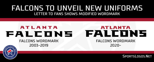
In news that could also subtly impact the uniforms, the team also has apparently updated their word mark, as witnessed on the top of owner Arthur Blank’s recent letter to fans. The letters have changed slightly in design and also have a bolder look to them. The spacing is also significantly changed.
I doubt that's true, given that whole concept was ripped from one if the entries in the redesign the Bucs comp on the UniWatch site a few months ago.Leaks
Makes no sense because the video has pewter in it
I doubt that's true, given that whole concept was ripped from one if the entries in the redesign the Bucs comp on the UniWatch site a few months ago.
Get rid of the hair and facial hair