Navigation
Install the app
How to install the app on iOS
Follow along with the video below to see how to install our site as a web app on your home screen.
Note: This feature may not be available in some browsers.
More options


You are using an out of date browser. It may not display this or other websites correctly.
You should upgrade or use an alternative browser.
You should upgrade or use an alternative browser.
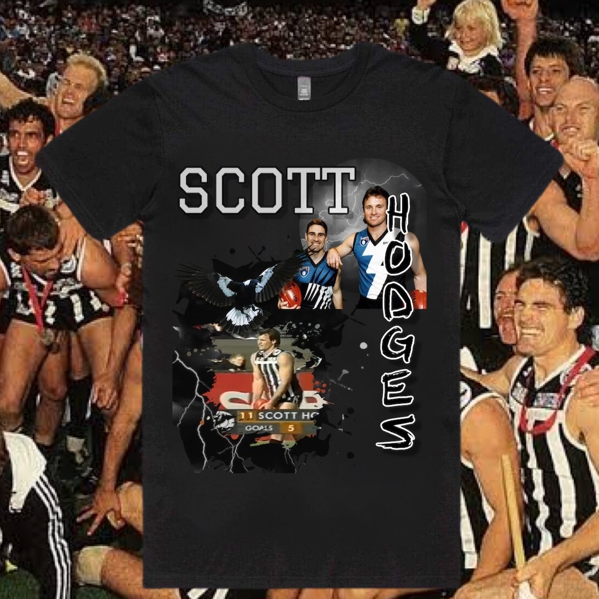
Mega Thread The Port Store Mega Thread Part 2
- Thread starter Mangus Onfries
- Start date
- Tagged users None
- Nov 5, 2015
- 5,415
- 9,773
- AFL Club
- Port Adelaide
LOL .. timing is everything
The dollars they would be missing out in the fortnight between the preliminary final and the Grand Final would be frightening.
Footy Time
Senior List
- Sep 1, 2021
- 220
- 679
- AFL Club
- Port Adelaide
- Banned
- #3,604
Such a shame. This place would have been packed in the lead up to the Grand Final, but now it will remain empty until next year because we got Hinkley'd.
Thats a very well stocked store full of 2021 merch right at the end of the season....
simba_
sucking a lemon
i'm going to get an unbeatable at alberton tee only because it's absolutely brilliant. and some stickers because i'm a sucker for stickers. THAT'S IT.
Have to cop this one
Sent from my iPhone using Tapatalk
Fanta ?
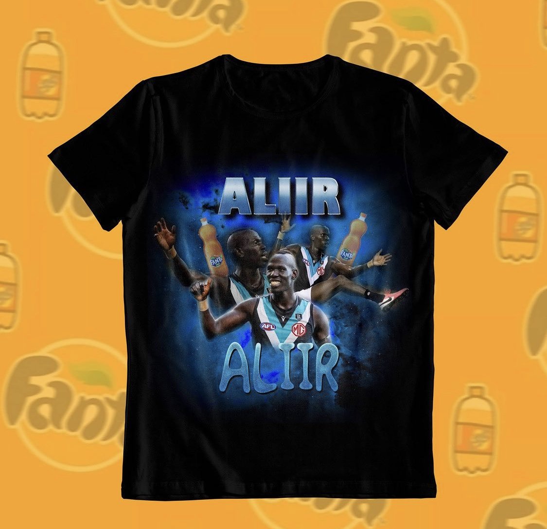
More like Oraaaaazio
Which presumably will all have to be liquidated before next season. There really were big consequences from last weeks no-show that no-one really wants to fess up toThats a very well stocked store full of 2021 merch right at the end of the season....
.PepeSilvia
Norm Smith Medallist
The mural (if that’s what it is?) behind the counter is not good. What’s with the red and blue stripes in the top right?
El Zorro
狐狸
Yes, the unbeatable at Alberton tee looks great. I'll get one.i'm going to get an unbeatable at alberton tee only because it's absolutely brilliant. and some stickers because i'm a sucker for stickers. THAT'S IT.
Launchpad McQuack
Internet fact checker.
- Jul 6, 2011
- 4,799
- 15,428
- AFL Club
- Port Adelaide
Probably magenta and blue throwback for reasons. Why not confuse our branding in our new digs?The mural (if that’s what it is?) behind the counter is not good. What’s with the red and blue stripes in the top right?
Edit: if a Port supporter that takes the time to post on a message board is wondering what the hell it is, it's probably a pretty ******* dumb decision to have it.
PepeSilvia
Norm Smith Medallist
Probably magenta and blue throwback for reasons. Why not confuse our branding in our new digs?
Edit: if a Port supporter that takes the time to post on a message board is wondering what the hell it is, it's probably a pretty ******* dumb decision to have it.
That was what I eventually assumed, but it definitely looks red rather than magenta to me and also why the *?!That's what I reckon it is.
Bizarre.
Last edited:
That mural is hideous
Sent from my SM-G986B using Tapatalk
Sent from my SM-G986B using Tapatalk
That mural:


- Feb 7, 2014
- 13,487
- 27,904
- AFL Club
- Port Adelaide
- Other Teams
- Chelsea FC , Boston Red Sox/celtics
Not going to lie would love to own that guernsey for the weirdness
bomberclifford
Importer/Exporter
The mural (if that’s what it is?) behind the counter is not good. What’s with the red and blue stripes in the top right?
It looks like it’s been hand painted straight onto the concrete wall. Poorly.
The red and blue is such an avoidable misstep.
Mural:
- Nov 5, 2015
- 5,415
- 9,773
- AFL Club
- Port Adelaide
The mural (if that’s what it is?) behind the counter is not good. What’s with the red and blue stripes in the top right?
It's terrible, way too much going on.
- Nov 5, 2015
- 5,415
- 9,773
- AFL Club
- Port Adelaide
That mural is hideous
Sent from my SM-G986B using Tapatalk
It's says, who the hell are we !
Have they literally just stuck the new store in a broom closet under the stairs? Cause that's what it looks like.
- Apr 27, 2008
- 64,749
- 78,535
- AFL Club
- Port Adelaide
- Other Teams
- Chael Sonnen: Moral Champion
Bulldogs in the top right.
Collingwood stripes to the left.
Teal and white stripes top left.
Wtf is going on
Sent from my Nokia 7.2 using Tapatalk
Collingwood stripes to the left.
Teal and white stripes top left.
Wtf is going on
Sent from my Nokia 7.2 using Tapatalk
Last edited:
Doctor Feel
Shitposter In Chief
My favourite is the random black circle to the right of the PA monogram.
Protip - they could have just painted that wall black, then painted a bigass white monogram and it would have looked chefs kissy fingers.
Protip - they could have just painted that wall black, then painted a bigass white monogram and it would have looked chefs kissy fingers.
Similar threads
- Replies
- 5K
- Views
- 107K
- Replies
- 10K
- Views
- 288K
- Replies
- 10K
- Views
- 271K
- Replies
- 10K
- Views
- 271K
- Replies
- 1K
- Views
- 30K
- Replies
- 9
- Views
- 195
