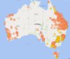
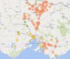
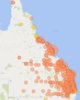
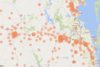
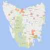
Was having a play around with the first preference data from the AEC website today, and thought people might find these interesting. Each bubble represents a polling booth with >10% primary vote for either PHON (orange) or UAP (yellow).
I haven't provided close-ups for SA, WA or NT as those were a bit boring.
I haven't provided close-ups for SA, WA or NT as those were a bit boring.