Janus
Advocatus Diaboli
- Sep 9, 2007
- 23,363
- 57,159
- AFL Club
- Port Adelaide
- Other Teams
- Dallas Cowboys, Chicago Bulls
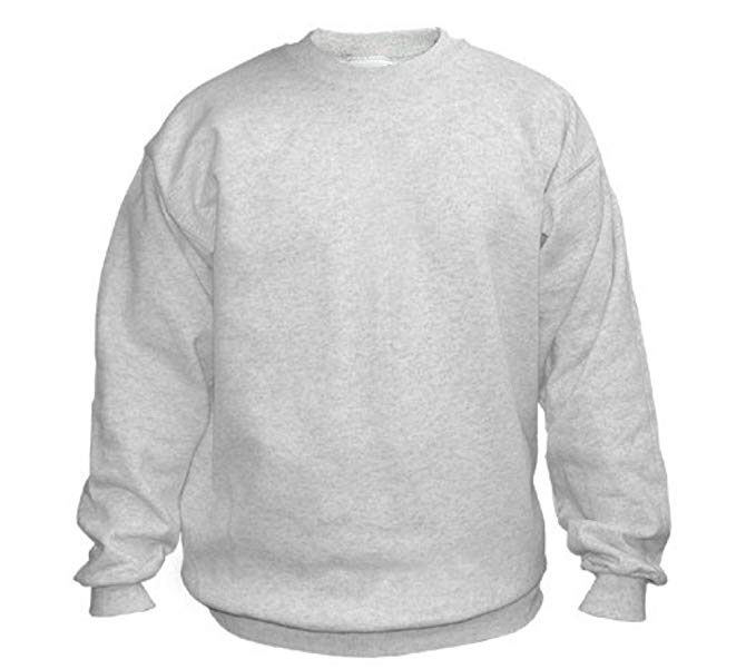
I have nothing against the P it just doesn't immediately read as a Ports jumper.
I quite like the PORT one though, but i've banned myself from merch this year unless we played in the PBs or something
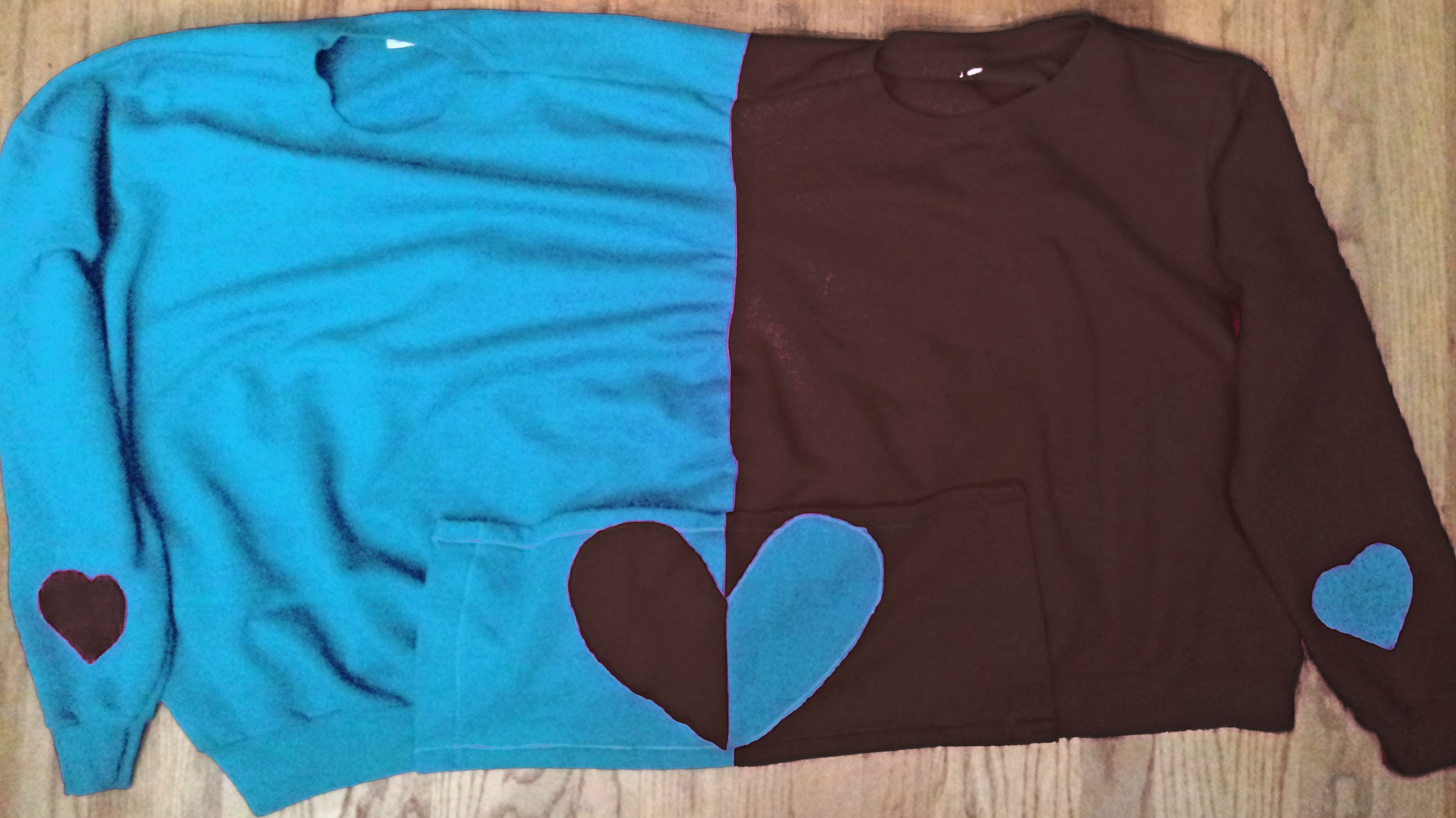
That’s why it was made.
It’s for people who want to wear something that isn’t readily identifiable as Port Adelaide but still want to support the club - it’s like the nose tap that the PA logo originally was.