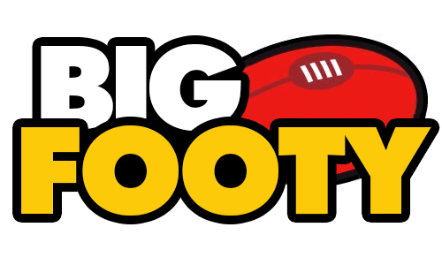
Win Prizes BigFooty Logo Upgrade Competition: Vote for your favourite + win. (Lots of image downloads ITT)

Remove this Banner Ad

At the moment I'm still turning it over in my head.

Do we want to strike out on a different path, or do we want to simply tidy up the existing logo?

So the finalists would have to be:

http://www.bigfooty.com/forum/threa...of-image-downloads-itt.1077972/#post-35275616

http://www.bigfooty.com/forum/threa...of-image-downloads-itt.1077972/#post-35275624

http://www.bigfooty.com/forum/threa...of-image-downloads-itt.1077972/#post-35275640

It's a difficult choice.
i reckon stick with the original, as nice as some of the ones posted are.

maybe adjust the sizing of the letters so it's not ascending with each letter, and get rid of the slight gradient in the letters, so its just a flat, simple colour.

it's hard to change when you're already attatched to something which has been around forever haha.
So, in other words, the first and second ones...
 

Log in to remove this ad.

well yeah, the second one is the original, is it not?

i like lmach's, but the outline is a bit heavy and the font seems slightly off.
The second one is an update. It takes the gradient and hardens it. So that the letters are divided in half (the true colour on top, and the darkened colour on the bottom.

Basically, wefvefc.png
 
The second one is an update. It takes the gradient and hardens it. So that the letters are divided in half (the true colour on top, and the darkened colour on the bottom.

Basically, View attachment 88992
yeah i see that. i meant more like this:

QNHssM9.png
 
it's hard to change when you're already attatched to something which has been around forever haha.

But it hasn't really, it changed in 2012 when BF moved to Xenforo. Essentially this competition is helping tidy up the logo once more (for what it's worth I like the first one out of the following two, the shading on the second one is strange)

Previous:
248587_10150260795856554_7553932_n.jpg


Current:
logo.png
ohh that's odd. yeah the shading is super weird on the second.
 

(Log in to remove this ad.)

Sorry to bother you, His Holiness and Highness Sir Chief, but will there be a resolution to this in the foreseeable future?
Yes I need to do this before the start of the season.

I am dithering way too much. I will pick the new one soon as I can.
 
I'm an art director by trade and I'd go for this.
That speech bubble footy is fantastic and would come in handy as a logo in future for apps, icons etc. the logo really personifies a footy forum even without the words.
Good work!

I agree and that's the one I liked months ago.

It's not super sexy but covers a lot of ground whilst the logo itself can do the talking.
 
One logo has stuck in my mind, and that's the below 'convo logo'. It's curvy (great for retina display) and has potential in the modern ipad/smartphone world of apps, blogs, and podcasts, and in the future would look great as a 'motion logo' in certain circumstances (the two speech bubbles could converge while the footy spins into focus from behind, like a drop punt).

However, it would be a departure from the last 15 or so years of "BIG FOOTY", which is very clearly worded and good for the actual website itself. I think unless there are plans for a push into diversifying the brand, it might be better to update the existing logo in high resolution (retina compatible, due to the curvy letters).

Personally, I value modernity and simplicity the most, so I would change it as I feel the existing logo is very pre-smartphone in terms of fashion. There's nothing wrong with change, as AFL clubs change their logos every 14 years or so too. But the trends they are a-changing, and few online logos last more than 15 years.
The goatse angle kind of puts me off though.
 

Remove this Banner Ad

Back
Top