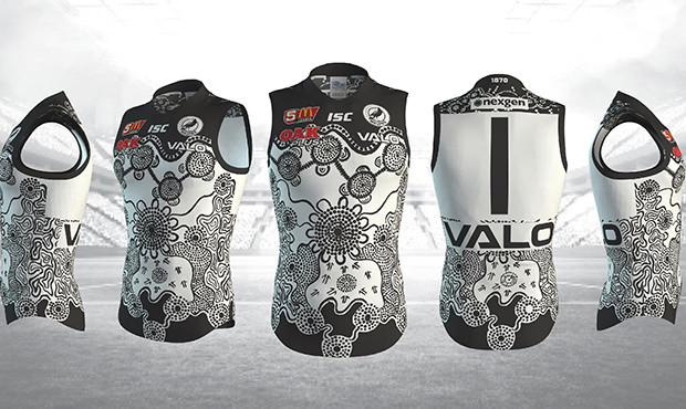
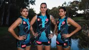
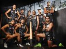
Official Club Stuff Introducing Yartapuulti Football Club

Remove this Banner Ad

Log in to remove this ad.

The only thing I will say, and I do love this one overall, but I don't think the Chevrons need to be captured in our indigenous guernseys. The teal V is not really a crucial part to keep.
At least we've integrated them into the design this year, as opposed to it being a bit of "design your art on the side around this". I do think every year the most striking Indigenous guernseys are the ones that completely forgo the teams traditional Guernsey elements (Crows guernseys are great at this), and would like to see more of it from Port.

But I rate this one, reckon it's a winner.
 
Here's a reddit link to all the other clubs guernseys.


Freo, Sydney & Geelong are standouts. Even Adelaide's is quite good.

Hawks looks good overall, but the cartoonish head ruins it, even more than ours.

Richmonds looks awful, like a throw back to 1950s Australiana.

Lol at North Melbourne. They can't even do this to a suitable standard.
 
So we’re called Yartapuulti for indigenous round games , it’s the Kaurna word for the area around the Port and Port River Yarta means land and puulti means sleep or death, maybe it was a burial ground.
Anyway just saying Aboriginal pronunciation would Yardabuldi , they say their t ‘s like a d and their P’s like a b . So this week it’s GO YARDUBULDI


That's the best indigenous guernsey we have done and maybe the best I have seen. Outstanding


I’ve said it on Twitter. We nail it every season.

I don’t remember a bad one.
 
I’ve said it on Twitter. We nail it every season.

I don’t remember a bad one.
In my opinion we're yet to have a bad one, but I'm pretty unbiased and I don't think there's been a season we've had the best one in the league. For contrast I think the Crows had the best one in 2016 which displays that I'll put my like/dislike of a club aside when judging these. That being said though, this year's one is gorgeous, and I'll easily come out and say we have the best one here by a long shot. And this is in a season where the bottom rung in terms of quality is getting even better, I don't think there's a single bad one across the league as a whole.
 
In my opinion we're yet to have a bad one, but I'm pretty unbiased and I don't think there's been a season we've had the best one in the league. For contrast I think the Crows had the best one in 2016 which displays that I'll put my like/dislike of a club aside when judging these. That being said though, this year's one is gorgeous, and I'll easily come out and say we have the best one here by a long shot. And this is in a season where the bottom rung in terms of quality is getting even better, I don't think there's a single bad one across the league as a whole.

We didn’t use our best one in the AFL:

PM_2018%20INDIGENOUS%20GUERNSEY-page-002.jpg

2018 Magpies


P.S.: Do we have a specific thread for ALL our Indigenous Guernsies? We should have one.
 

(Log in to remove this ad.)

Coming late to this thread but I think it is an outstanding initiative.

We are Port Adelaide AND now Yartapuulti.

Just as our individual and national identities are multifaceted, so can the nature of our club.

This and other acts like it are symbols of our becoming more comfortable with those multiple identities, as well as coming to terms with the complexities and failures of our past.

As I said in the Voice discussion, the terms woke, political correctness and virtue signalling get thrown around as though the are sufficient arguments against any sort of progressive change to the status quo.

But this isn’t just white guys getting together to make themselves feel better. It is being led by our indigenous players and staff.

And while don’t solve deep socioeconomic problems, they do help start dialogues and create the sense of common purpose that is necessary to chip away at them.
 
In my opinion we're yet to have a bad one, but I'm pretty unbiased and I don't think there's been a season we've had the best one in the league. For contrast I think the Crows had the best one in 2016 which displays that I'll put my like/dislike of a club aside when judging these. That being said though, this year's one is gorgeous, and I'll easily come out and say we have the best one here by a long shot. And this is in a season where the bottom rung in terms of quality is getting even better, I don't think there's a single bad one across the league as a whole.
Essendon still wins 2023 for me. It would be very interesting to run a "best of all time" competition on the main board some time, maybe at the 10 year anniversary if we haven't reached that yet.

 
We didn’t use our best one in the AFL:

PM_2018%20INDIGENOUS%20GUERNSEY-page-002.jpg

2018 Magpies


P.S.: Do we have a specific thread for ALL our Indigenous Guernsies? We should have one.
That guernsey is an absolute ripper when photographed statically, but like most indigenous designs on footy jumpers ( and I can't recall the game(s) it was used in ), many of the designs are in my opinion a bit too busy to show up well on tv, although it is definitely possible they could be fine for spectators at the game.
 
This year's design is one of our best.

I like our colours generally but I reckon it's easier for teams with brighter colours to come up with more striking designs given how busy and complex the designs tend to look.
 
See this is why I'd love someone to run a comp for this. I don't think any of these would be in my top 3.

I'd probably have Essendon > GWS > Hawthorn > Port > Geelong

You’d need to establish common criteria of assessment to have a legitimate competition. Otherwise it’s just a popularity contest.

These 3 are top for me because they break the usual design of the guernsey to prioritise the indigenous artwork.
The execution of the design is done well and is respectful of the cultural significance of indigenous storytelling through visual art.

How are you making your selections?

I'd be interested to hear how you reconcile the cartoon head on Hawthorn’s guernsey with indigenous culture?
That drops it down significantly for me.

Ours suffers the same but not as much.
I don't hate it, but I get a "bought-from-Brickworks-in-1988" vibe from ours.
Yep would just be a popularity contest for sure, but you could at least make it so people can't vote for the guernsey from the team they support.

I'm literally just listing mine in how cool I think they look - no thoughts beyond that at all.
 
These three are the standouts for me, with Geelong being the best by an absolute mile.

rf1dzfpomrza1.jpg


prwdgaqomrza1.jpg


v62l9eqomrza1.jpg

See this is why I'd love someone to run a comp for this. I don't think any of these would be in my top 3.

I'd probably have Essendon > GWS > Hawthorn > Port > Geelong

It's definitely an interesting exercise, because for me, the top 3 are GWS, Richmond and then I find it hard to split the bird trio of ours, Hawks and the Bombers for third, think it might be ours out of those but it could be just a bit of a bias sneaking through.

While we're at it, my all time favourite Indigenous Guernsey of anyone's is this ripper:
images (1).jpeg
Think it's the perfect blend of being recognisably a Sydney Guernsey but with the black swan artwork that just looks fantastic and really pops.


For us, this year's is my favourite but I will give a bit of a shout out to these two:
images (2).jpeg images (3).jpeg
 

Remove this Banner Ad

Back
Top