- Sep 26, 2017
- 26,639
- 43,845
- AFL Club
- Geelong
Follow along with the video below to see how to install our site as a web app on your home screen.
Note: This feature may not be available in some browsers.


They brought these two out at the same time.I really dislike our current logo that we use. It looks cheap and nasty and is in need of an update.
I actually like the logo on the jumpers but it isn't used that often, it should be our only logo imo.
View attachment 1700683Bad
View attachment 1700684
Good
The only merch I buy is either the jersey, or retro gear with this on it.
Retro 80s/90s gear is the way to go for sure. The current logo ruins a lot of merch. The one I've noticed it ruins more than anything else is snapback caps and baseball caps. The minimalist "club logo against a single club colour" design motif that's common on snapbacks and baseball caps usually makes the logos look stylish and cool when the logo is well-designed, but when you put our modern logo on a snapback or baseball cap it just draws attention to the tackiness and childishness of the design.


I was going to give it a go.
I quite like the logo that is the prowling Cat combined with our hoops that comes with the members game ticketing emails.
 This is a great effort. That cat is unidentifiable. Meaning it's neither any of the big cats and doesn't fit the mold of a house cat. But it's tough and mean looking.

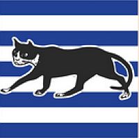
100%, we'll never go better than this ^ one, and THIS is the reason any retro merch with this on it over the past decade or so sells like hotcakes.Our best logo will always be the 80s and 90s logo.

Absolute classic.
http://www.gfc.com.au/Portals/0/cats_docs/...kyou_Letter.pdf <--- dead link now
Primary:
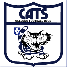
This is our main marketing trademark and is contemporary, youthful, energetic and even a little intimidating. It deliberately continues to emphasise our traditional hoops and cat identity. This appears on all our marketing material and symbolises our attitude of "we give everything that we've got" - Footy Full On
Secondary:
We have also introduced a very special new logo that will be found on the player's Guernsey and on field playing apparel. It represents our proud history since 1859. The hoops and cat images are continued to reinforce that sense of tradition. This shield is worn with pride and represents the honour of playing for the Geelong Cats.
View attachment 1719869This is a great effort. That cat is unidentifiable. Meaning it's neither any of the big cats and doesn't fit the mold of a house cat. But it's tough and mean looking.
The problem with our mascot, if you take the historic element out, it's quite vague. Specifically we should be known as the Geelong black cats. But we're just "cats". It's like if a team were known simply as "birds". We've got Swans, Magpies etc. But no team's known as just a generic bird.
Any logo where our cat looks like a panther is a winner for me. The Geelong basket team (the Supercats). Their cat type creature always looks ready for action.
View attachment 1719870 View attachment 1719872

Primary:
This is our main marketing trademark and is contemporary, youthful, energetic and even a little intimidating. It deliberately continues to emphasise our traditional hoops and cat identity. This appears on all our marketing material and symbolises our attitude of "we give everything that we've got" - Footy Full On
FMD, where do they dredge up these w***ers?!
Somewhere...someone...from the marketing team in 2007/08 has read this and felt pretty chuffed with themselves as "job done".This morning, I was walking down the street and found a gang of youths proudly displaying GFC gear marching from the other direction, daring challenge. I felt pure terror for the first time in my life, the hairs on my arms raised, drenched in a cold sweat, I dived for the other side of the road scarcely dogging moving traffic so reach the sturdy safety of the cement pavement. They energetically marched forward, invading the ground I once occupied, without a care of who or what stands in their way.

Reminds me of the Ben Graham era. Pass.
Although the cats nickname undoubtedly came from a black house cat, we do have the Otway Panther myth basically at our doorstep. I would be OK with blurring the lines between the 2 types of catNo Panthers!